2014 Shortlist – Best Typography – From Earth’s End
Mary Egan Publishing Award for
Best Typography 2014
Highly Commended
| | |
 | Designers Adrian Kinnaird (cover), Alan Deare and Kate Barraclough (Kate Frances Design) (interior)
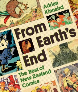
Title From Earth's End: The Best of New Zealand Comics by Adrian Kinnaird
Publisher Random House New Zealand
Format 250 x 210mm, 448pp, paperback with flaps, spot UV
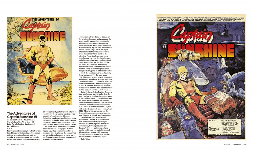
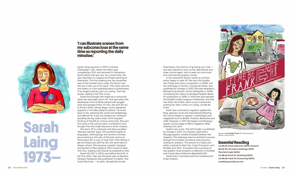
Fonts Set in Graphik Regular 9/11pt, with titles and pull quotes in Platform Bold, and captions in Trio Grotesk Medium 6/7.5pt
|
| Judges’ Comments The type for From Earth’s End is bold and contemporary. Its striking graphic quality expresses what this book is about without deploying the usual typographic clichés. The title font is an idiosyncratic geometric, playfully speaking to the singular, reductionist quality of the comics themselves. However there is enough ‘serious’ typographic detail in the body text and captions to signal the growing academic and literary concerns of this genre. Pull quotes throughout keep the narrative rolling with sound bites that draw the reader back in. It is a finely judged deployment of text and imagery combined in a way that reminds us of the subject itself. |


View shortlist | View winners