Mary Egan Publishing Award for Best Typography 2017
Finalist
Designer: Spencer Levine
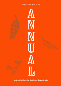
Title: Annual
Publisher: Gecko Press
Format: 260 x 193mm, 136pp, cased hardback, section sewn, square back. Cover matt lamination with spot UV and gold foil.
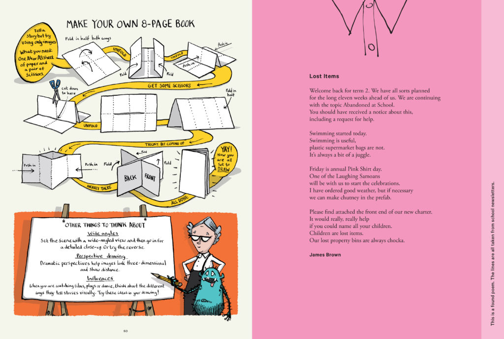
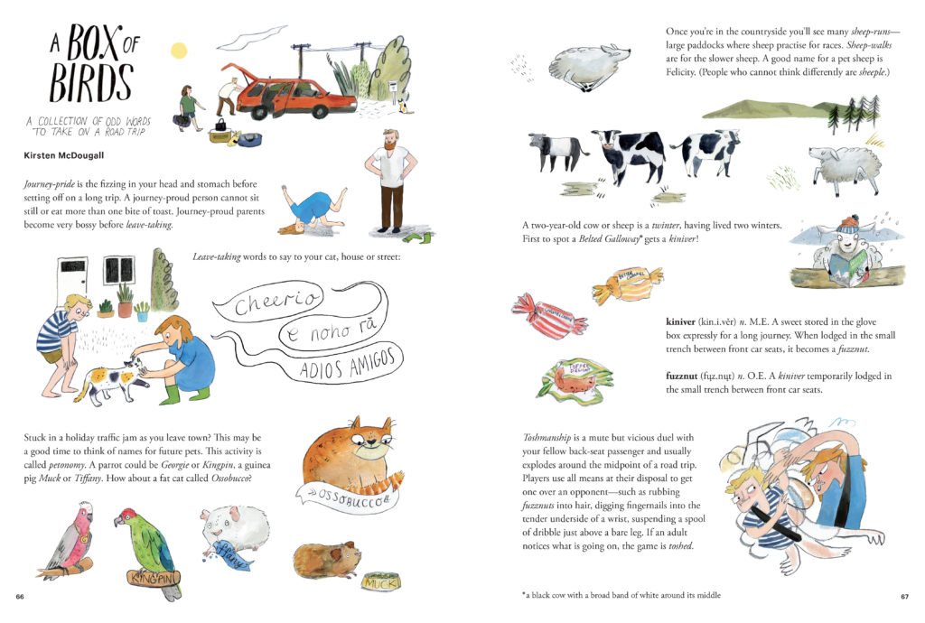
Fonts: Goldpicker and Mark Pro (cover). Internal typefaces: Goldpicker, Mark Pro, Garamond (various), Calibre (various), Courier and hand drawn fonts.
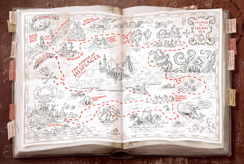
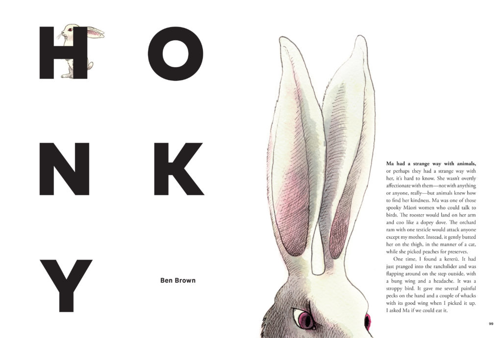
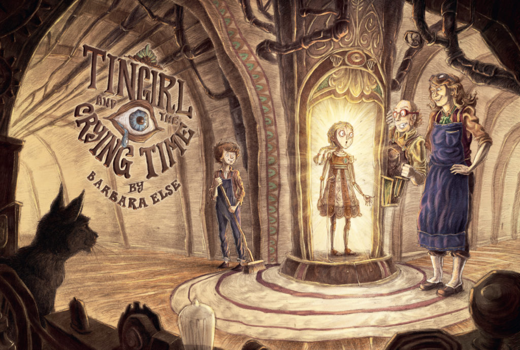
Judges’ Comments The typography in this book design has a hard job of work to do, a demanding audience, not only the readers but the contributors. So many different voices to accommodate. But, largely the typography holds and stitches the many strands together. Each piece is well supported and brings a sense of tradition to what otherwise is a very contemporary set of contributions. And to borrow from and play with a pull quote, set strikingly in red, from Hungarian-American mathematician John VON NEUMANN on page 37 – “Young man, in typography you don’t understand things. You just get used to them.”

