Harpercollins Award for Best Cover
Shortlist 2009
Designer Catherine Griffiths Designer Sarah Maxey Designer Keely O'Shannessy

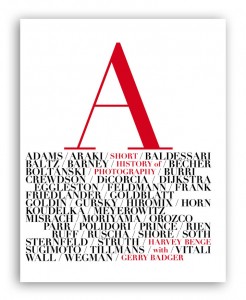
Title A Short History of Photography by Harvey Benge with Gerry Badger
Publisher Random House New Zealand
Format 285mm x 235mm, 80pp, hardback
Judges’ comments A Short History of Photography was actually the clearest winner in any category. It is visually striking, and conceptually brilliant. Having a ‘history of photography’ without a photograph on the cover is itself breaking every unwritten rule – and yet it was necessary. Harvey Benge’s photos are a collection of pieces that pay homage to the greats of photography. As such, no one image could encapsulate the book. Instead, the cover acts as the index so that, whilst browsing the images, one turns back to the list of names on the cover for clues as to who is being referenced. It is a novel concept – but one that came out of a clear and logical analysis of the problem posed by a unique book. Griffiths even manages her own take on the concept with some typographic homages of her own.

Title A Good Handful: Great New Zealand Poems About Sex edited by Stu Bagby
Publisher Auckland University Press
Format 195mm x 148mm, 128pp, paperback with flaps
Judges’ comments Sarah Maxey’s cover for A Good Handful is immediately joyous. Dick Frizzell’s painting provides a suitably sensuous backdrop to Maxey’s inspired choice of type. How do you make lettering look sexy? With this typeface, both the word ‘good’ and the central line of E’s evoke coupling. Together with the close packing of words and the overall combination of hard and soft lines in the letterforms, this is as eloquent an argument for typography being as good as sex as you will ever get.

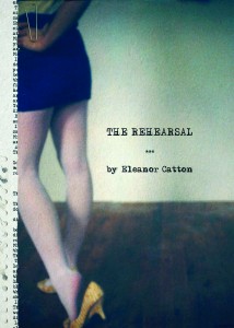
Title The Rehearsal by Eleanor Catton
Publisher Otago University Press
Format 280 × 220mm, 216pp, gatefold paperback, matt lamination, section sewn
Judges’ comments Keely O’Shannessy had to deal with a text that revolved not around good handfuls of sex, but rather around its taboos. The cover of The Rehearsal therefore had to hint and to suggest – to hide more than it reveals. It had to be gritty and yet theatrical. This is achieved through the stripping away of an image to reveal a script, which occurs on both front and back covers. The effect is a cover that whispers rather than shouts, but nevertheless compels you to pick it up.


