G.A. Pindar & Son Award
For Best Typography
Shortlist 2009
Designer Sarah Maxey Designer Arch MacDonnell Designer Katy Yiakmis
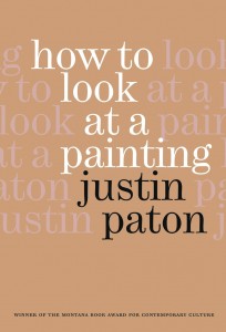
Title How to Look at a Painting by Justin Paton
Publisher Awa Press
Format 198mm x 136mm, 152pp, cloth casebound with french-fold dustjacket
Judges’ comments Sarah Maxey’s design for How to Look at a Painting is the most understated of the three. Its strengths are the least immediately obvious, but a closer look shows how a series of wonderful decisions (like the choice of typeface, line length, leading and the non-capitalisation of headings) all contribute to a book that is simply a joy to read. In the end, it was this ability to achieve maximum effect through minimal means that meant it was selected as the overall winner. The typographer works with a limited palette, and Maxey’s control of that is about as good as you will ever see.
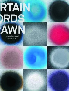
Title Certain Words Drawn by John Reynolds
Publisher Random House New Zealand
Format 240mm x 190mm, 480pp, hardback
Judges’ comments A fusion of design with text is found in Arch MacDonnell’s subtle, contemporary and perfectly appropriate response to John Reynolds’ art and the different authors who comment on it. In Certain Words Drawn, the typography has to interpret writing that spans the academic, literary and anecdotal. The resulting changes of typographic approach to indicate the book’s different sections bring a degree of edginess, variety and unpredictability, but there is never any loss of coherence.
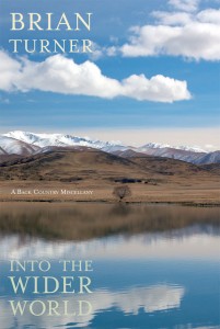
Title Into the Wider World: A Back Country Miscellany by Brian Turner
Publisher Random House New Zealand
Format 235mm x 158mm, 496pp, paperback
Judges’ comments Katy Yiakmis’ design for Into the Wider World manages to be both gutsy and sophisticated – the typeface supplying the guts, and the placement on the page and elegant section headings supplying the sophistication. They suited the text beautifully, and give an unusual but thoroughly appropriate visual texture to the book.


