Random House New Zealand Award for
Best Illustrated Book
Shortlist 2010

Designer Cameron Gibb
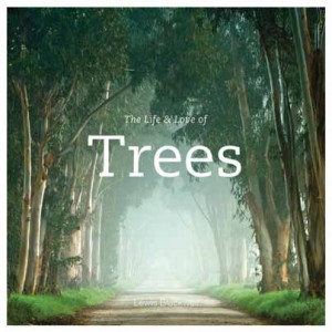
Title The Life & Love of Trees by Lewis Blackwell
Publisher PQ Blackwell/Hachette (NZ)
Format 305mm x 305mm, 200pp, jacketed hardback with printed, debossed case and printed endpapers
Judges’ comments This book, quite simply, has a massive ‘wow factor’. This is partly due to the quality of the photos, but it also stems from the design, the simplicity of which belies some wonderful decision-making. Tempting as an elegant serif for the text must have been, it would have been too much of a good thing. The round sans serif provides an ideal foil to the sophistication of the photos, and there is a series of similarly skilful decisions, such as the rhythmic endpaper design periodically appearing throughout the book. This book does not need much explanation. It is a unanimous winner.

Designer Spencer Levine (cover),
Katrina Duncan (interior)
Title Marti Friedlander by Leonard Bell
PublisherAuckland university Press
Format 285mm x 235mm, 232pp,
jacketed hardback with french folds
Judges’ comments Marti Friedlander's rich, dark and evocative photographs demand sensitive interpretation, and the design presents them with deft typographic grace. The cover, velvet to the touch, is simple and arresting, whilst inside, the grid supports, but never overwhelms, the photographs. The main contrast to the dominant black and white aesthetic is the bright blue jacket, which introduces a real element of surprise.

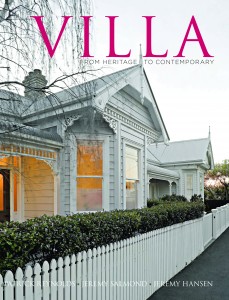
Designer Fiona Lascelles
Title Villa by Patrick Reynolds,
Jeremy Hansen and Jeremy Salmond
Publisher Random House New Zealand
Format 315mm x 245mm, 337pp,
jacketed hardback with printed, laminated case and printed endpapers
Judges’ comments The challenge in Villa was to both celebrate and control Patrick Reynolds’ sumptuous and brightly coloured images, and the exacting standards of the photographs are here perfectly complemented by a vibrant yet supportive design. The two-colour captions are the key to integrating the text and images, and the headings (in Trajan) perfectly evoke the heritage aspects of the subject matter. A highly flexible grid allows for constant surprises as one moves from spread to spread, whilst maintaining a thoroughly coherent design ethos.
.


