Mary Egan Award for Best Typography
Shortlist 2010
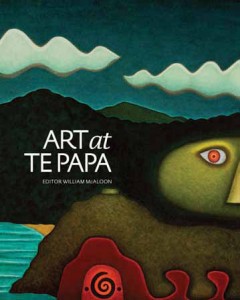
Designer Grant Sutherland, Mission Hall (interior), Robyn Sivewright, Afineline (typesetting), Neil Pardington (cover)
Title Art at Te Papa edited by William McAloon
Publisher Te Papa Press
Format 315mm x 250mm, 440pp,
flexibind with flaps
Judges’ comments The beautifully weighted serif typeface used throughout the headings and body text is both perfectly round and ... pointy. The captions are discreet and easy to read, while the flush-left columns are distinct and decorative on the white page. The sans serif cover type evokes the Te Papa identity, but is in keeping with the serif type in the rest of the book. Overall, the leading, weight, grid and type selection are perfect (and thus invisible). Readers will simply be aware of it being an enticing and elegant design, but it is also a consummate piece of typography.
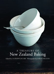
Designer Kate Barraclough
Title A Treasury of New Zealand Baking edited by Lauraine Jacobs
Publisher Random House (NZ)
Format 250mm x 195mm, 256pp, unjacketed hardback with printed, laminated case
Judges’ comments This book uses type effectively – in this case the combination of two serif typefaces is so perfectly fused that it almost makes cooking look easy. Generous leading and the beautiful weighting of the typographic elements allow the type to counterpoint the very rich photographs, and the purely typographic ‘essentials’ pages are elegant in the extreme
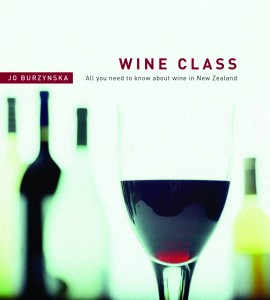
Designer Kate Barraclough
Title Wine Class by AUTHOR
Publisher Random House (NZ)
Format 200mm x 170mm, 256pp,
paperback with flaps
Judges’ comments With a slab typeface and generous leading, the text sits lightly on the page, and the wide outside margins allow for headings and extra information panels to break out of the grid and create a dynamic balance throughout. Its open, clean and modern design delivers a thoroughly stylish book.


