Mary Egan Publishing Award for Best Typography 2017
Finalist
Designer: Alan Deare, Area Design
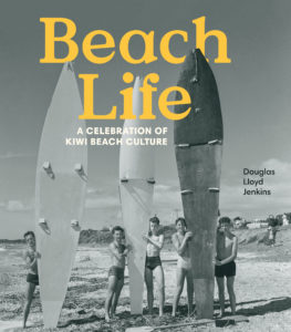
Title: Beach Life
Publisher: Penguin Random House
Format: 225 x 225mm, 296pp, printed on 140gsm woodfree text stock, with 400gsm one sided art-card cover with grained lamination finish.
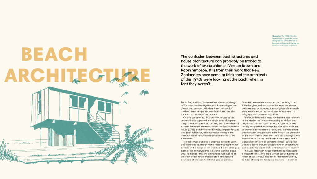
Typography: Harmonia Sans Pro Type family, varying sizes and weights according to hierarchy of the text.
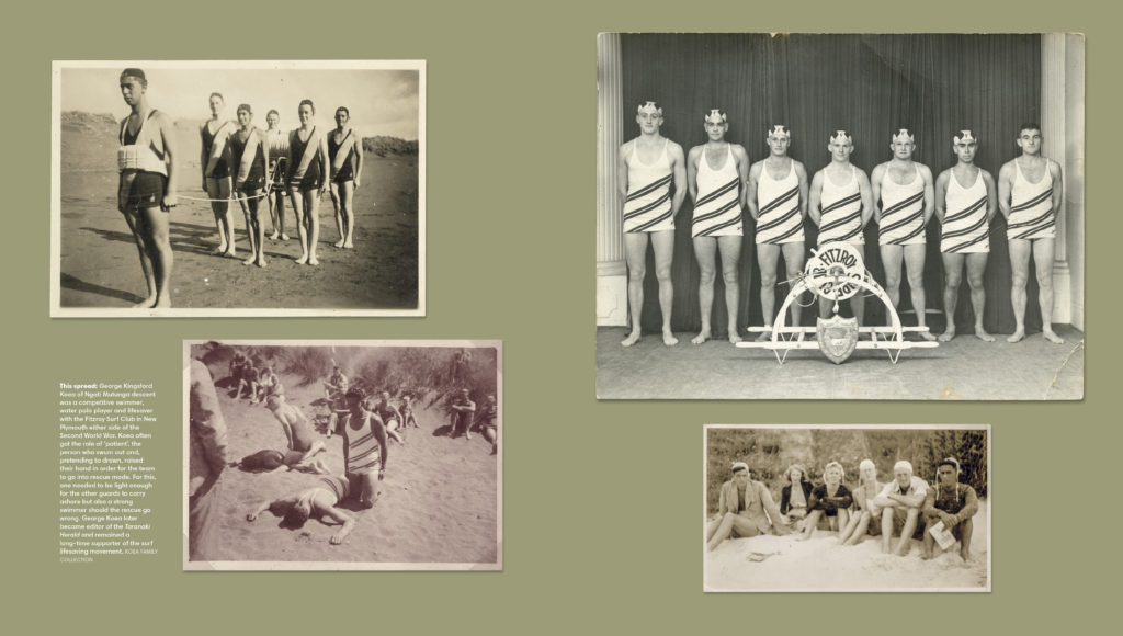
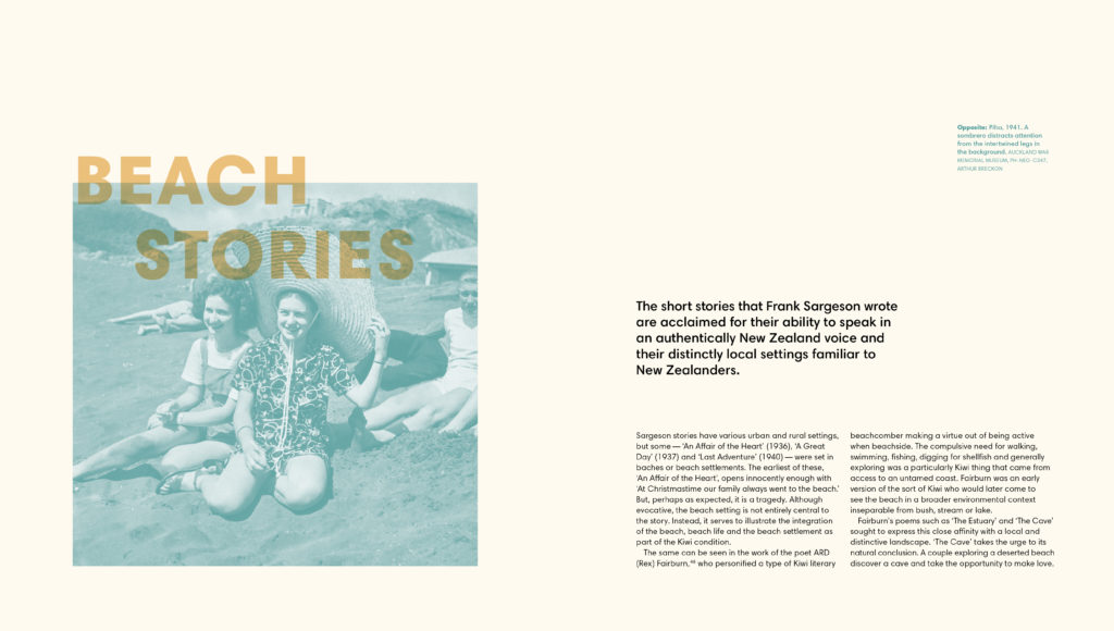
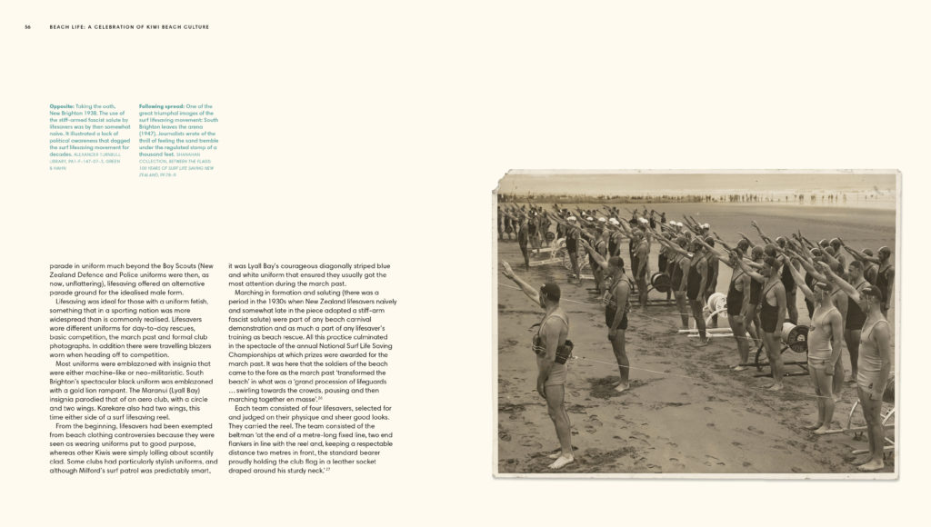
Judges’ Comments The typography here carries with it the energies and spirit of the beach. It has tonal ‘weights’ of the stained wet sands at high water marks, it ventures into restrained, sun bleached colour and overlays and takes the reader from bright sunlight to strong shadows through the stories. Personality comes through in pull quotes, which subtly step up a point size and add weight as one journeys through the body text. The appearances of title case for chapters are robust enough to cope with being overprinted across image and page ground. The reader’s job is made very easy to read page by page or to randomly dip into a chapter and either way pick up the flow of the content.

