Edify Award for Best Educational Book or Series – Primary 2020
Finalist
Designer: Floor van Lierop, This is Them
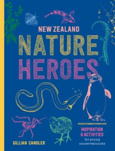
Title: New Zealand Nature Heroes
Publisher: Potton & Burton
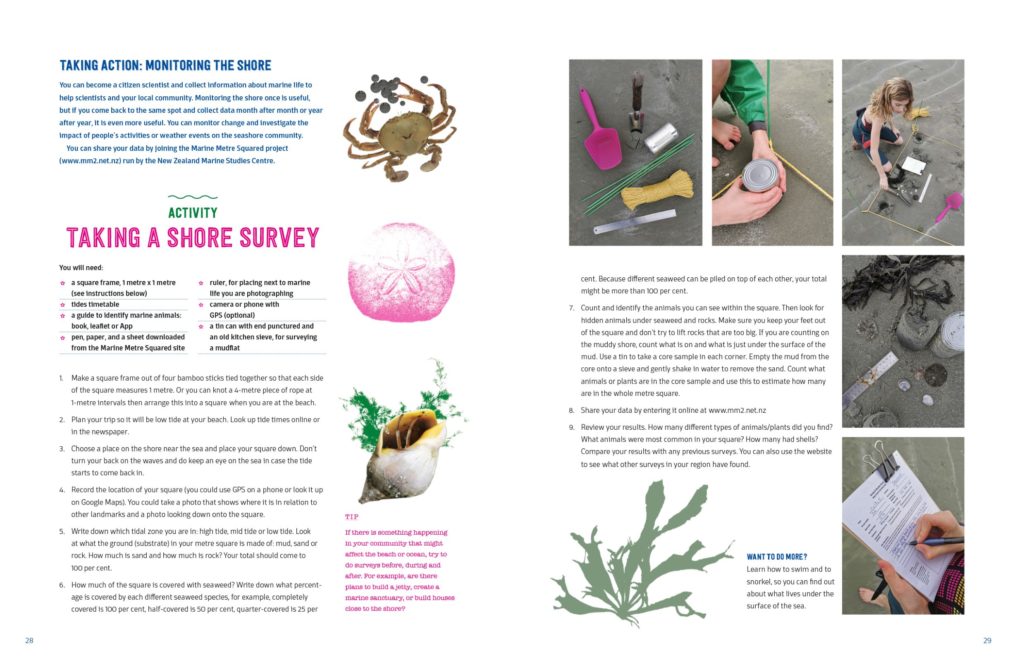
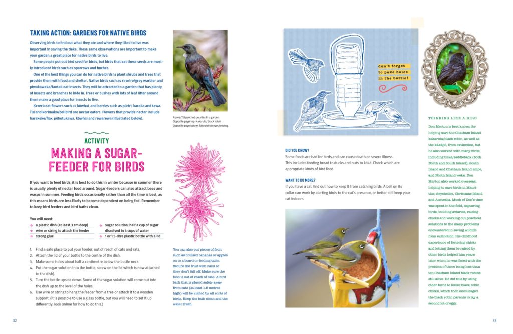
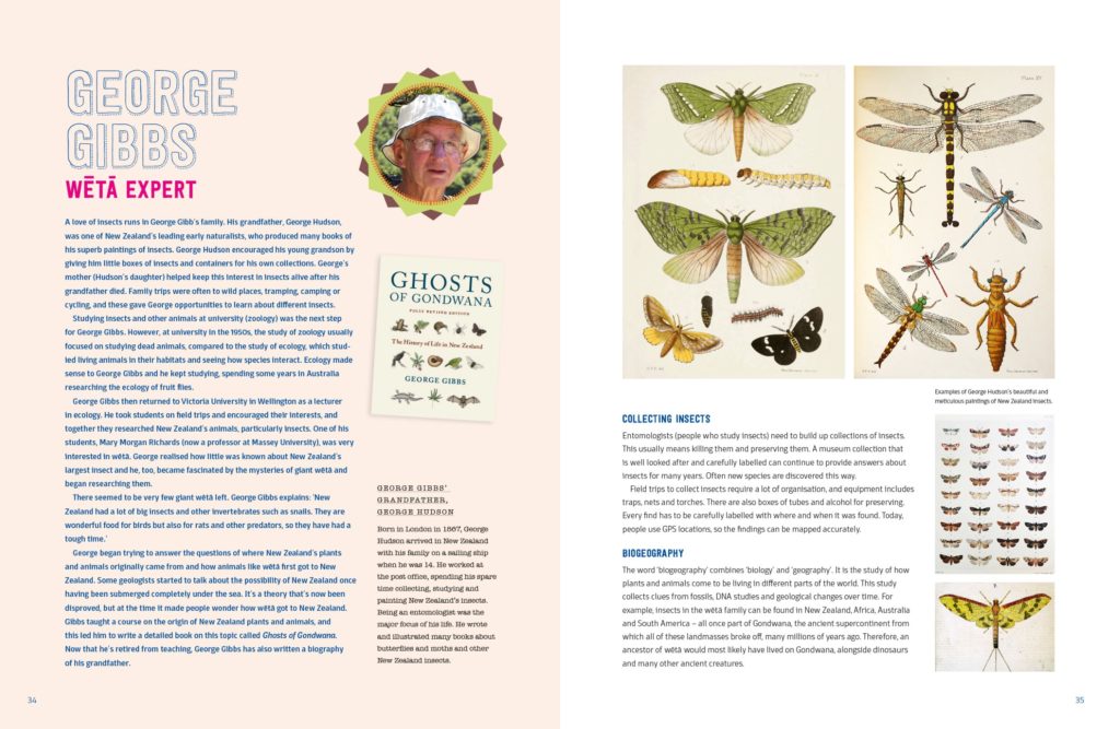
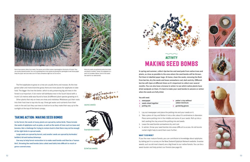
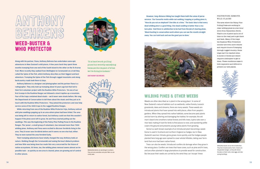
Format: 280mm x 215mm, 80pp, section-sewn, drawn on cover. The cover was printed CMYK plus 2 fluorescent PMS colours to achieve an eye-catching colour scheme with lots of pop. The flaps extend the outside colour to the interior, add interest and give the book more ‘heft’, despite the cover stock being just 250 grams (C1S Artboard). An uncoated, FSC certified stock (130 grams Yulong Pure Cream 1.3) was chosen for the interior to link in with the kaitiakitanga and sustainability focus of the book.
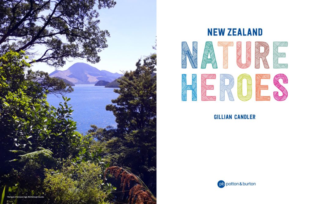
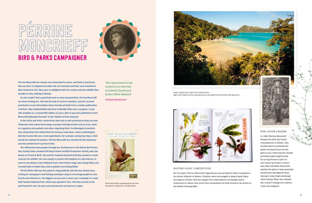
Typography: Festivo Letters typeface family is used for titles, subtitles & subheaders; Domotika is used for bodytext, introtexts; American Typewriter is used for textboxes and AFL Font Nonmetric is used for quotes and highlights.
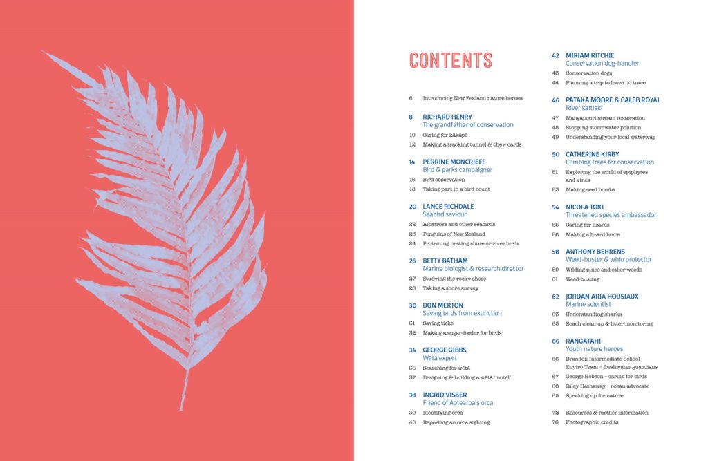
Various styles of the layered typeface (Festivo Letters) are used to give the text a friendly, playful and hand-made feel that suits the illustrations, and the character of the suggested DIY activities of the book – all of which are designed to appeal to the book’s target group (8–12 year olds). Some of the (body)text is colour-coded and differently textured variations of the typeface (e.g. dotted outline, inline) are used to create variation and help readers distinguish between different types of content such as activities, information on individual ‘nature heroes’ and smaller snippets of related information.
Judges’ comments A beautiful package filled with engaging and aptly designed inspirational content. The design does a great job of balancing inspirational careers with activities. Nice to hold (lovely stock), great to read — well done!

