Allen & Unwin
Award for Best Commercial Book for Adults 2024
Finalist
 Designer: Julia Murray & Steven Ranson
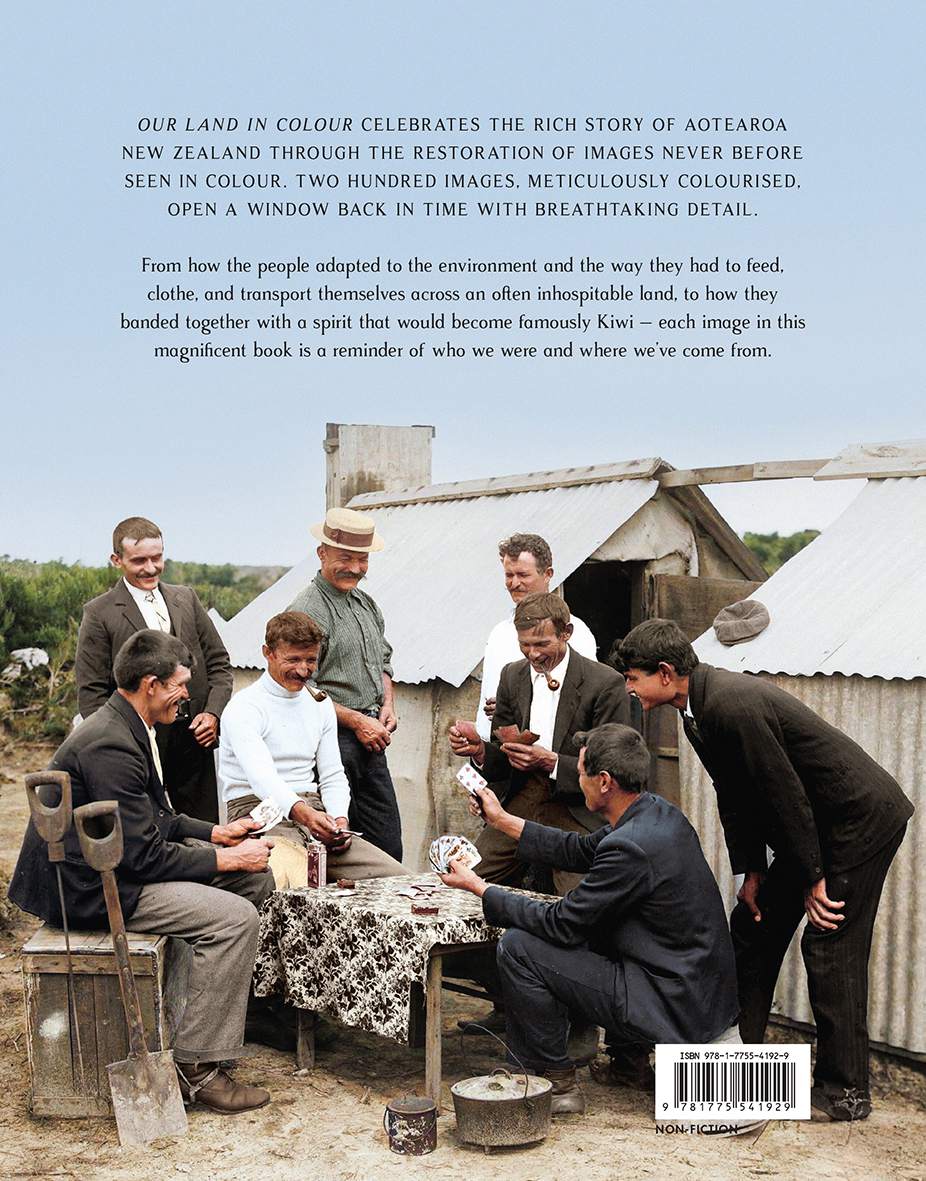
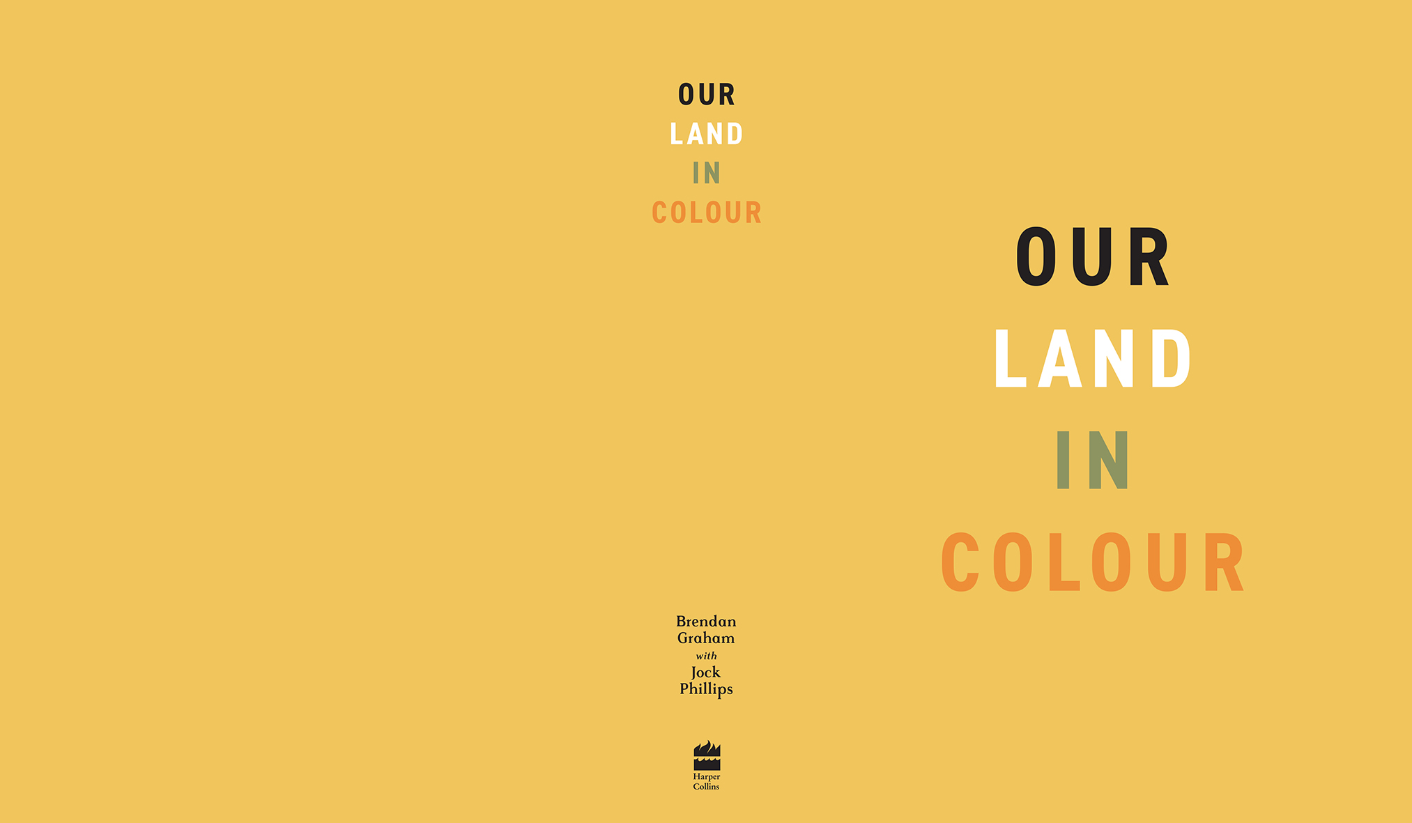
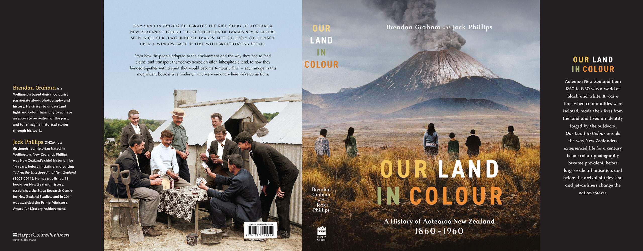
Title: Our Land in Colour
Publisher: HarperCollins Publishers Australia and New Zealand
Format: 245 x 190mm, 400pp.
Case: Wibalin 4C.
Jacket: 4C + Spot UV embellishment Internals: 140gsm woodfree.
Typography: Cover title: Din 2014 Narrow; 72 size; 110 kerning; 76 leading (family also used in varying weights as internal page furniture and instructional copy)
Rasmus (internal titles and secondary font on cover)
Adobe Caslon Pro (section intros body copy)
Cronos Pro (caption body copy)
‘The challenge was to design the book in a way that let the photography really be the star of the show. We wanted to do it in a way that was modern but echoed the historical feel of the photography. We searched for a classic, bold and legible title font to sit over the photography for the cover and chose Din 2014 Narrow as the main cover font. The Din family is a timeless classic and offsets the more decorative style of Rasmus (the secondary cover font). Rasmus (created by Markus John at The Designers Foundry) was carefully selected for the main titles of the internal pages because of it’s beautifully welcoming warmth and charismatic nod to historical vintage signage. The Din family is used in varying weights as the page furniture and instructional notes. The internal type layout design needed to be flexible and let the photos sit in a way that didn’t crop or interrupt them.”
Judges’ comments A fantastic photographic history of New Zealand, this book skilfully balances aesthetic choices with historical integrity. The earthy tones in the design complement the connection to the land, both in typography and photography, breathing life into Aotearoa’s past. The layout, with centred text and thoughtful use of negative space, creates a visually engaging experience. The subtle choices, such as the light orange endpapers, work harmoniously with the colouring of historical photos, enhancing their vibrancy and relevance.