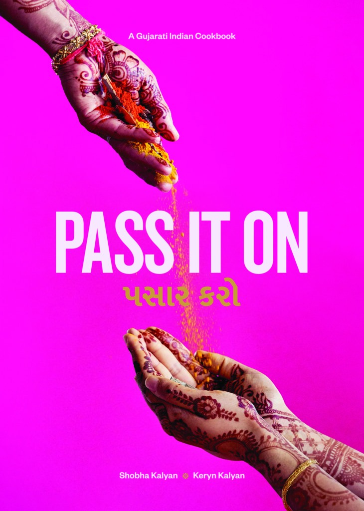
HarperCollins Publishers Award for Best Cover 2020
Winner
Designers: Key designer: Jessica Read in collaboration with Shobha and Keryn Kalyan
Title: Pass It On
Publisher: Self published by Shobha and Keryn Kalyan
Format: 297 x 210mm, 288pp, hardcover, section sewn in 16s with gold ribbon bookmark, all edge gold gilt and gold foiling stamping on the front cover and spine.
Typography: Cover: Knockout No. 48 Featherweight 156pt from Hoefler&Co foundry; Mukta Vaani Medium 53pt from Ek Type foundry; Founders Grotesk Medium 16pt from Klim foundry.
For the Gujarati text on the cover of the book we used a typeface called Mukta Vaani. Mukta is a versatile and contemporary typeface that supports Devanagari, Gujarati, Tamil and Latin Scripts. Mukta is a type family designed as part of an ongoing effort to develop a unified type family for each Indian script. The goal is to build one harmonious family across all Indian scripts without letting the visual features of one script dominate over others. This project is led by Ek Type, a collective of type designers based in Mumbai focused on designing contemporary Indian typefaces.
Judges’ Comments Zinging with vibrant energy and colour you can taste, the cover of this self-published book is a fantastic celebration of Indian culture. Conceptually tight, the idea of Pass It On is played out on the cover in a way that is visually arresting. The choice of clashing colours is brave and the gilded edges finish it perfectly. And all with confidence to not use food to sell a cookbook. Magic.


