Scholastic New Zealand Award
for Best Children’s Book 2020
Finalist
Designers: Studio Katie Kerr and Tyla Mason
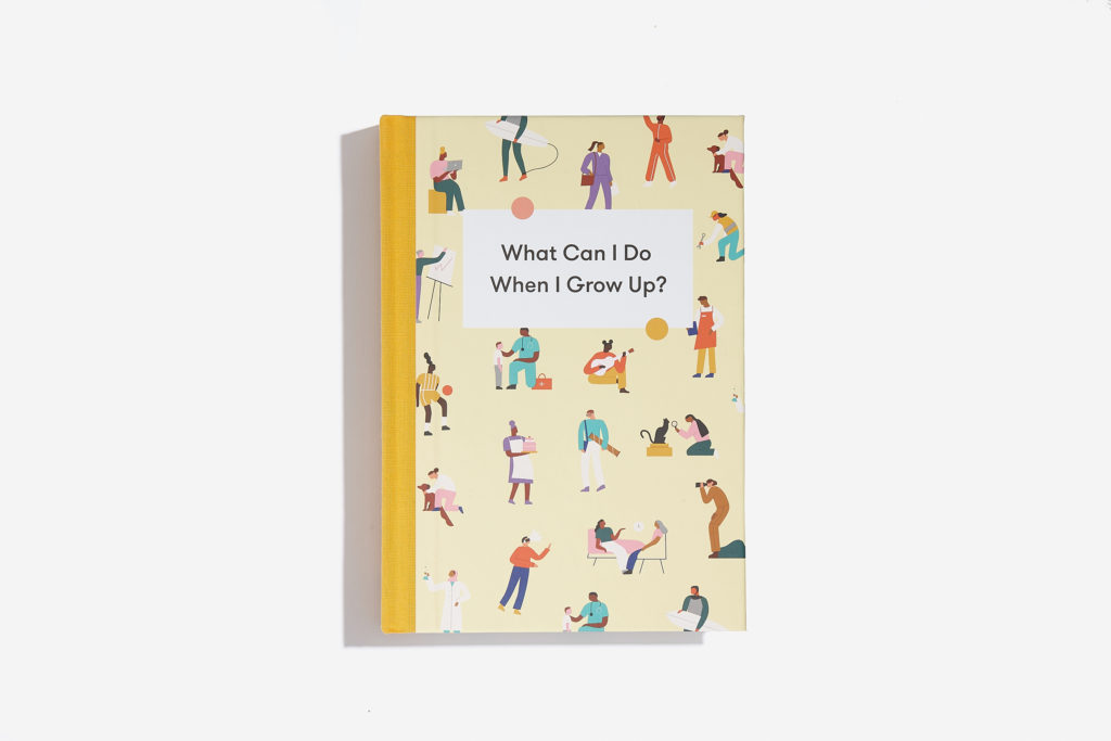
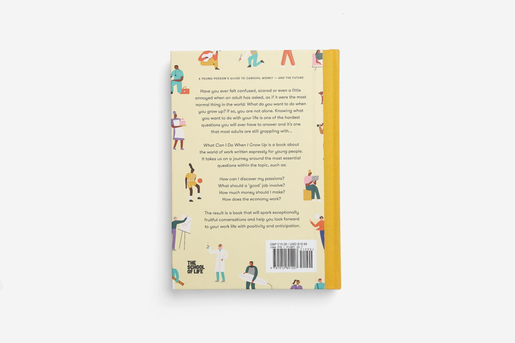
Title: What Can I Do When I Grow Up?
Publisher: The School of Life Press
Format: 227 x 160mm, 175pp, hardcover, section-sewn, quarterbound with a yellow headband. We used a quarter-binding technique on the hardcover to combine a durable laminate cover with a cloth spine to align with previously designed titles from The School of Life. The endpapers and bookblock are printed on Munken Print.
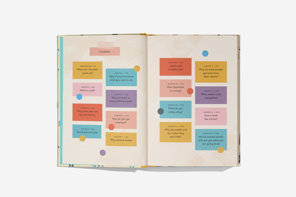
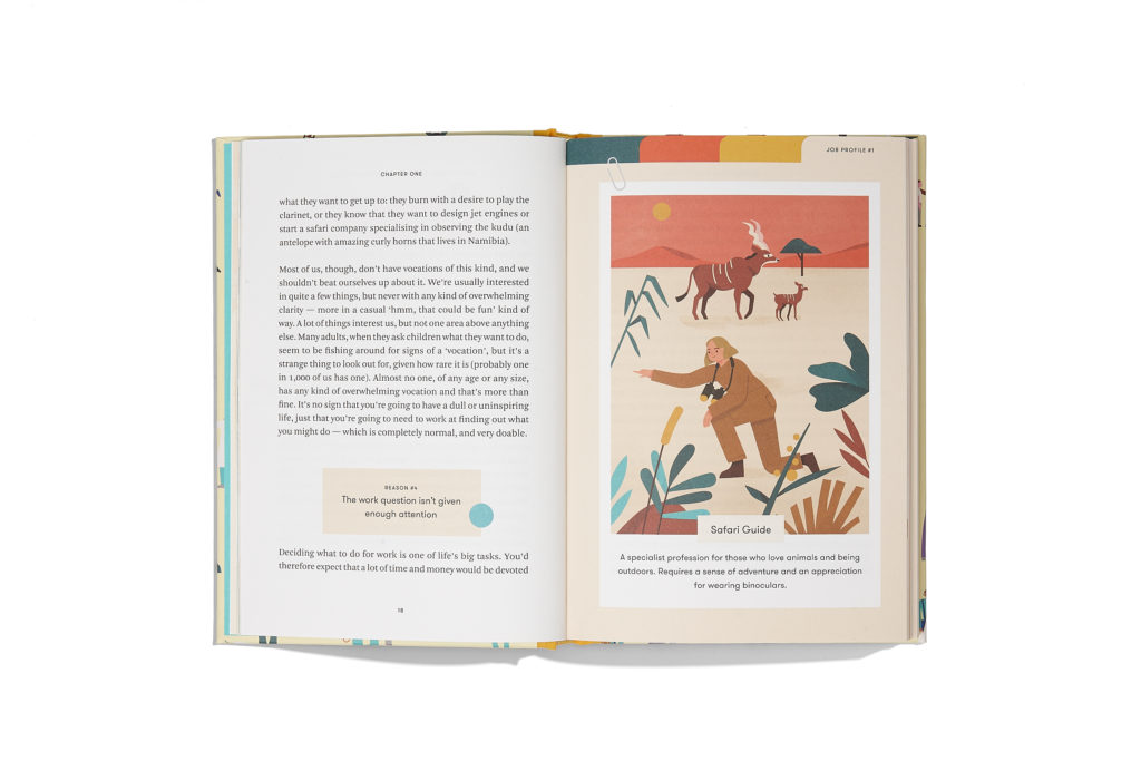
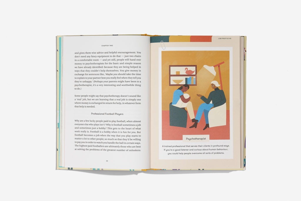
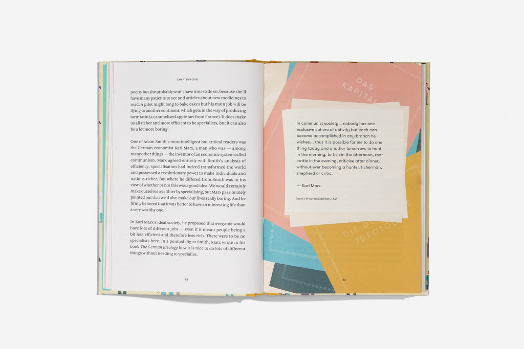
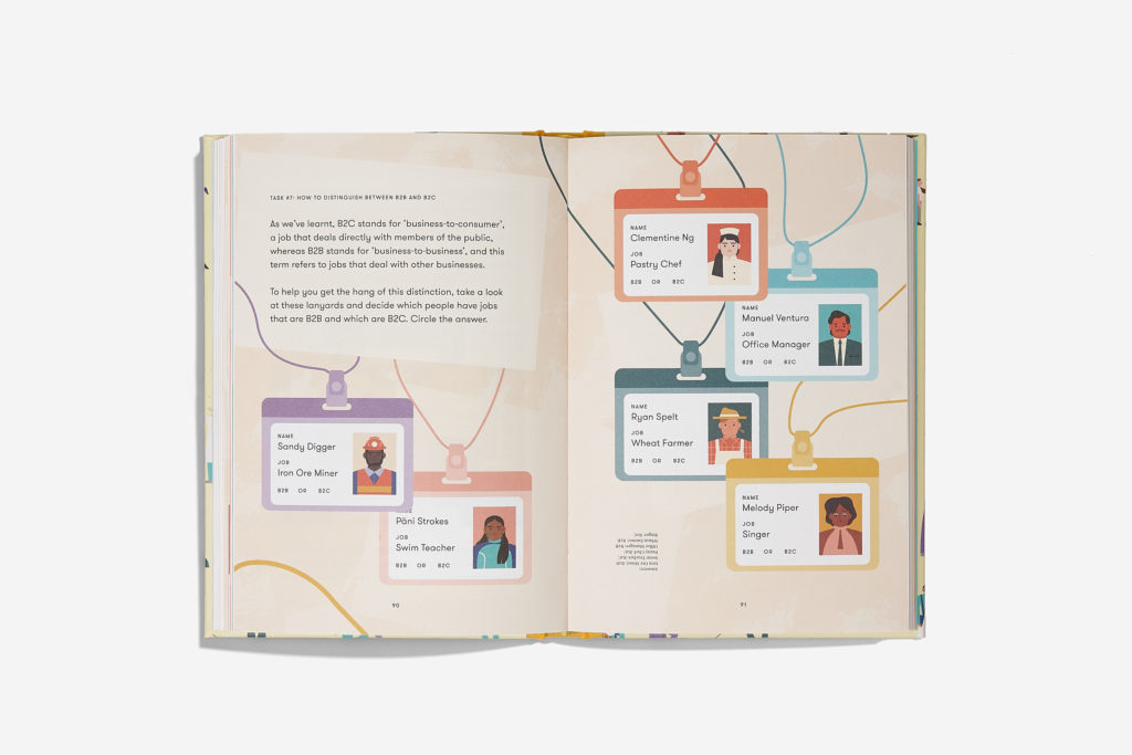
The primary typeface is Arnhem, designed by Fred Smeijers in 2002. All body type is set at 12pt without hyphenation to be legible for readers of the age group 9–12 years. The line height and leading has also been considered (and tested) for easy readability. The display typeface is GT Walshiem, designed by Grilli Type in 2010. Both typefaces were chosen for their agreement with each other, for their legibility for young readers and their good-natured, ‘gentle-yet-authoratitive’ style that reflects the editorial voice of Alain de Botton.
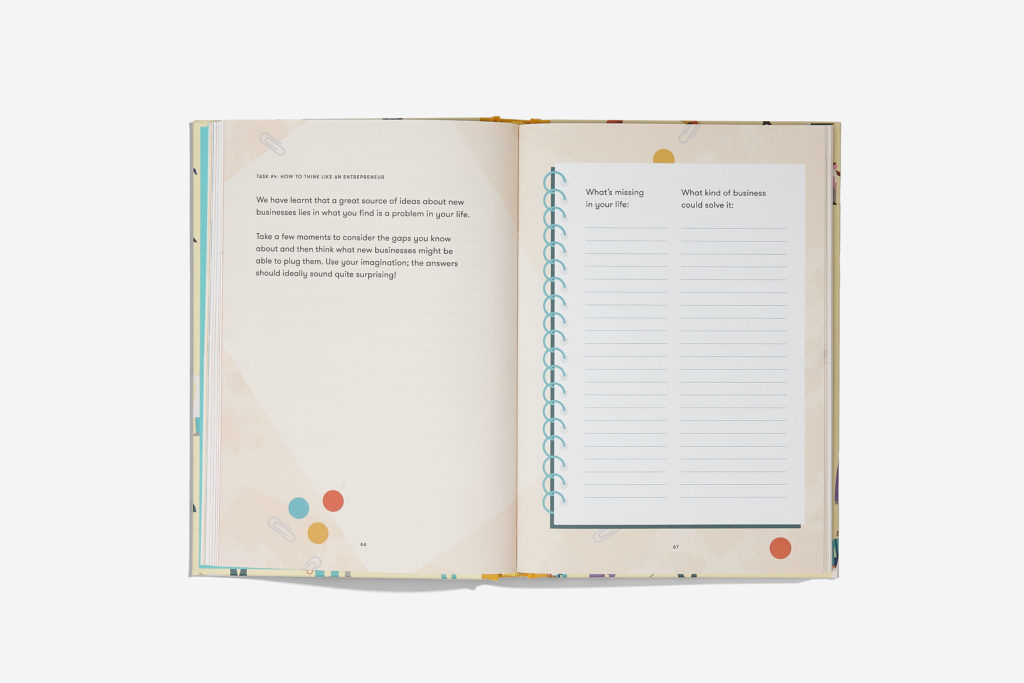
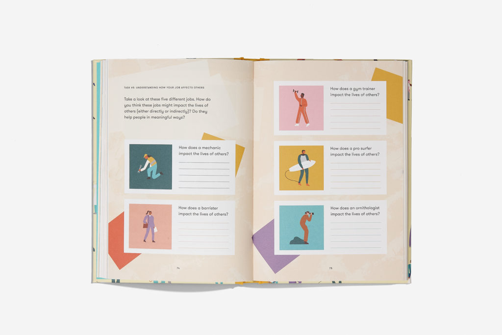
The design of the publication was based on several conversations I had with my 11-year-old niece. My design research for this publication involved spending time with her, as a member of the target audience of the publication, to understand her needs as a young reader and her interests as a budding jobseeker (she would like to be a horse trainer when she grows up, FYI). Our interactions lead to the implementation of a graphic theme of stationery in the book — her love for colourful office supplies reflecting her wonderfully aspirational view of what it might mean to have an “adult job”.
Judges’ comments Well considered overall, especially for such a tough brief. The clean design, judicious typography, interesting colour palette and high production values are all working hard to make this content accessible and engaging. The beautiful illustrations help to make this subject-matter fresh, fun and not in the least preachy.

