Upstart Press Award for Best Non-Illustrated Book 2022
Winner
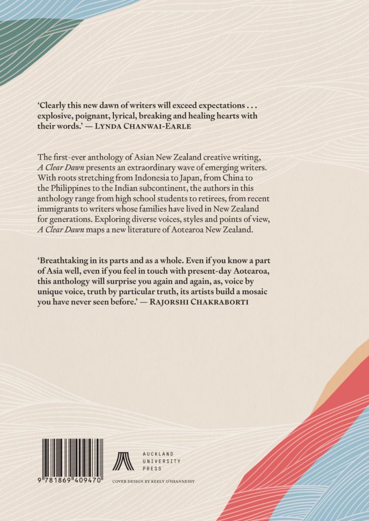
Designers: Keely O’Shannessy with typesetting by Tina Delceg
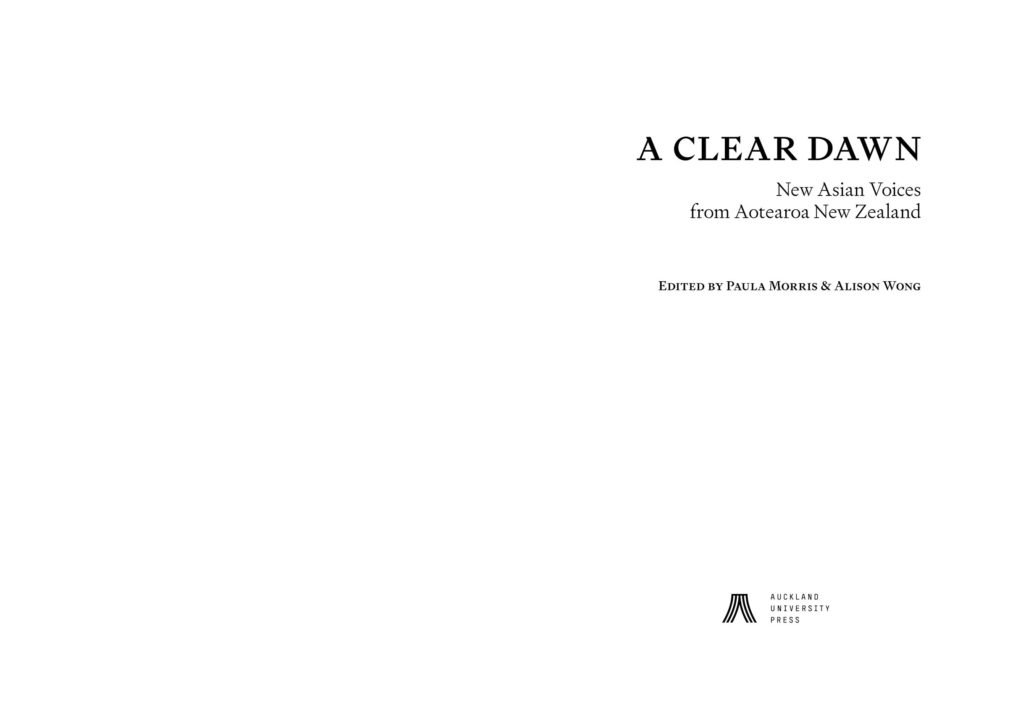
Title: A Clear Dawn: New Asian Voices from Aotearoa New Zealand
Publisher: Auckland University Press
Format: 240 x 170mm, 352pp. Flexibind cover printed 4c with gloss machine varnish on cloth-wrapped 250gsm board. Internals printed on 80gsm Bai Jin 1.7 Ivory Woodfree, with endpapers Pantone 1787 U on 140gsm Woodfree and cream H&T bands to match the cover. Bound section-sewn with flexi case. All stock FSC-certified.
Typography: Cover: Signifier Regular and Medium and Garamond Premier Pro Medium.
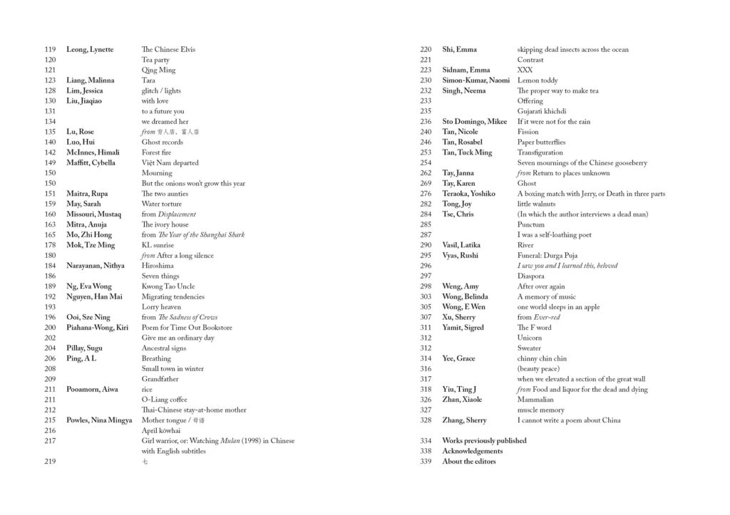
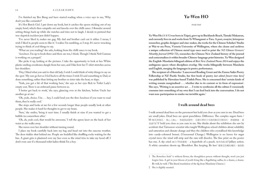
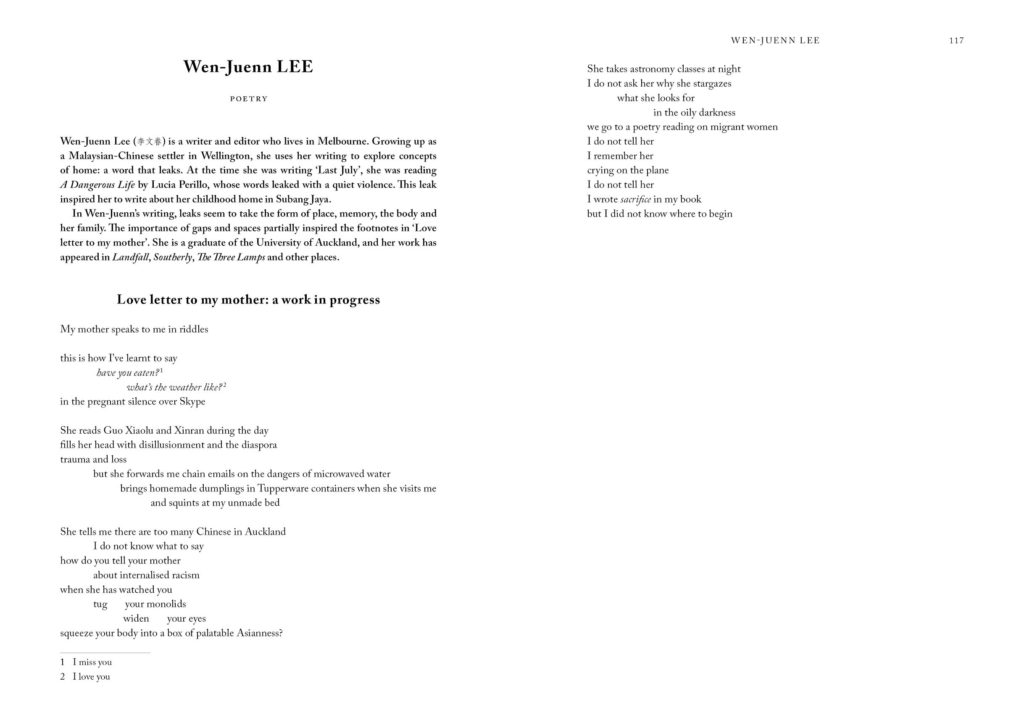
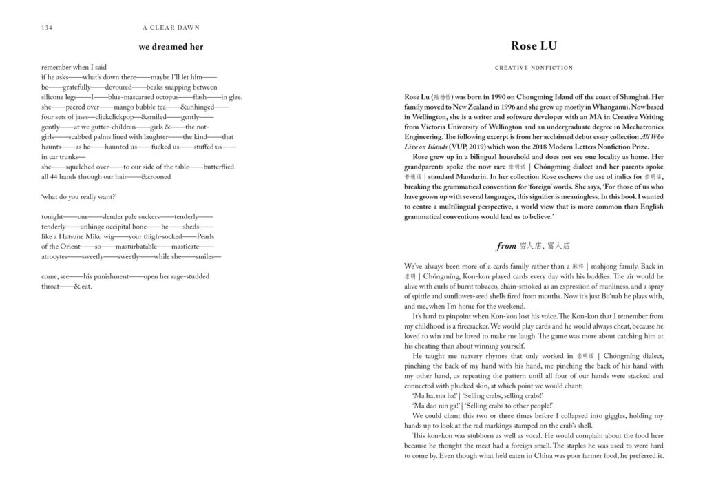
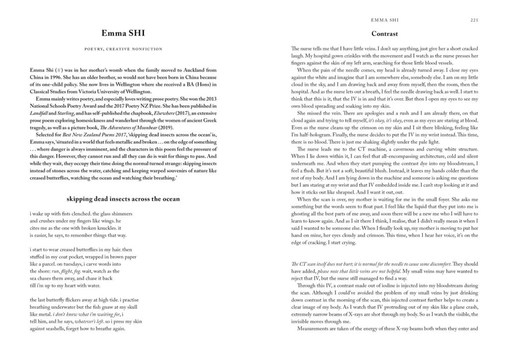
Internals: Signifier, A Caslon Pro, Adobe Fangsong Std R, Angsana New, Batang, Devanagari Sangam, Gujarati Sangam, Iskoola Pota, Latha, Malayalam Sangam, Mangal, PMing LiU, Shruti, Sylfaen.
A range of fonts were used to deal with the many non-English scripts throughout the text. In most cases the Chinese scripts were able to be standardised (FangSong) for consistency across both simplified and full-form characters, however exceptions were made so that specific characters and glyphs weren’t distorted in the process. Font sizes for many of the non-English scripts were made smaller than the English, which achieved a more cohesive visual result.
Judges’ comments There’s nothing shouty about A Clear Dawn. It’s a non-illustrated showcase for new Asian writers and a perfect example of designing for content. It stands on its cover and the type treatment of the pages. Designer Keely O’Shannessy’s cover is a triumph in subtlety both in its illustration and font (Signifier, Garamond Premier). The colour palette is muted, etched in textures of the sky and water that add detail to the graphic landscape, somewhat akin to Japanese wrapping paper. The effect is further enhanced by the cloth-wrapped board of the flexibind cover. The red endpapers provide the strongest colour in the book, adding a punch of vibrancy before the book unfolds.
Typesetter Tina Delceg had her job cut out for her through her choice of Signifier and A Caslon Pro for the internals and a range of non-English scripts throughout the text. That the book looks coherent and inviting to read is a testament to her skill.
A worthy book given the typographical treatment it deserves.

