Upstart Press Award for Best Non-Illustrated Book 2023
Finalist
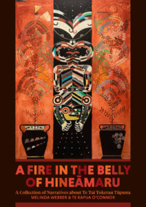
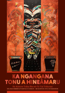
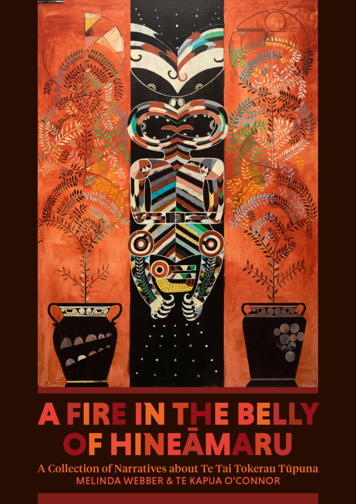
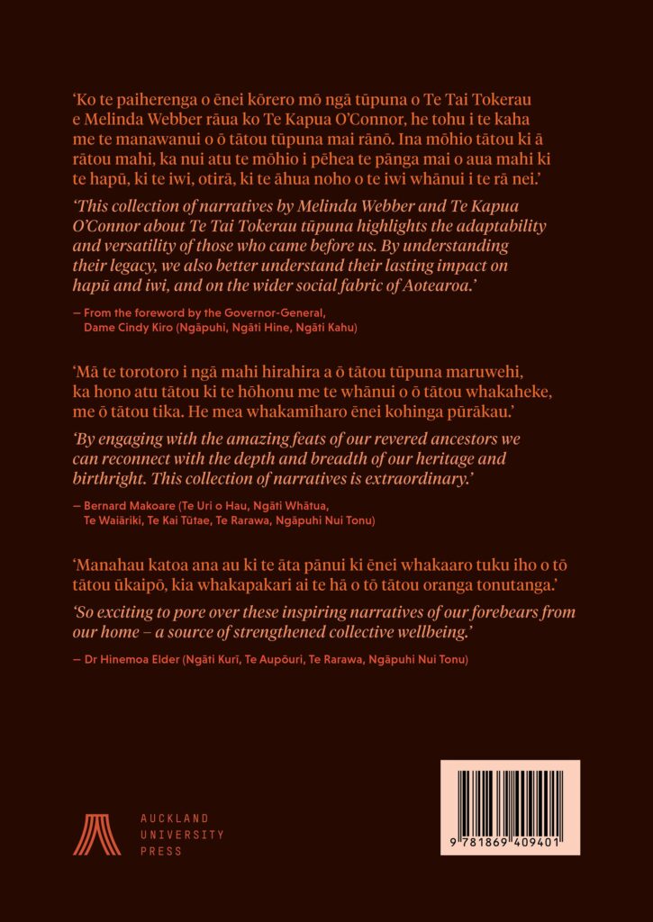
Designer: Duncan Munro, Lucky Stairs Studio, custom artwork created by Shane Cotton
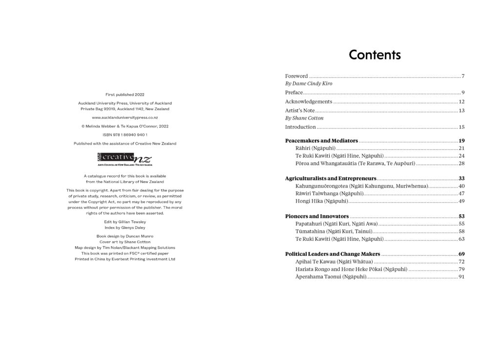
Title: A Fire in the Belly of Hineāmaru: A Collection of Narratives about Te Tai Tokerau Tūpuna & Ka Ngangana Tonu a Hineāmaru: He Kōrero Tuku Iho nō Te Tai Tokerau
Publisher: Auckland University Press
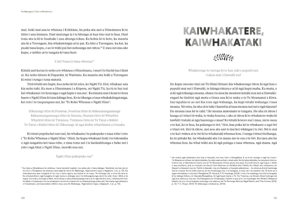
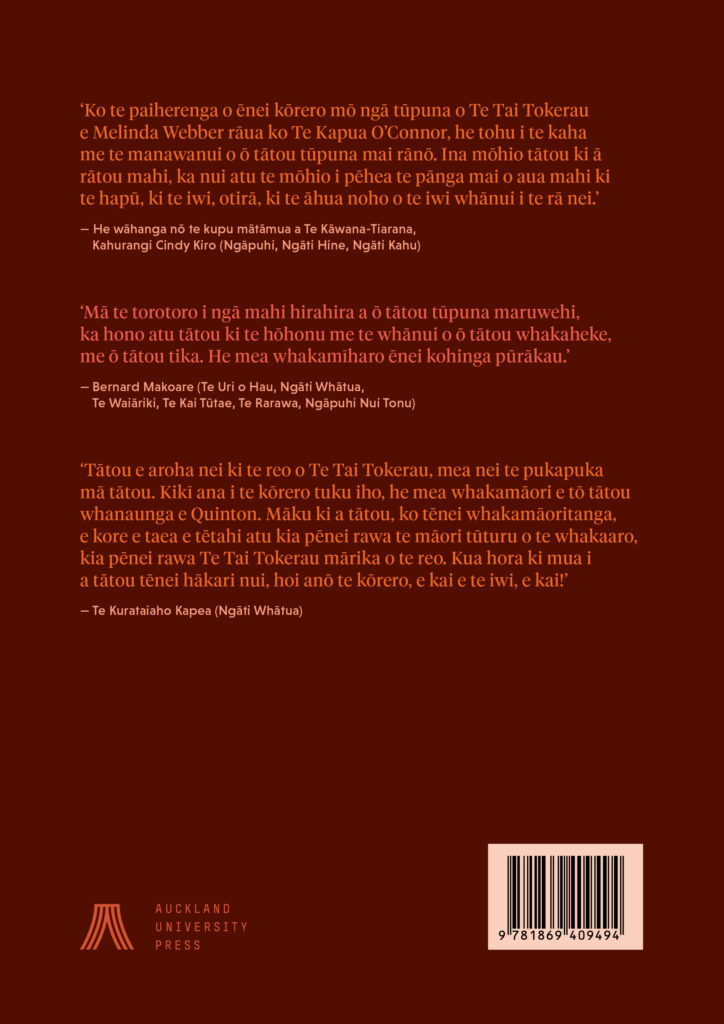
Format: 240 x 170mm, 192pp and 184pp. Jacketed Hardback. Both editions have matching design with variations in colour on the jacket and case. The ‘flame text’ on the jackets is blind debossed onto the cases – in ‘Graphite’ Buckram for the English edition and ‘Cherry’ Buckram for the reo Māori edition.
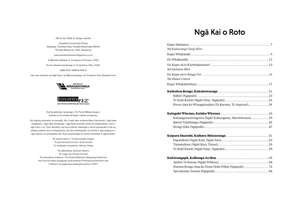
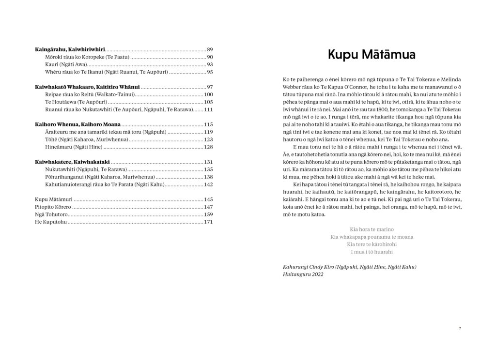
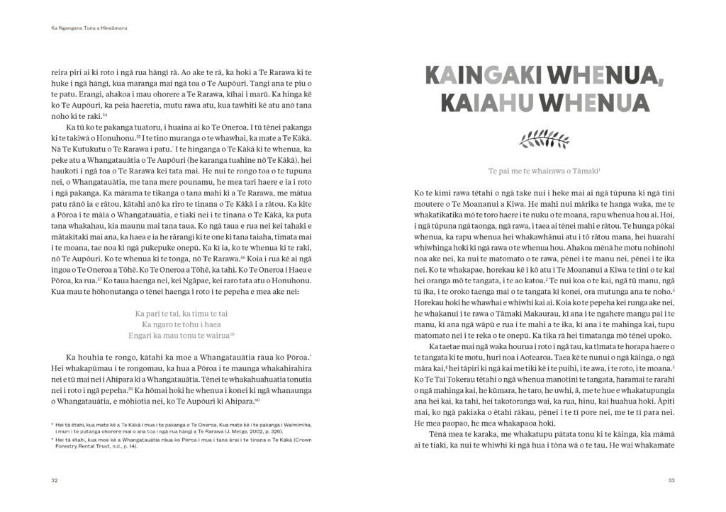
Typography: Title font: Niveau Grotesk. Footnote font: Founders Grotesk Text. Body text font: Tiempos Text.
“The cover was, of course, very driven by Shane Cotton’s artwork. The design challenge was to work around and respect that artwork rather than get in the way of it.
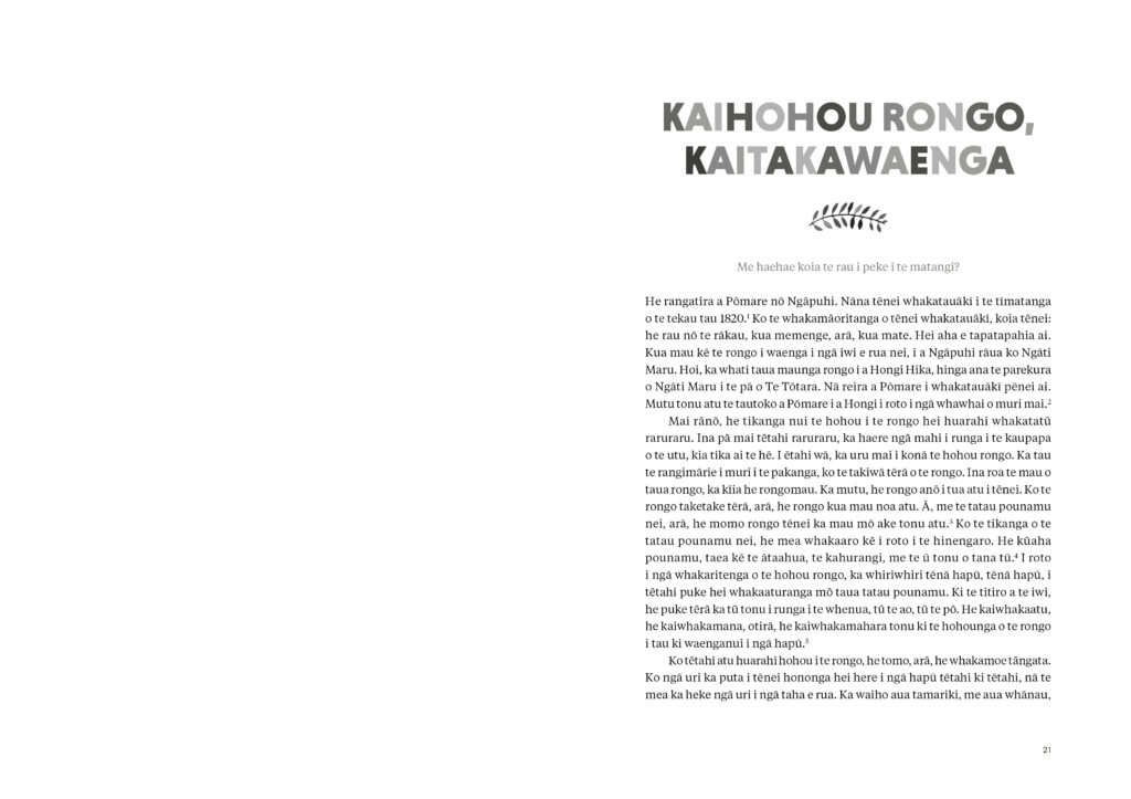
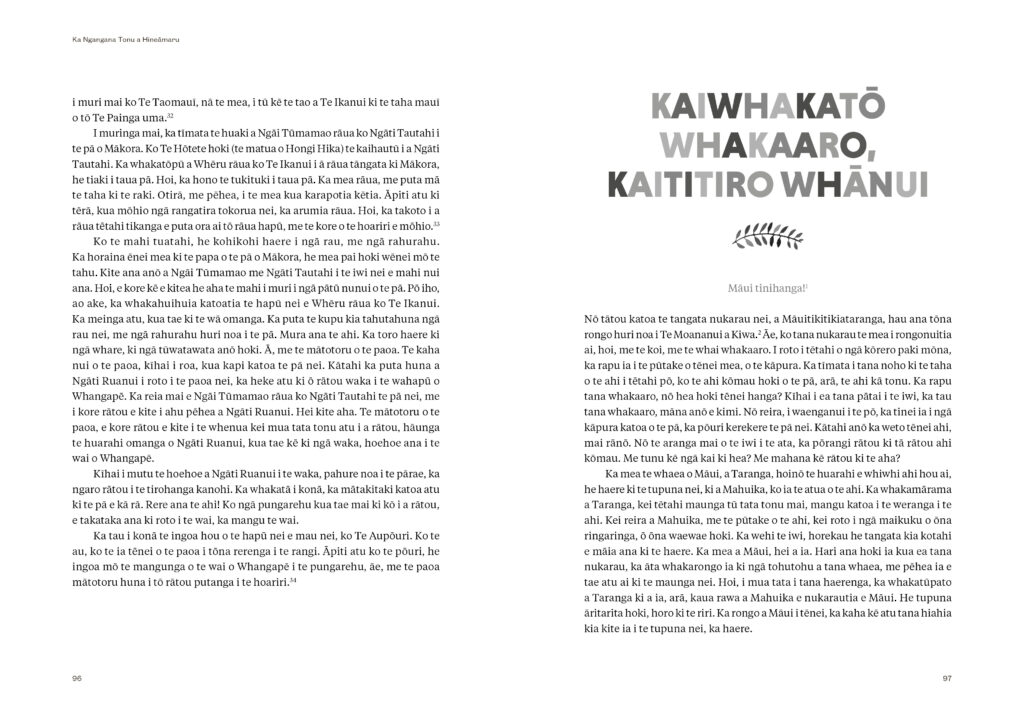
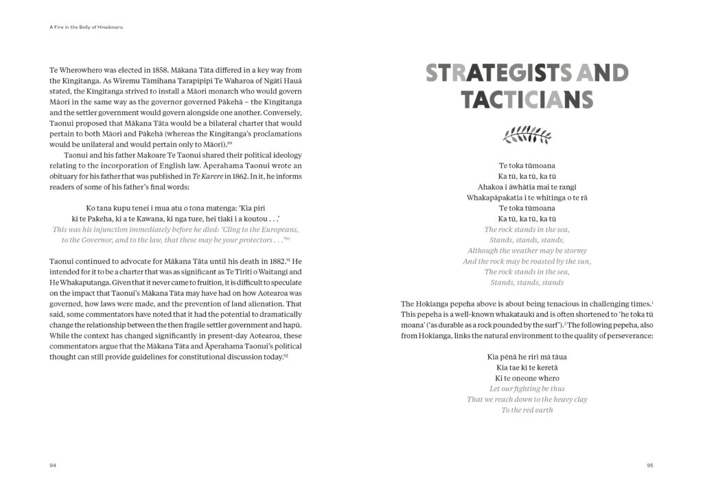
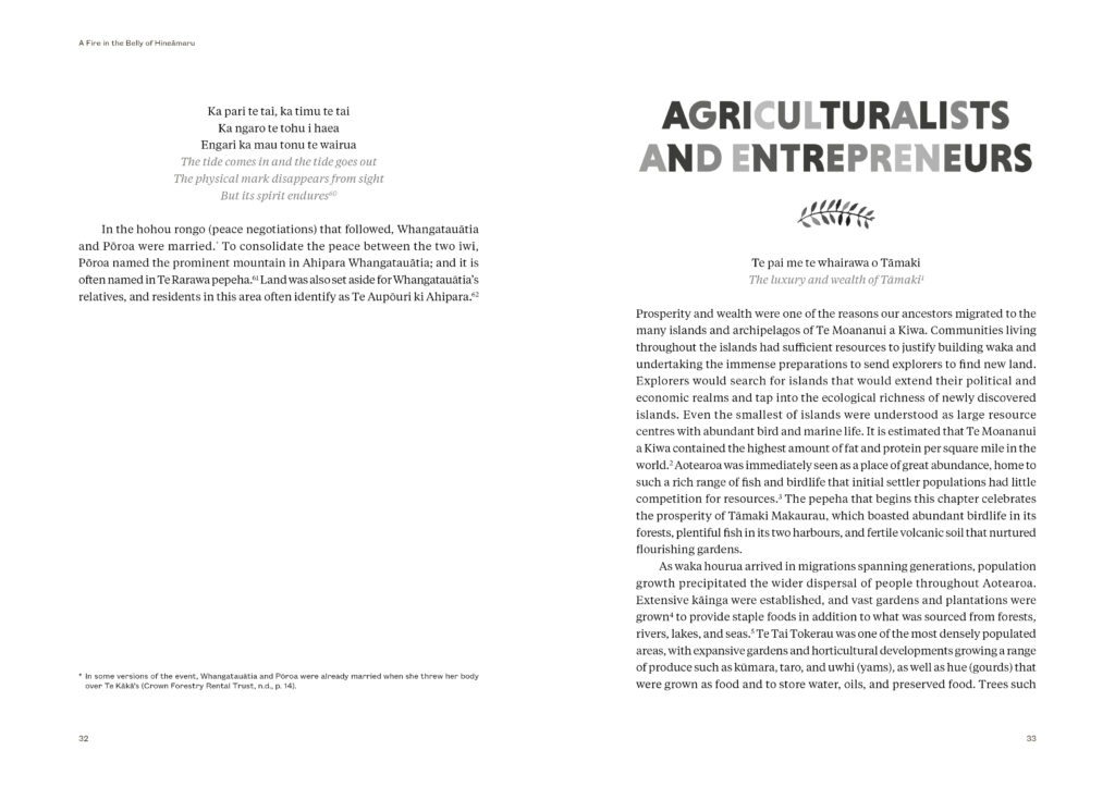
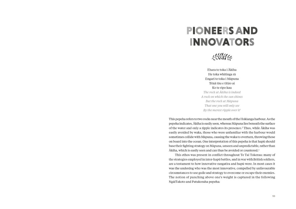
The colours of the type on the cover reference the ‘fire’ of the title, and this was carried through into the chapter headers also.
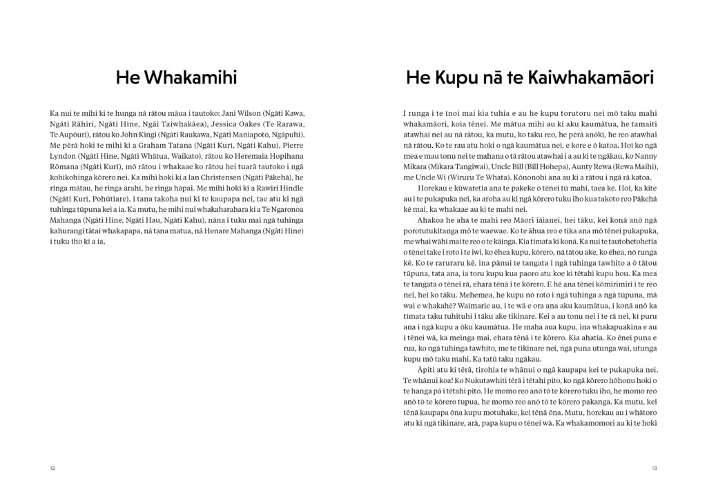
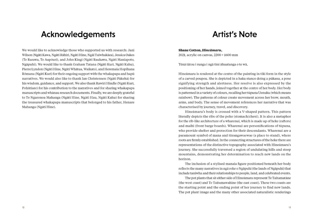
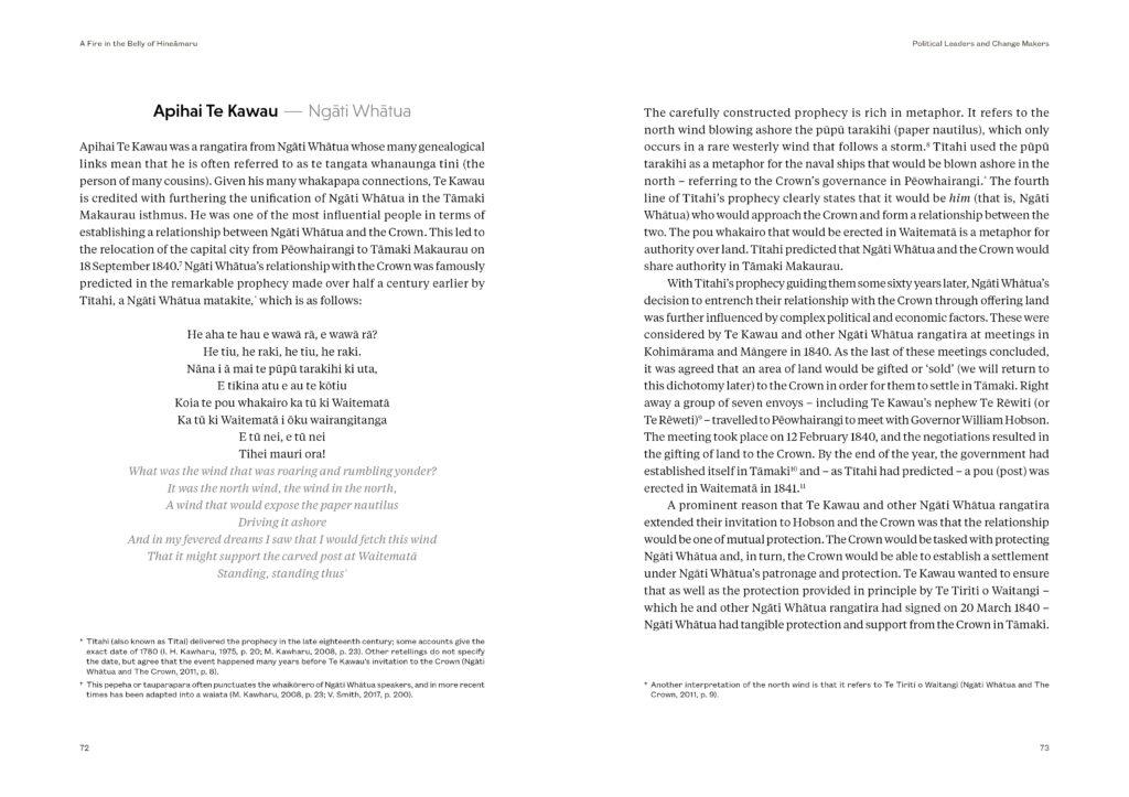
The overall typography and page layout was designed with the broad, and somewhat younger than usual, audience in mind. This played out through the fonts choices – a lively geometric alongside a modern interpretation on traditional book fonts for the body text, and also in the generous spacings and margins so as to avoid any sense of heaviness.
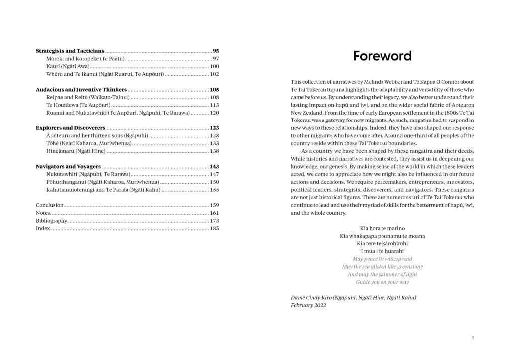
The text includes both footnotes and endnotes, and is, of course, across two volumes – one te reo Māori, and the other English. It included many pepeha and whakataukī and there were also (rather obviously) many Māori names and place names, so line and page breaks had to privilege the reading of te reo over Indesign’s idea of where these breaks might fall. This fairly dense cluster of technical requirements did mean that setting the books was at times quite challenging, though this sort of technical challenge is one I enjoy so I found it actually quite satisfying.”
Judges’ comments A beautiful pair of books – one in te reo, one in English. Shane Cotton’s visually arresting artwork Hineāmaru is complimented by the alternating coloured letters of the fiery title type. The internal typography continues this visual theme with subtle tonally adjusted titles. The text is set at an easily readable size, and with considerable attention given to the tracking of every line, giving very consistent colour to every page.

