1010 Printing Award for Best Cookbook 2019
Finalist
Designers: Floor van Lierop, This is Them
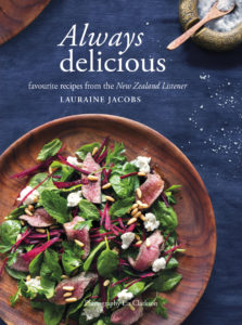
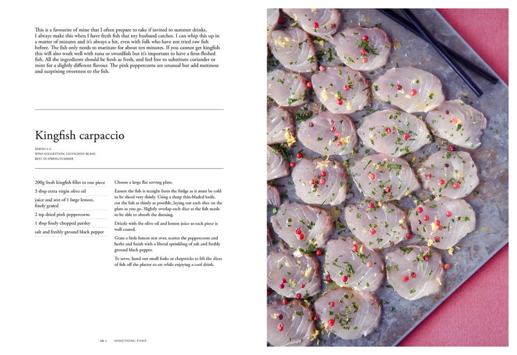
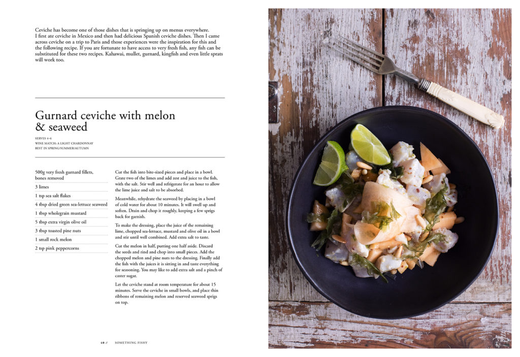
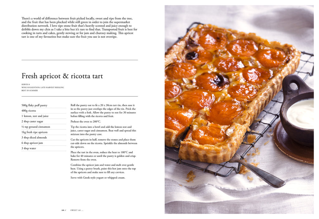
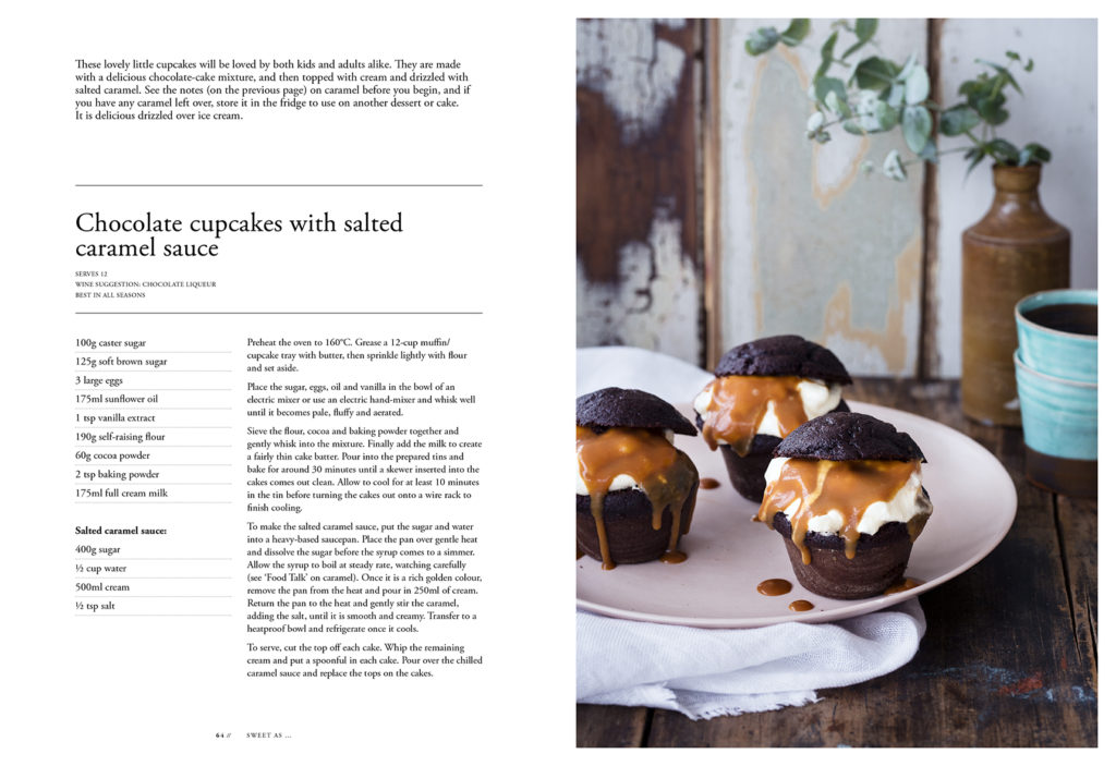
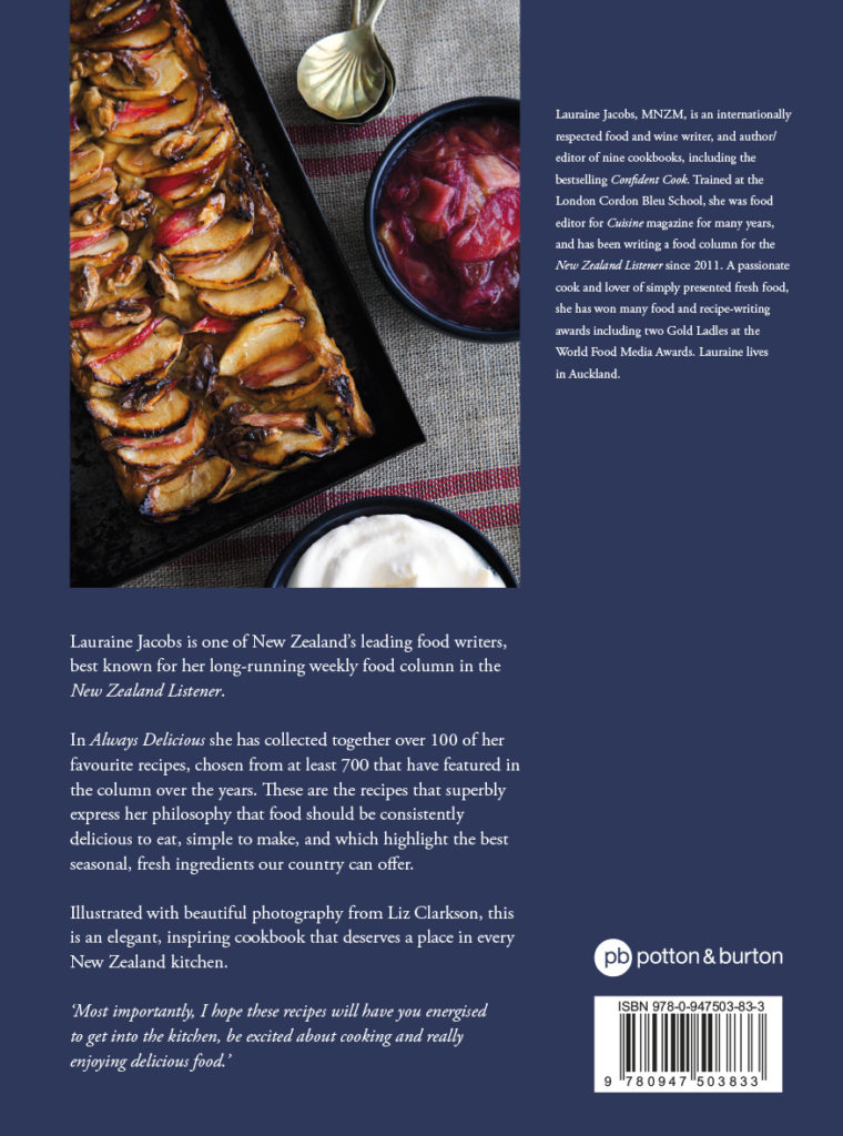
Title: Always Delicious: Favourite Recipes from the New Zealand Listener
Publisher: Potton & Burton
Format: 254 x 185mm, 236pp, PLC hardback
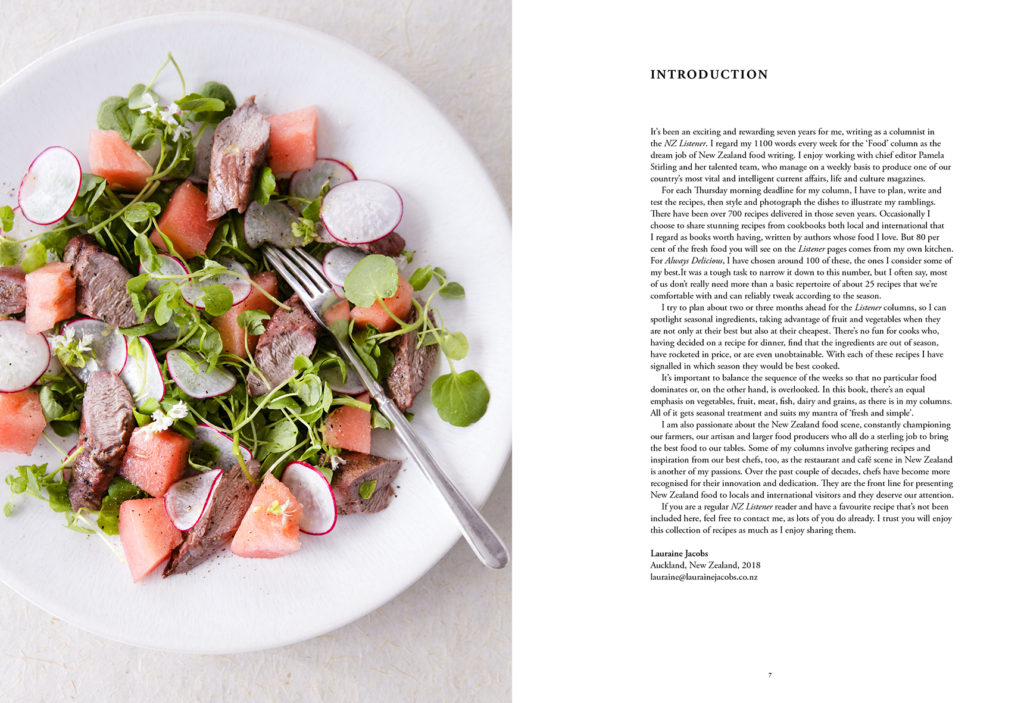
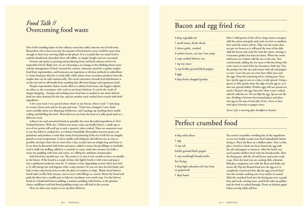
Typography: Bodytext: Adobe Garamond Pro regular, size 9.5pt, leading 12pt.
Headers: Adobe Garamond Pro bold, size 13pt, leading 15.6pt, uppercase.
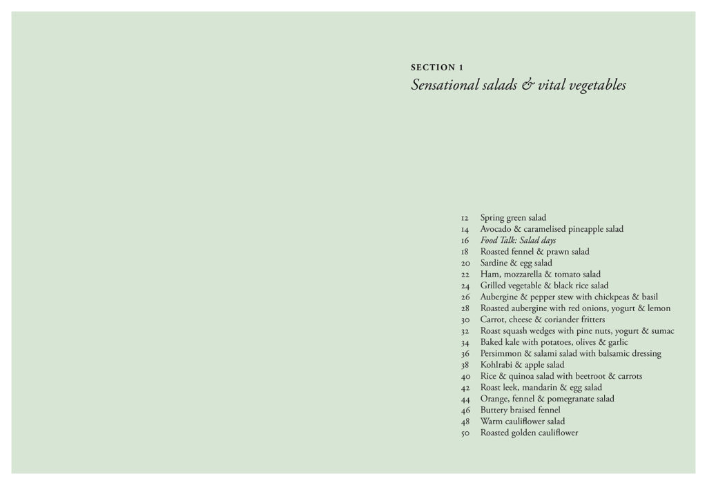
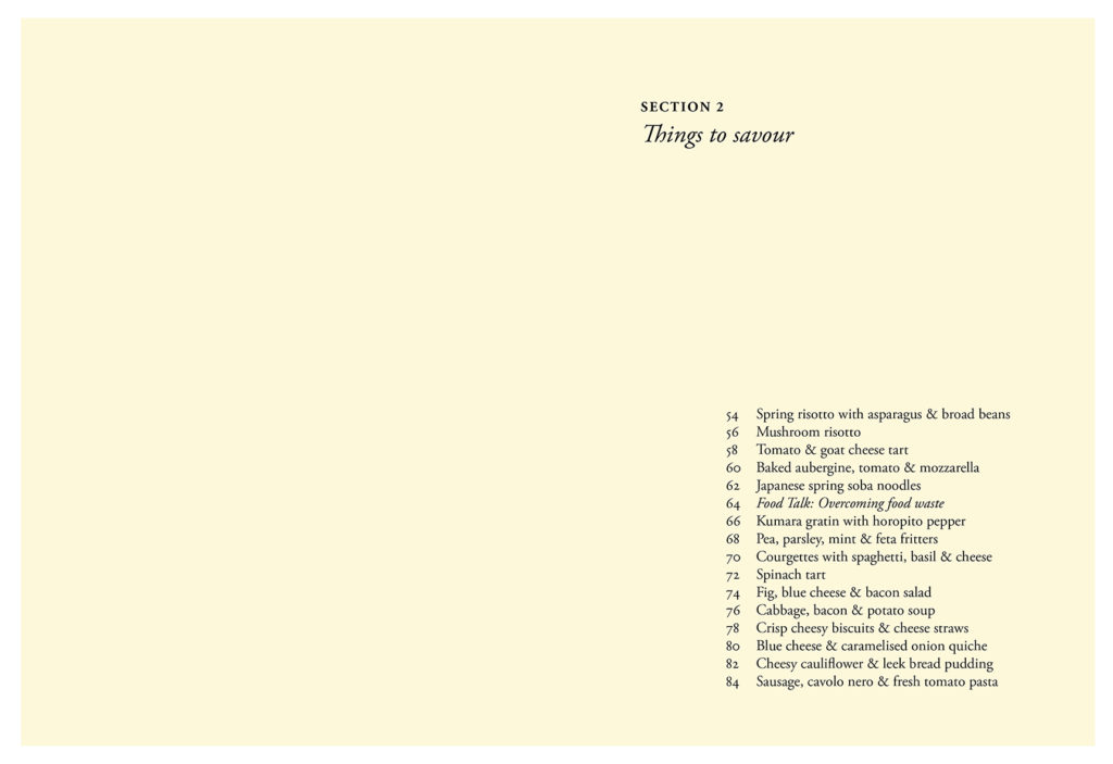
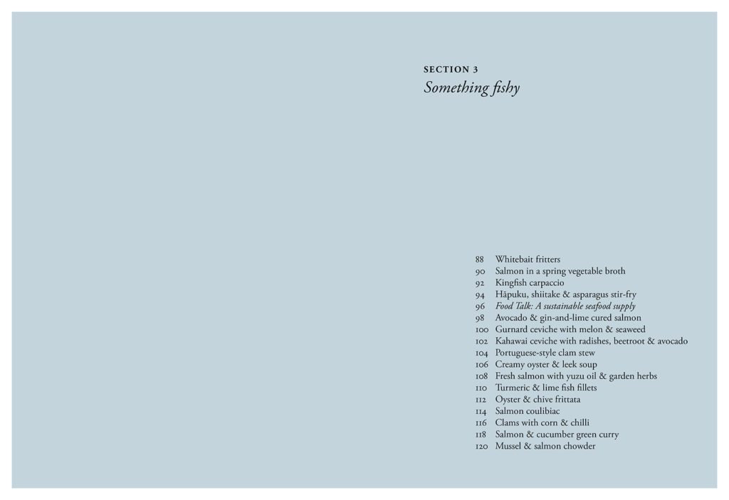
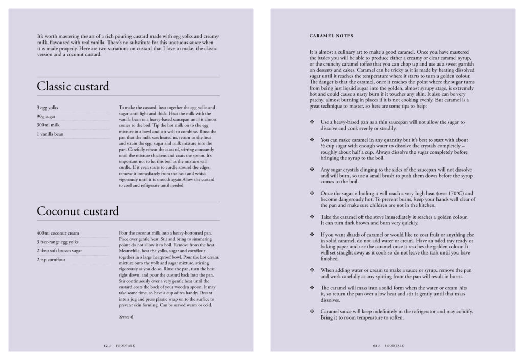
Section pages
Headers: Adobe Garamond Pro bold, size 13pt, leading 15.6pt, uppercase.
Titles: Adobe Garamond Pro italic, size 24pt, single line.
Contents: Adobe Garamond Pro regular, size 14pt, leading 16.8pt.
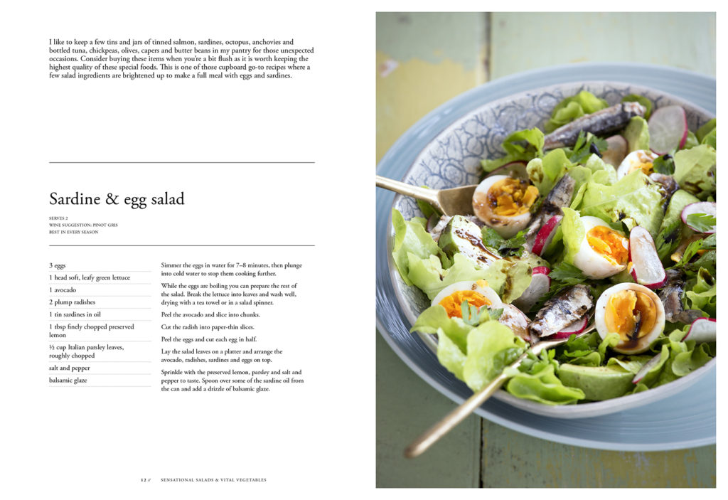
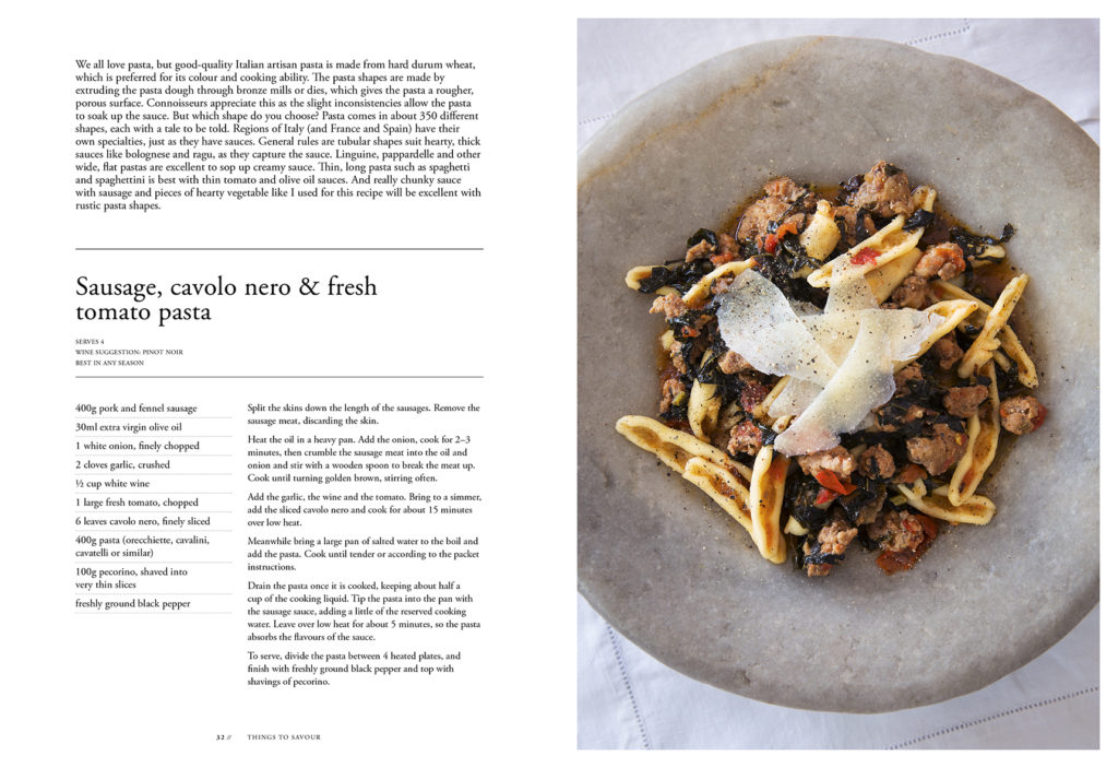
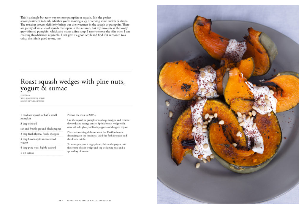
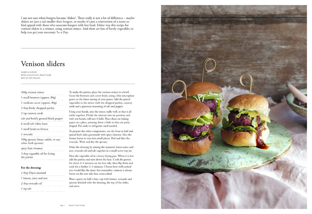
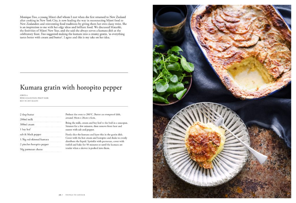
Recipe pages
Intro: Adobe Garamond Pro regular, size 11pt, leading 12pt.
Title: Adobe Garamond Pro regular, size 25pt, leading 23pt, sentence case.
Serves & suggestions text: Adobe Garamond Pro regular, size 6pt, leading 10pt, uppercase.
Ingredients: Adobe Garamond Pro regular, size 10pt, leading 12pt.
Bodytext: Adobe Garamond Pro regular, size 9.5pt, leading 12pt.
Footer: Adobe Garamond Pro regular, size 6pt, uppercase.
The entire book is set using just one classic typeface: Adobe Garamond Pro. It’s easy to forget that you don’t always need multiple font families to create an attractive and intuitive visual hierarchy – a lot can be achieved through the use of various font sizes, weights, and styles of one well-designed font family.

