2009 PANZ Book Design Awards
Nielsen Award for Best Book
Winner
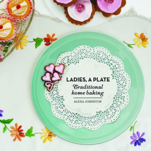 | Designer Alan Deare, Inhouse Design Title Ladies, A Plate: Traditional Home Baking by Alexa Johnston Publisher Penguin Group (NZ) Format 230mm x 230mm, 176pp, paperback Designer's Comments ‘This book inspires fond memories with a scrapbook-like collection of handwritten and printed cooking ephemera, faithfully collected by the author over the years. One part social commentary, one part cookbook, the layout is designed to have the logic and clarity of the most up-to-date publication, whilst balancing nostalgic elements.’ |
| Judges’ comments The cover is a superb evocation of the tradition of home baking, yet, like Johnston’s text, it turns the nostalgia crisp and contemporary. The typographic mixing of a thirties art deco typeface, and a fifties script with a timeless serif text face – all of which appear on the cover and are then carried on throughout the book – is far more novel and difficult than it looks. Similarly, the placement of the page numbers as part of the left-hand headings anchors the sloping and flourished script that could otherwise have been slightly messy. A grid is set up, but varied, whilst the large photographic chapter headings continue the approach of the cover. The colour and feel of the photographs is carefully maintained at a low key that enables the baking browns to dominate. Most crucially, the typographic treatment allows the recipes to be read easily and uses a format that works for readers regardless of whether they think in ounces or grams. Even the feel of the book is scrumptious. Baking is about texture, and when holding the book, the smooth, velvety cover – combined with pliable, bendy pages that are gently resistant to the touch – evokes a tactile hint of moist dough. | |
Awa Press Young Designer of the Year Award
Winner
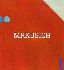 | Spencer Levine ‘Books become part of people’s lives in a way that not many other things I’ve designed can. They not only have to please the editors and authors, the covers have to stand out and sell in a very crowded marketplace. They have to be, to a degree, timeless. They differ from most of my other design projects in terms of shelf life. Designing something that can have that timeless quality, hit a specific market and please all involved is a challenge.’ |
Click here to see the shortlisted candidates
Category Winners
Click the images below to see the 2009 shortlisted candidates for each category.
From the Judges |
| Book Design Awards Judges Peter Gilderdale (Convening Judge) Graham Beattie Guy Somerset Young Designer of the Year Judges Nick Turzynski Sharon Grace |
| The job of a graphic designer is to translate an idea or text so that it communicates visually. When done well, the mix of images and letters looks so natural that people tend to take it for granted. The PANZ Book Design Awards recognises a group of designers whose backroom efforts often go unremarked, yet who – like lighting directors and art directors in film – wield the power to ruin an author’s most inspired efforts. Lines that are too long, paper that is too shiny, and lettering that is too large or too small can all derail a potentially good book. So, too, can poor choices of typeface and the wrong choice of image for the cover. Publishers, of course, understand just how much the design of a book contributes to its overall success – which is why the Publishers Association of New Zealand is a logical sponsor for awards that celebrate excellence in this essential area. Before judging commenced, I had optimistically expected that the cream of book design would be instantly recognisable. It was – but there was frequently nearly as much cream as milk. Over 160 books came in and I began by looking at the illustrated book category, with over seventy titles. After the first cut, there were still twenty-nine books in my ‘excellent’ pile. It was at this point that two things became clear. Firstly, that New Zealand is blessed with some quite brilliant book designers, and secondly that, with just three finalists per category, we would not be able to recognise many admirable productions. Fortunately, one does not have to judge alone. My fellow judges brought vast experience to the job. Quite apart from his writing and work with the New Zealand Listener, Guy Somerset had convened the judging panel last year, which gave a welcome sense of continuity. And in Graham Beattie we were blessed with one of the most seasoned and recognised figures in New Zealand’s literary world. Working with them both was a real pleasure. The judging process itself went smoothly. Our shortlists for the six categories were not, of course, identical. With very different backgrounds, each of us had books that we liked and the others were less enthusiastic about. We all agreed, however, that the standard this year was high and even, with many books in contention. Fortunately, there proved to be considerable overlap between our lists. The final decisionswere achieved amicably and represent books we all recognised as being outstanding. As is apparently normal for these awards, the illustrated book category was keenly contested, of a consistently high standard and it provided, in Ladies, a Plate, the winner of the Best Book award. The non-illustrated book, cover and typography sections, however, also contained many excellent books. The children’s book and educational book categories had fewer entries, and were more uneven, but still had gems amongst them. Overall, the selection of books that we judged represents a highly fruitful partnership between publishers and designers. These books were also well into production before the current recession hit. It is to be hoped that the 2010 judges are not faced with a dropping off in either numbers or quality, and that the publishing industry remains resolutely buoyant. What we saw this year is a confident and talented industry with huge potential, and one that is well served by its designers. Long may that continue. Peter Gilderdale |

