Hachette Aotearoa New Zealand
Award for Best Typography 2024
Finalist
Designer: Arch MacDonnell, Inhouse
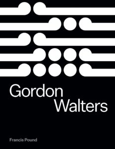
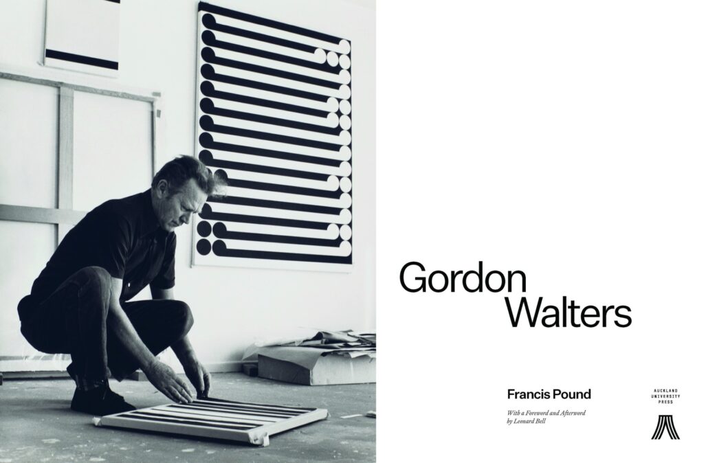
Title: Gordon Walters
Publisher: Auckland University Press
Format: 270 x 205mm, 464pp, jacketed hardback.
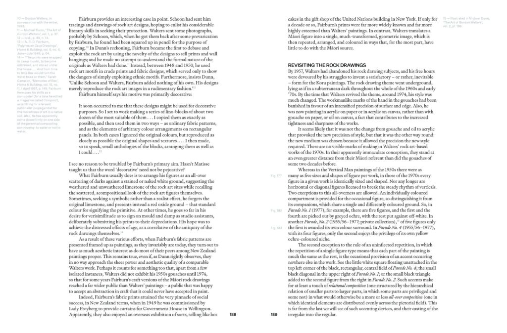
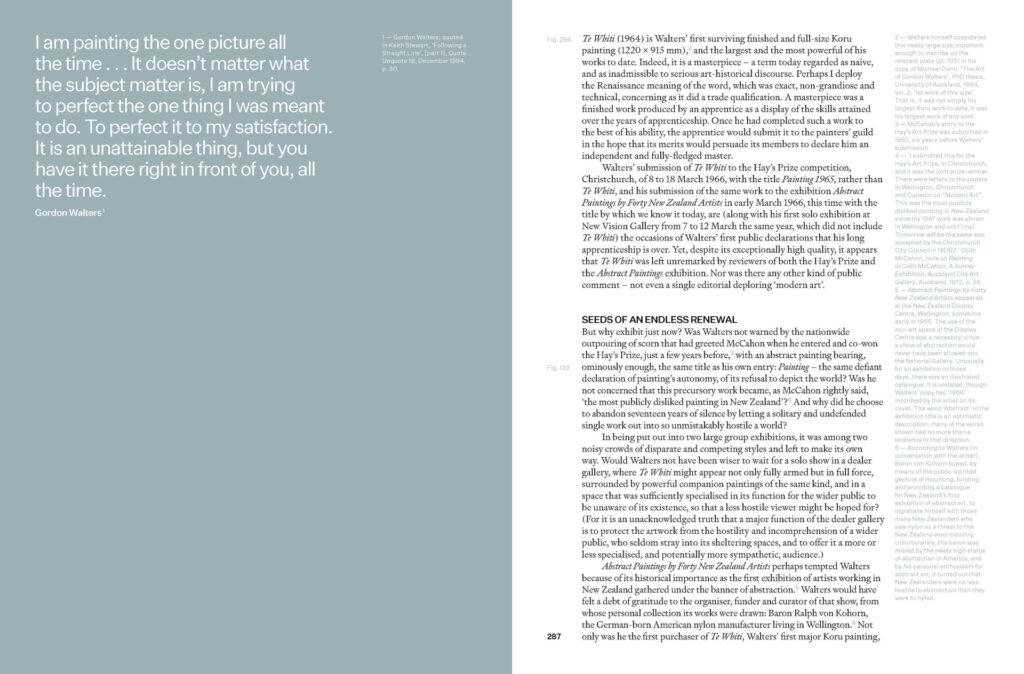
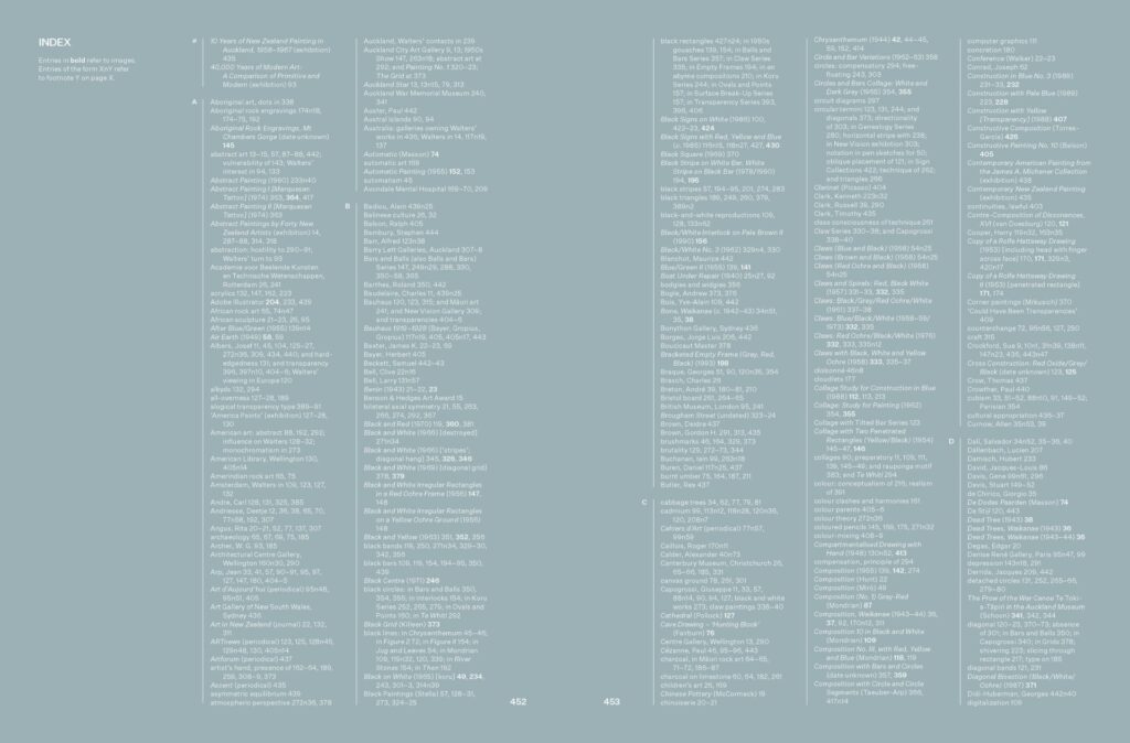
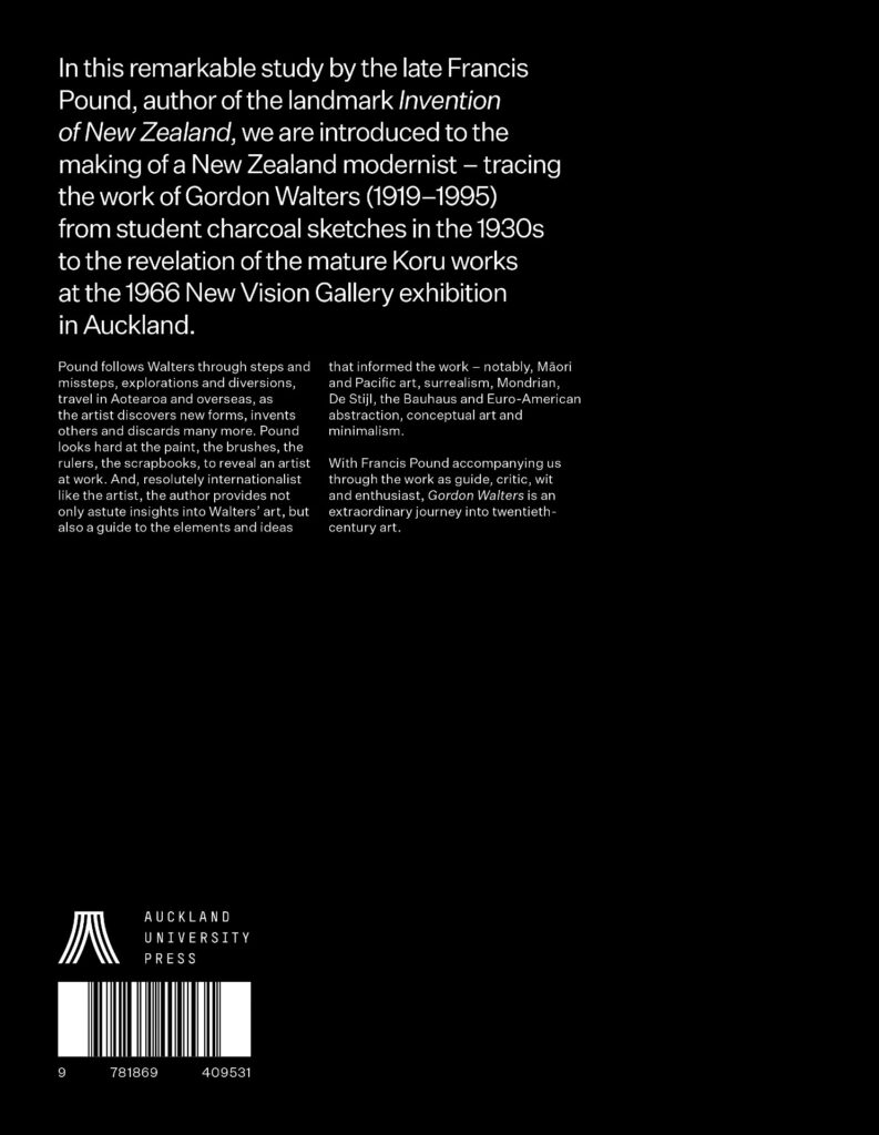
A French-folded jacket printed 2c (black + PMS Cool Grey) with a non-scuff matt lamination, and case printed 1c black on white Wibalin Buckram with varnishing and text blind debossed on the front and spine. Internals printed 5c throughout on the pale and creamy Chinese Vellum uncoated stock. The cool grey seen on the jacket lettering runs through to the endpapers and the internals – as a background wash and as the footnote and caption text colour, allowing the very small supporting text to pop on the page. The finished square-backed casing has a minimal overhang to the book block, soft buffy H&T bands and two ribbons in two different shades of grey.
Typography: Title/byline/cover copy/captions/footnotes: Untitled Sans
Body: Signifier Light
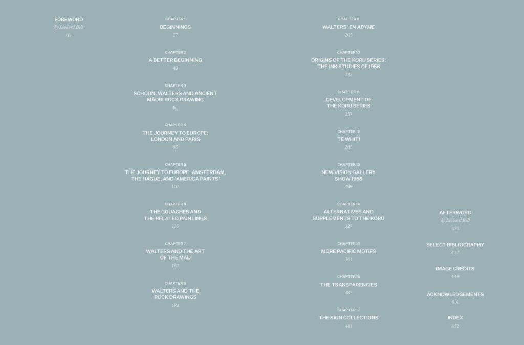
“The text is a great read, and generally we wanted this to look and feel like a book for reading as well as for looking at the artwork – friendly and approachable, warm but stylish. However it is long – with 140k word count plus 39k worth of notes and over 400 images. We needed to find a suitable size that would accommodate all the material without the extent blowing out, but wouldn’t feel too large and bulky. And we wanted a fluid layout with images running through the text and a reader-friendly solution for Francis’ very extensive footnotes without cluttering the page or pushing them to the back of the book.”
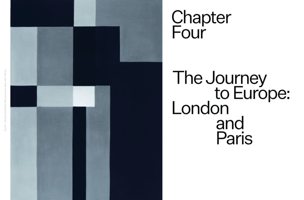
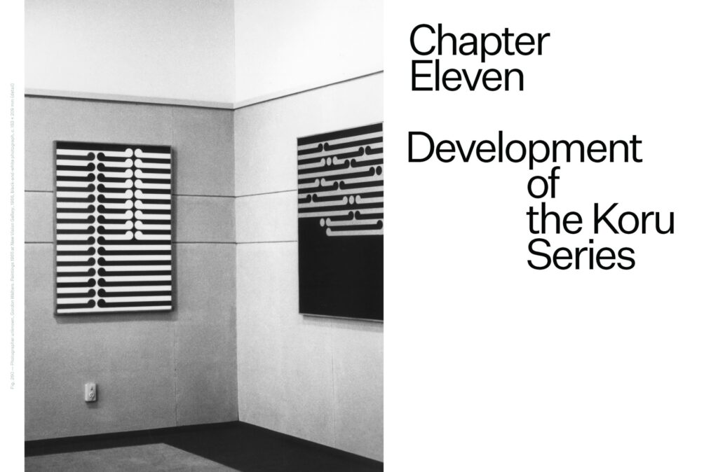
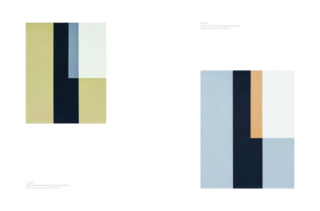
Judges’ comments From a logistical standpoint the task to set this matter is Herculean, the sheer weight of the main text and the dedication to the footnotes to match the gravitas of the main body is awe-inspiring. The inspiration of the movement in Gordon Walters artwork to inform the movement of the chapter openers is a beautiful touch, as is the spot colour on the notes and the excellent use of white space however this pales in comparison to the technical marvel that is the care, consideration and love applied to the body text, it never feels too clinical nor unapproachable. Simply a masterclass.

