Lift Education Award for Best Educational Book or Series – Secondary/Tertiary 2023
Finalist
Designer: Brittany Irvine
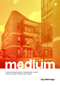
Title: Medium: A technical guide for creating better medium density housing in Aotearoa New Zealand
Publisher: EBOSS
Format: 297 x 210 mm, 240pp, PUR binding.
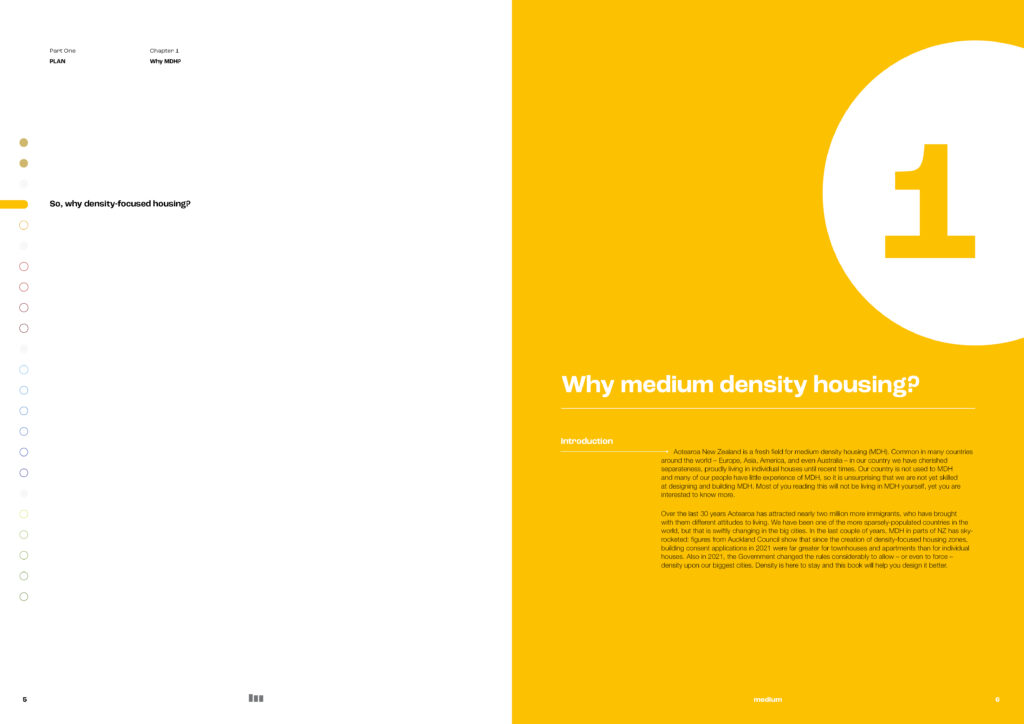
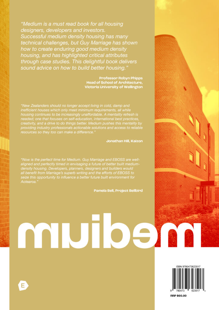
Typography: Title and subtitle: Roc Grotesk (Bold), Body text: Helvetica Neue (Light).
“Our brief required the integration of design theory and technical content to be
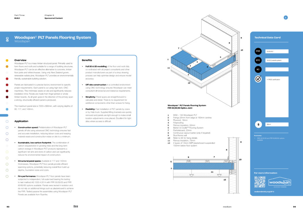
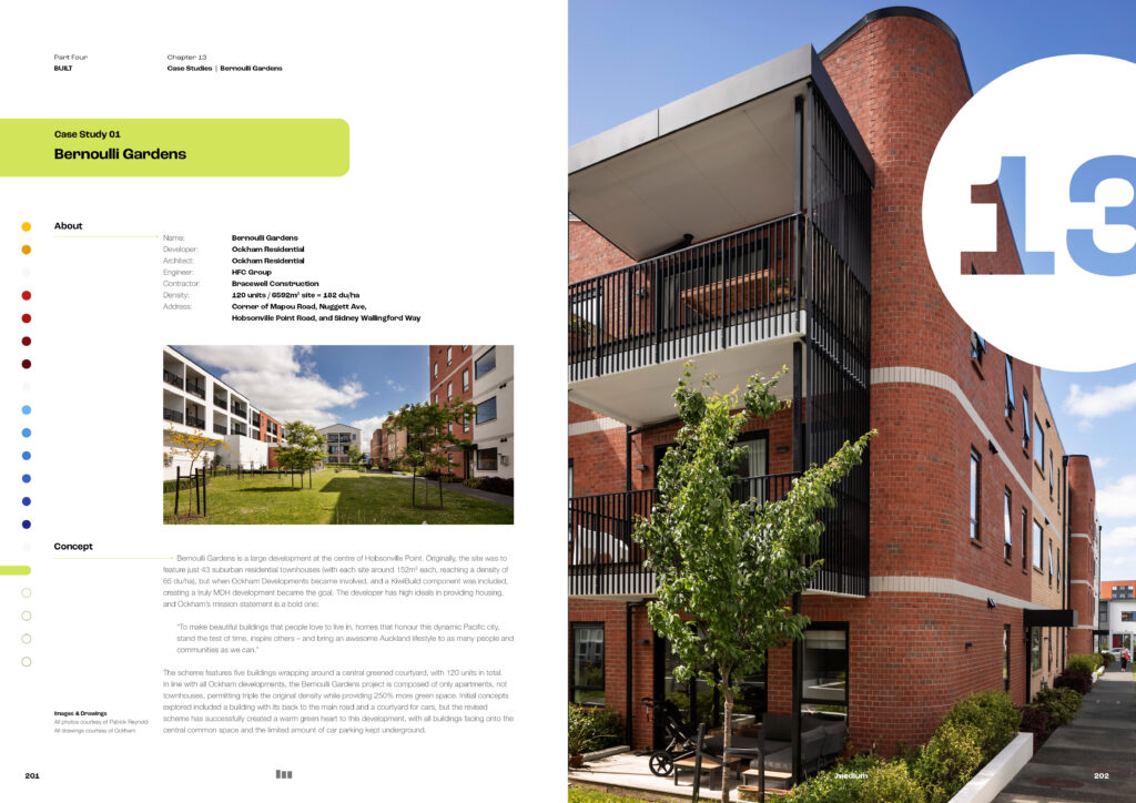
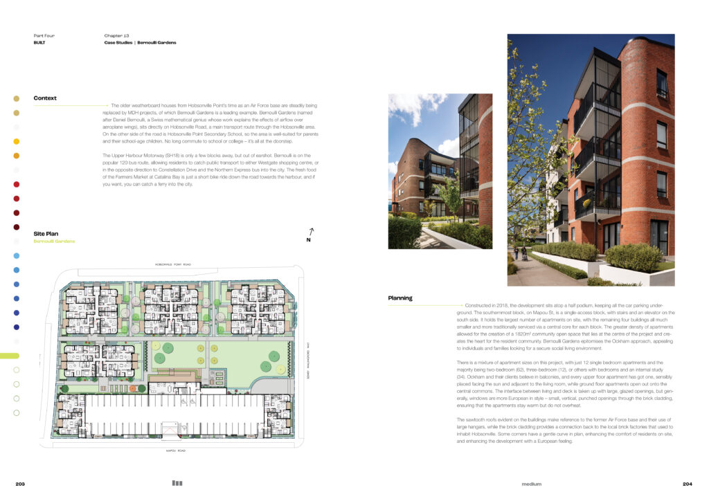
depicted in a clean and simple format with high-quality graphics that would appeal to a wide audience, including design students, practising designers, and builders. The design also had to work well on the web, especially for builders working on-site. The author provided 17 chapters alongside a highly technical series of drawings from 27 industry suppliers, which required visual consistency to make it easier for readers to understand and compare different solutions. The goal was to create a trusted resource for construction professionals and students to rely on.”
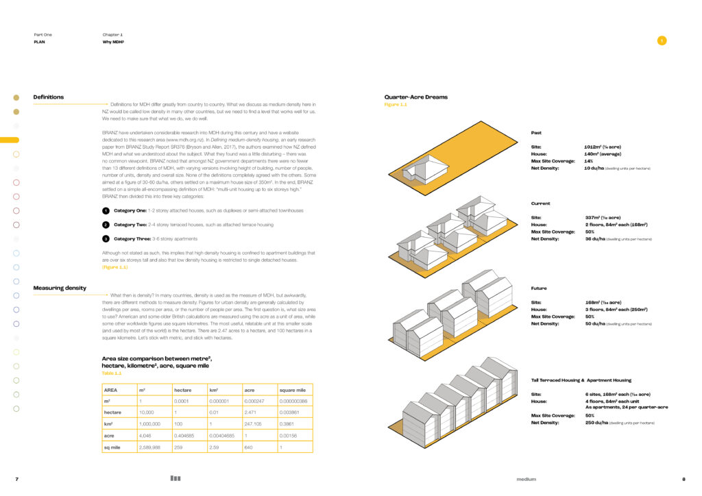
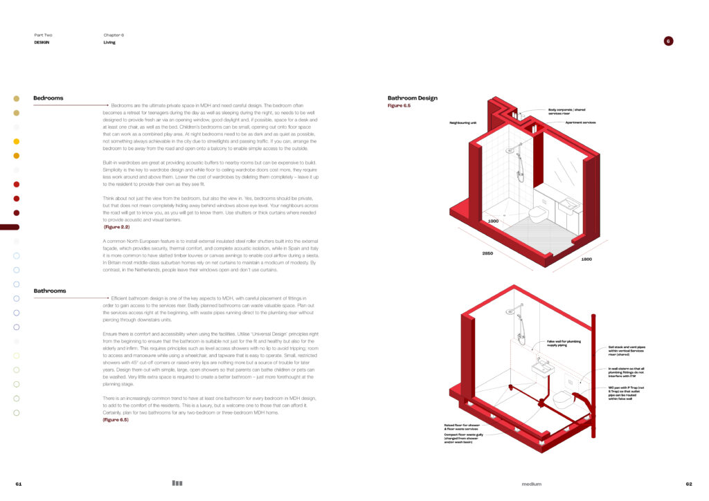
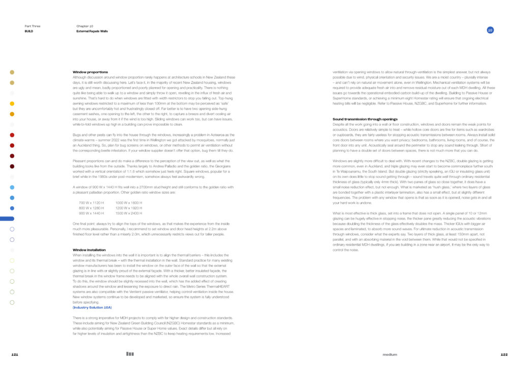
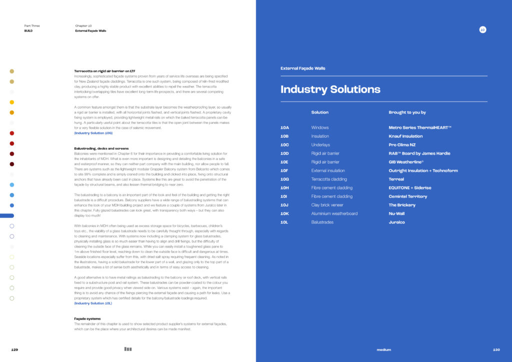
Judges’ comments The design solution here is highly sophisticated. The diversity of information from technical specifications to narratives about the uses and experience of the end product — medium density housing, asks a great deal of the designer. The result talks the right language — technical manual, isometric illustrations, charts, tables, side bars, QR code online jump off points, and subtle use of colour key to guide through sections. It could be easy to become distracted when faced by the content, but the design really achieves a methodical, step by step certainty and confidence in the presentation of content. There are layers of subtle production choices that elevate, the emboss of the title, the intelligent use of white space throughout that reveal themselves the more time is spent turning pages. Given the nature of the content this will reward the reader or user over many years.
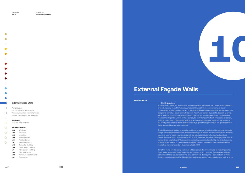
A large complex project with many disparate elements to unite in the design. The grid system is well conceived and ably meets the challenge. The complex typographic hierarchy is well addressed and provides a clear structure to information levels. Colours and icons have also been intelligently used to identify different subjects. The illustrations – isometric views, cross sections and details are given additional clarity with additional colours. Section pages use full-bleed colour and large typography to provide welcome visual breaks.

