HarperCollins Publishers Award for Best Cover 2024
Finalist
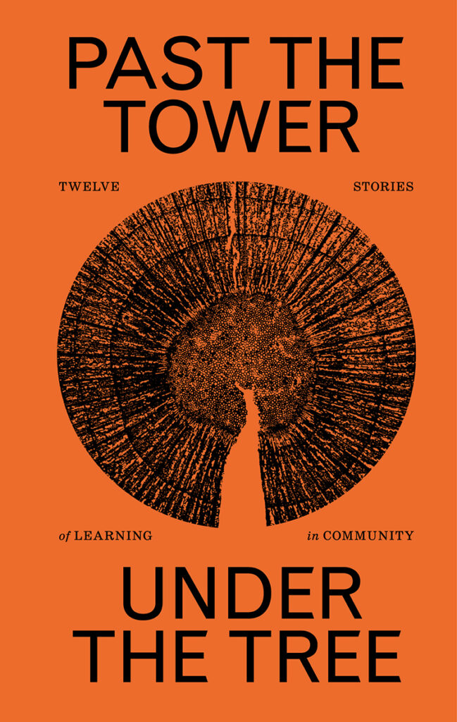
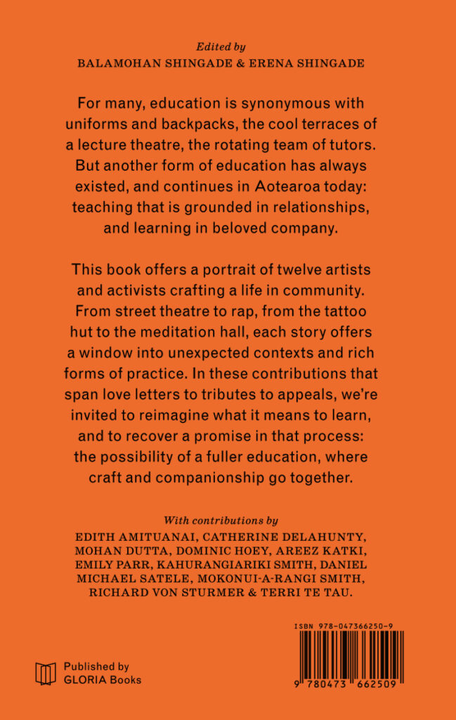
Title: Past the Tower, Under the Tree: Twelve Stories of Learning in Community
Publisher: GLORIA Books
Format: 180 x 114mm, 216pp, perfect bound. The cover has a soft touch varnish coating.
Typography: Schoolbook by ParaType and Grotesque by Monotype.
Century Schoolbook was originally designed by Morris Fuller Benton in 1919 to fulfil the need for a solid, legible typeface in school textbooks, so it seemed fitting to use a version of this typeface for a book on alternative education.
“Past the Tower, Under the Tree” is the sixth book produced by Katie Kerr for GLORIA Books. GLORIA is an intercontinental publishing platform for art and photography books run by Kerr (a book designer) and Alice Connew (a photographer based in Bristol, UK). GLORIA is a small press that acts a research facility to explore a multidisciplinary approach to publishing. The designer is deeply involved in every step of the process, producing objects that express a singular intention — from concept to design to print. The design for each publication is the result of a lengthy design research process. For Past the Tower, Under the Tree, this involved a field trip to Kōtare Trust in Wellsford, which houses an incredible archive of political posters dating back to the 1970s. Many of the aesthetic decisions were drawn from this archive, including the choice of colour and type. You can read more about the design process in the final chapter of the book, Lessons: A Note on the Design, written by Katie.”
Judges’ comments Its like orange concentrate, paired with its coating gives this a touch of something few paperbacks of this size conjure — quality, strength and the workings of something beyond being a book. The designer compliments the subject matter, captures the wisdom of lived-experience and growth, as well as acting as a symbol of community. The consideration of type, subtleness in the face of fluro orange and nods to field guides, this cover upends its archetypal boundaries, references history whilst charging confidently into the future.


