Upstart Press Award for Best Non-Illustrated Book 2024
Finalist
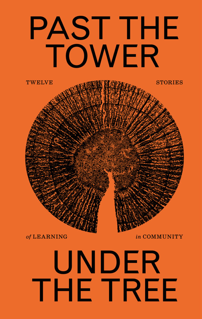
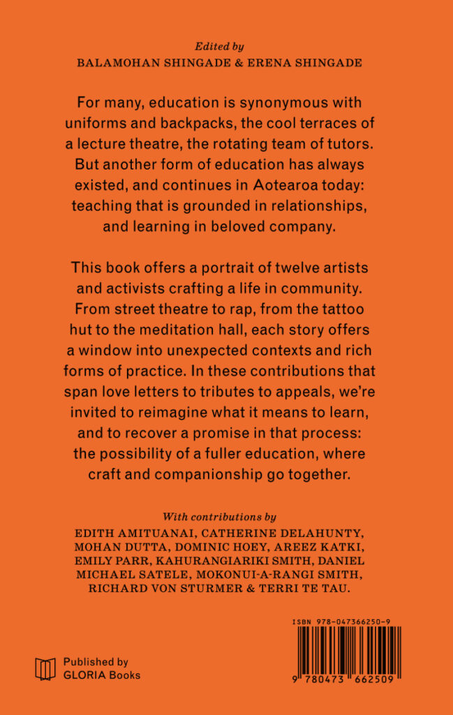
Title: Past the Tower, Under the Tree: Twelve Stories of Learning in Community
Publisher: GLORIA Books
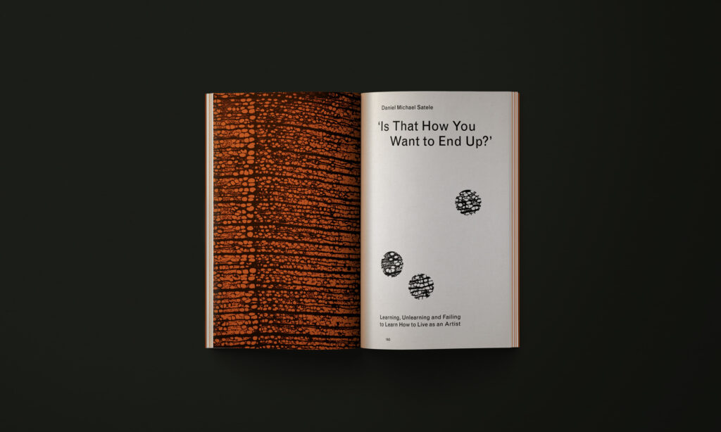
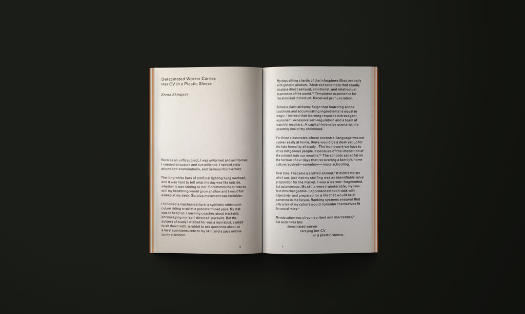
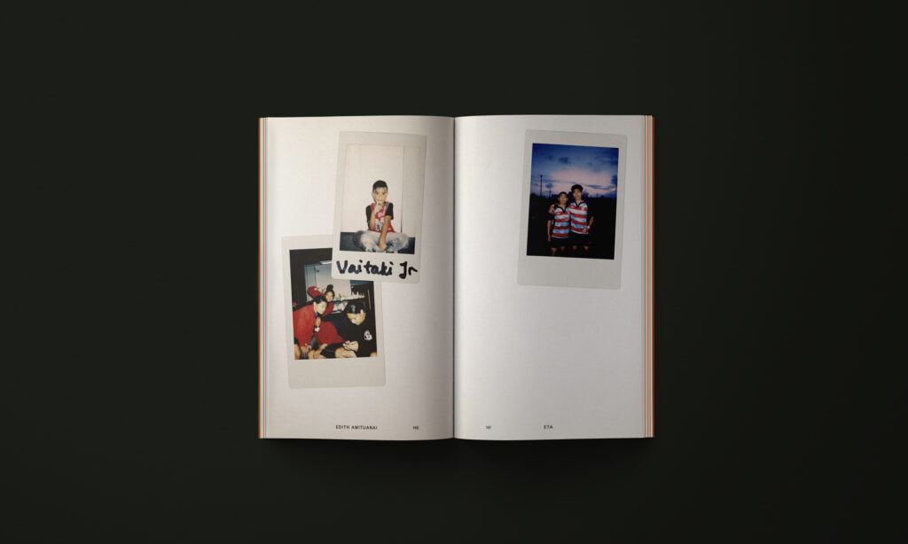
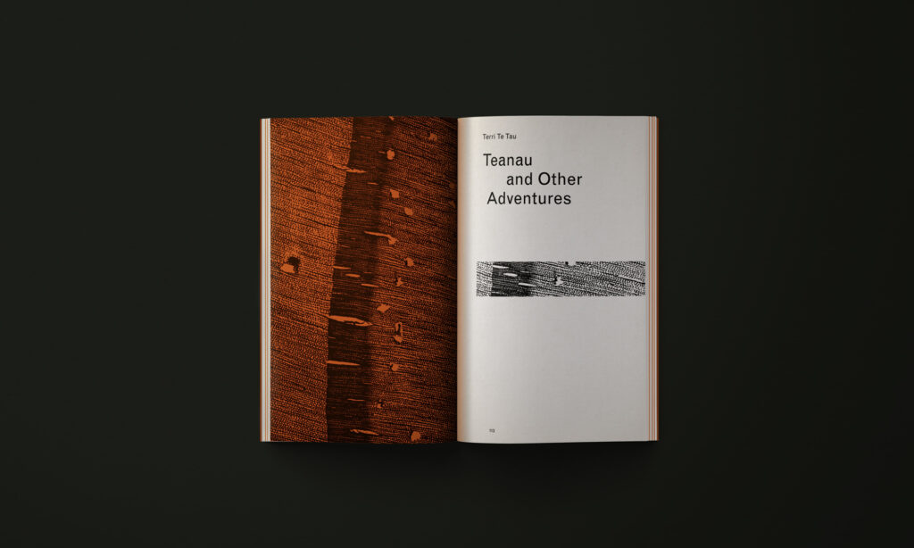
Format: 180 x 114mm, 216pp, perfect bound. GLORIA’s books are produced in Aotearoa by working closely with local printers and binders. The interior has two paper stocks: DCP Bulk for the text and Pop’Set Flame Orange for the chapter titles. The cover has a soft touch varnish coating.
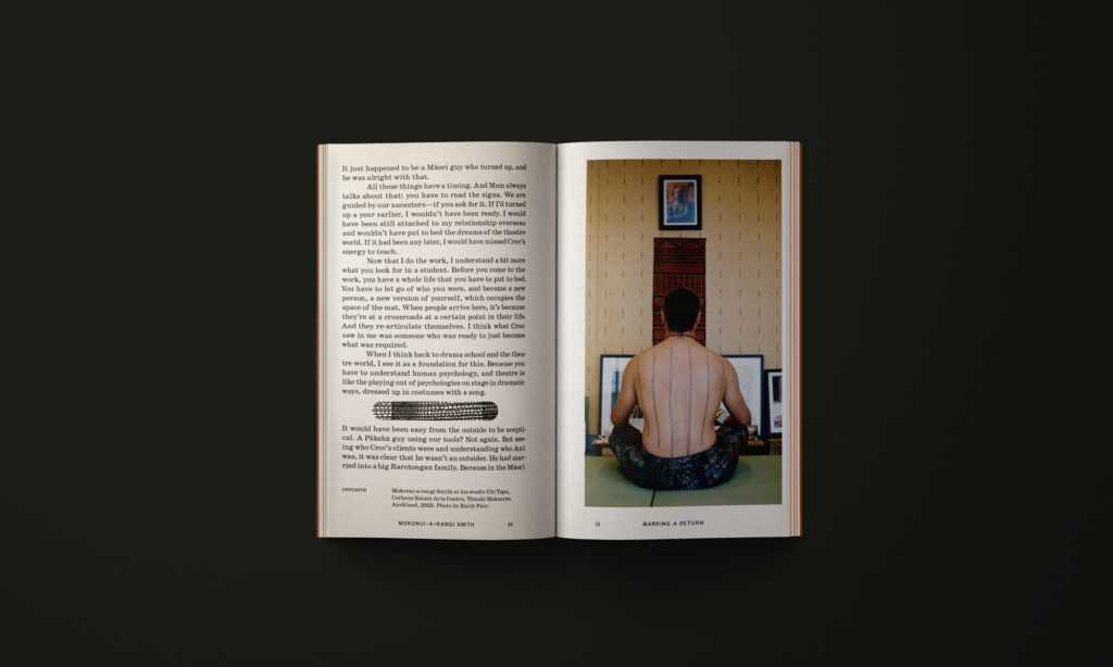
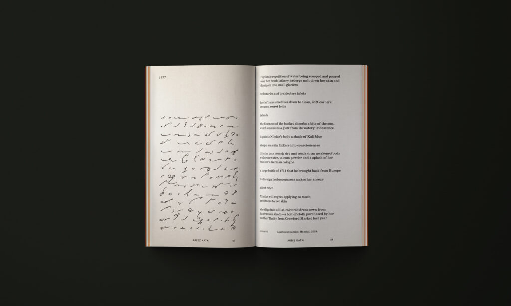
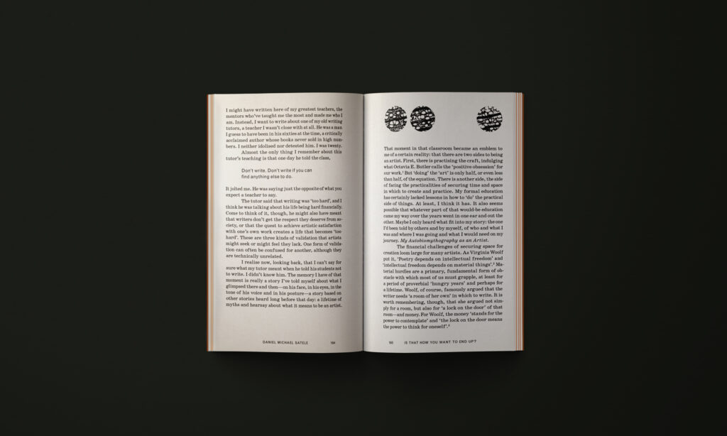
Typography: Schoolbook by ParaType and Grotesque by Monotype.
Century Schoolbook was originally designed by Morris Fuller Benton in 1919 to fulfil the need for a solid, legible typeface in school textbooks, so it seemed fitting to use a version of this typeface for a book on alternative education.
“Past the Tower, Under the Tree” is the sixth book produced by Katie Kerr for GLORIA Books. GLORIA is an intercontinental publishing platform for art and photography books run by Kerr (a book designer) and Alice Connew (a photographer based in Bristol, UK). GLORIA is a small press that acts a research facility to explore a multidisciplinary approach to publishing. The designer is deeply involved in every step of the process, producing objects that express a singular intention — from concept to design to print. The design for each publication is the result of a lengthy design research process. For Past the Tower, Under the Tree, this involved a field trip to Kōtare Trust in Wellsford, which houses an incredible archive of political posters dating back to the 1970s. Many of the aesthetic decisions were drawn from this archive, including the choice of colour and type. You can read more about the design process in the final chapter of the book, Lessons: A Note on the Design, written by Katie.”
Judges’ comments This book is a beautiful and cohesive package, exuding a sense of worthiness and erudition. And we love the orange pop on the cover! The book is meticulously designed and demonstrates a deep typographic craft. The justified text is executed seamlessly, showcasing a dedication to pushing the boundaries of one typeface family (FreightTextPro) without relying on unnecessary embellishments. The cream paper stock complements the refined use of typography and is further enhanced by thoughtful choice of plates that span the gutter.


