Previous Features
Book Look — with Sabrina Malcolm
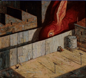 Our latest Book Look is from Sabrina Malcolm. Sabrina is an illustrator and graphic designer with a background in botany and geology. Her illustrations have appeared in scientific publications, issues of School Journal, and picture books.
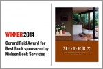
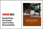
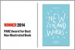
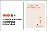
Our congratulations to all winners and finalists in the 2014 PANZ Book Design Awards!
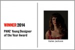
See the Book Design Award winners and the Young Designer of the Year.
Media Release: Winners 2014 Press Release
Media Release: Shortlist 2014 Press Release
The 2014 PANZ Book Design Awards are only a few hours away!
While you wait, here is shortlisted Young Designer Sam Bunny‘s brilliant video on his design process.
My Design Process: Sam Bunny from Sam Bunny on Vimeo.
One more day until the PANZ Book Design Awards!
Until then, have a look at this great video showing the design process of shortlisted Young Designer Kalee Jackson.
Kalee Jackson: Process from Kalee Jackson on Vimeo.
We asked this year’s shortlisted Young Designers to create videos about their book design process. Jenny Haslimeier sent us this clever animation.
The Creative Process from Jenny Haslimeier on Vimeo.
Book Look — with Jane Arthur
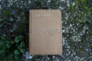 A lovely contribution to Book Look from Jane Arthur, Assistant Publisher at Gecko Press.
Book Look — with Donna Robertson
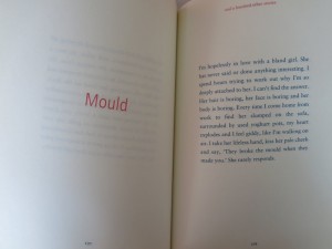 “I’ve seen millions of book covers. Most librarians have. That doesn’t make me immune to the power of an attractive cover …”
Our new Book Look is with Donna Robertson, editor of the Christchurch City Libraries’ web team.
Book Look — with Anna Brown
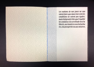 This week’s Book Look is with Anna Brown, a book designer and design educator. She is a senior lecturer at Massey University’s School of Design and director of Open Lab, its in-house design studio.
Introducing Book Look — with Kate Barraclough
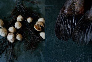 Book Look will be our new weekly feature where we invite designers and book industry figures to talk about a particular book that has caught their eye.
This week we asked Kate Barraclough, winner of last year’s Young Designer Award, to tell us about a book that has inspired her.
Previous Young Designer and 2013 Judge
23 July 2013
Megan van Staden was awarded the Awa Press Young Designer of the Year in 2012 for her sensitivity to subject matter and versatility. This year she was the convening judge for the award. We recently had a chat with her about design.
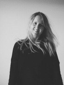 Whose work is inspiring you at the moment?
Australian designer, Allison Colpoys — I love her hand-drawn, personal approach to book design, Alan Deare — typography genius, John Boyne —his illustrations and stories, Colin McCahon — his style and colour palette. I also recently visited Melbourne’s Federation Square and have been inspired by the Aboriginal art; dotted type is in my future.
Do you have any advice for other young designers out there?
Work hard, practise, be brave!
What do you enjoy most about being a book designer?
I enjoy the challenge of constructing a visual identity that’s original and creative, as well as the technical and organisational aspect. There is something relaxing and methodical about laying out a book.
If you could design a book/cover for any author, who would it be?
I’d like to design for Jostein Gaardner. I love the magic realist touch to his books, and I think I could bring a childlike innocence to the design.
Do you have a particular design process?
After briefing, I mull over the book for a few days. Depending on how inspired I’m feeling, the ideas flow, and I’ll start drawing and collecting visual references. If I’m struggling to come up with options, I will focus on research and visiting bookstores/our extensive warehouse. The next step is organising and narrowing down the ideas. I’ll do page plans and mood boards with the different elements I am planning to use for each concept. Once I translate this into InDesign, the designs are tweaked, as I print things out and adjust for the best visual outcome. Then it goes to the commisioning editor and author and continues to develop.
 What has been your favourite book design project so far?
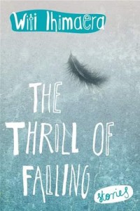
As much as I love typography and grid structures, I find the most creatively satisfying books for me are the ones which I’ve had a ‘hand’ in. I loved drawing and designing for Felix and the Red Rats, Thrill of Falling and First Crossings.
In your opinion, what is the most awesome book cover ever designed?
There are too many beautiful covers, it would just be impossible to choose.
Stefan Sagmeister heavily influenced me when I was studying, and I always admired his interactive approach to design. Both The Things I Have Learned in My Life So Far and Made You Look are great covers, maybe not from a marketing perspective, but definitely from a designer’s.
What makes a book a stand out book for you?
Something that’s original with a bit of a personality, flawless typography and beautiful photography.
Which category in the PANZ Book Design Awards appeals to you personally and why?
I love the non-illustrated section. There seems to be a bit more creative freedom and emotion in the covers — lots of beautiful illustrations and type.
What are some of your favourite tracks you listen to while working?
I like to listen to a wide range of music depending on my mood. Some favourites include Alpine, Fernando Milagros, James Blake, Sigor Ros. I have a few guilty pleasures which I shall refrain from mentioning . . .
See the 2013 winner of the PANZ Young Designer of the Year
Kate Barraclough – Shortlisted for Young Designer 2013
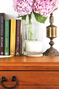
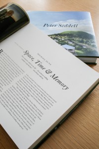
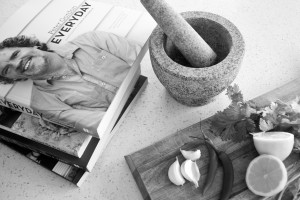
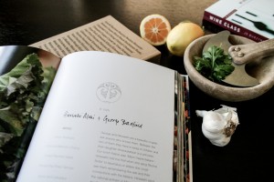
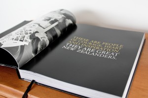
My day as a book designer starts with a coffee, and from that point onward no one day is the same. I’m generally working on anywhere from 5-10 books at once, and all will be at different stages of the design process.
At the start of a project I usually meet with the publisher to discuss the look and feel, the format and other more specific design requirements. Research is always important as each book requires a different approach. Whether I’m targeting the home baker, the expert cook, the outdoor lover or tractor/sailing/gardening enthusiast, it is important to understand what attracts that audience to buy the book. The design of a book is what engages the reader, it brings the images and words together in a way that helps them navigate and digest the content, making the reading of it a really enjoyable experience.
 |  |
|
I’ll style sample layouts, which once approved by the author, publisher and sales and marketing team, become the basis for layout. On receiving the edited manuscript and photographs, the book really takes shape. It will go through numerous rounds of corrections before the final layout is signed off and ready for print.
On the odd day when there is nothing in my inbox you can probably find me at the bookstore or library, checking out the new and innovative ways others are approaching book design.
 |  |
|
 |  |
|
Anna Egan-Reid – Shortlisted for Young Designer 2013
Here is another awesome design video from one of our shortlisted Young Designers:
Design Video from Anna Egan-Reid on Vimeo.
Carla Sy – Shortlisted for Young Designer 2013
Here is a great video from one of our shortlisted Young Designers:
My Video from Carla Sy on Vimeo.
The First Young Designer – Spencer Levine
16 July 2013
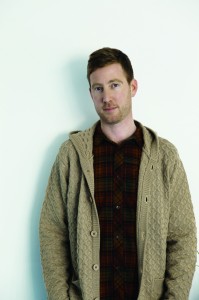
Spencer Levine was the first winner of the PANZ Young Designer of the Year Award in 2009. We visited him in his design studio to see how he’s going four years after winning the award.
 When you won the award how did you feel it affected your business?
I won the award about a year after I’d started the business and it was a really amazing award to win. It was fantastic. It was a good validation that I was doing the right thing and that I’d made the right choice starting my own business. It did affect my business because I think Gecko Press found out about me through the award. But any time you win anything it’s pretty exciting.
What’s your favourite cover that you’ve designed?
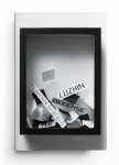
It’s usually the one I’ve just finished doing. So at the moment it’s the Ben Cauchi book I worked on with Victoria University Press [The Evening Hours], especially because it’s got a special hidden treat under the jacket. That’s probably my favourite at the moment.
What about from another designer?
I really like Paul Sahre’s work. He’s really awesome. He does great work.
What would be your biggest piece of advice for other young designers?
Obviously, it helps if you like books. If you like reading books and you enjoy books – that’s a big plus. I don’t really know how people break into the industry anymore. I think first you need to cut your teeth a little bit as a designer and figure out what it is that you like to do in the design realm. If you find yourself gravitating towards books, then make some phone calls and go to some book launches and make some contacts. It’s like any job, it’s mostly a networking thing, which in New Zealand isn’t too hard to do. If you love it, go out and get it.
How hard is it for designers to get their heads around book design if they haven’t done it before?
If you like books, then you’ve probably read a lot of books, and if you’re a designer you probably gravitate towards well-designed books. But you don’t necessarily have to know the industry in order to do the job. Usually the designer relies on the brief from the publisher. If you get a good brief, respond to it well and the feedback’s good, then anybody who has a design background should be able to design a book. If you really like it and you study a few books, you can probably pick it up.
 Which book did you enjoy designing the most?
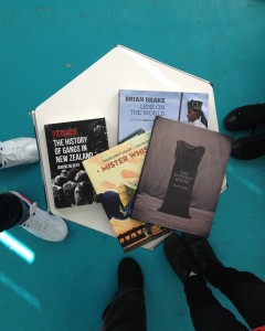
I usually go back to the Brian Brake book. It was great subject matter, the format was good, the editors I was working with were great, and, you know, it’s Brian Brake. I do like art books and I especially do like photography.
Has anyone approached you to do e-book design?
People have asked me about it, but I’ve yet to do one. I have a friend who recently got a Kindle and she’s loving it. When she recommended a book to me I went to Arty Bees and bought the book. It’s a really lovely edition, nice paper, hardback. The guts of the book are obviously the same but when I showed her the book she was like ‘Ooh I’d really love to own that book one day’. There’s possibly a little less excitement for a designer in creating an e-edition. At least when you’re designing a book you can specify paper and typefaces and size and there’s just more variables, so you can tailor it more.
Do you do most of your design on the computer? What’s your design process?
I am actually a computer first sort of designer. Most of the people I’ve worked with previously were adamant that I had to have a pen and pencil and a book at all times. I do still use it for jotting down ideas but I don’t sketch things out on a pad. It’s good for logo design and other types of design but I don’t think it’s so great for book design.
Apart from the tools of your trade, what is the most important thing in your studio that keeps you focused and inspired?
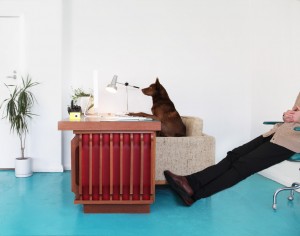
If I’m not allowed to say my computer, or anything on the computer – like the internet – some of the artwork I’ve got around the studio is kind of great. And usually, when Bruno [my dog] is here, he’s sort of a semi-inspiration. But that would be it for things in the studio. My inspiration really comes more from a personal desire to do well and be good at what I do.
Which category in the Book Design Awards appeals to you most?
I like Best Cover.
Do you think there should be a category for e-books?
Sure I guess so, yeah. What do you think?
Maybe it’s early days yet?
Some of the e-magazines have got it right. They’re sort of more exciting. But there is always the format issue for me – ’cause you’re stuck with a standard size, and it’s small. Imagine if every book was the same size? I guess Penguin had that thing for a while, right, when all their books were the same size and it definitely worked. But I can’t imagine reducing Brian Brake down to that size; it just wouldn’t work. Also, no spreads! Spreads are important in a book like that. It’s so important when you’ve got something on one page to see what’s facing it. One informs the other.
Living the Dream
A Conversation with Dreamboat Books’ Mark and Rowan Sommerset
28 June 2013
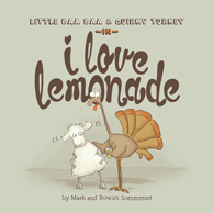
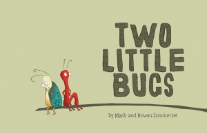
In 2012, Dreamboat’s Two Little Bugs won Best Book and Best Children’s Book at the Book Design Awards. They have been shortlisted again this year with their picture book, I Love Lemonade.
 |  |
|
Dreamboat is a boutique publishing house run by husband and wife team Mark and Rowan Sommerset. Based on Waiheke Island, the pair found the courage to start the company through their strong desire to create picture books together.
Two Little Bugs was a standout in last year’s awards, not least for its tactile elements, including little chew-holes through the pages. ‘[It] was a really fun book for Rowan to work on as a designer,’ Mark said. ‘By making the page the “physical leaf” and using die-cut holes, the two characters are able to communicate with each other from opposite sides of the page. The design plays an integral part in the story-telling and is a major contributor to the book’s overall appeal.’
Storytelling is at the centre of Mark and Rowan’s design philosophy. ‘With Two Little Bugs I was excited by the idea that the design of the book and its production could be an integral part of the actual illustration/storytelling,’ says Rowan.
By insisting on quality production, selecting high bulk wood-free paper stocks, and using techniques like aqueous seals, matt lamination and UV overgloss – each book is unique; the story determines the design.
Sticking to the essentials to serve the story is a clear theme in Rowan’s design process. ‘Generally I start by roughing up the entire book so I can see the storytelling as a whole. This is where I spend most of my time, developing and refining ideas and removing unessential elements.’
During this initial phase she also likes to plan the print production and embellishments rather than waiting until the end of the design process. ‘I guess you could say I have a holistic approach and spend a lot of time visualising and getting the ideas right before producing the finished work,’ she says.
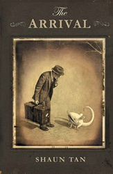
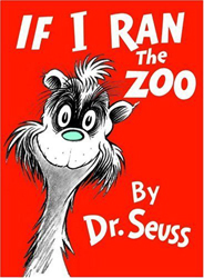
We asked Rowan which children’s book illustrator was her hero. ‘Well gosh lots really, all for different reasons. A few are Oliver Jeffers, Shaun Tan, Katsumi Komagata, Maurice Sendak, Shel Silverstein, Dr Seuss…’
 |  |
|
Since winning the Best Book and Best Children’s Categories in 2012 things have been going well for Dreamboat Books. The company’s New Zealand business is continuing to flourish, and Mark says there had been some exciting developments overseas. ‘Two Little Bugs, I Love Lemonade and Baa Baa Smart Sheep are now published by HarperCollins in Australia and in the next few months the same three titles will be published in Germany,’ he said. Dreamboat Books has also signed a deal for French language editions and of Baa Baa Smart Sheep and I Love Lemonade for release in early 2014.
Fortunately, this family-run business has its own built in test audience, the pair’s son, Linden. But no one Dreamboat book stands out as Linden’s favourite. ‘He loves a couple of books at bedtime each night. One week Two Little Bugs dominates, the next couple of weeks it’s someone else’s titles, then it’s Cork on the Ocean and so on,’ Mark says. ‘Much like him, I don’t have a clear favourite – I like them all for different reasons.’
Mark said that each Dreamboat book has been fun to write for different reasons. ‘Publishing Baa Baa Smart Sheep, and its sequel, I Love Lemonade, has been great fun. I love that adults often laugh as hard as the kids do and that both books give readers a lot to think about (beyond the gratuitous use of sheep’s droppings and goat pee!)’
When asked if the team would ever consider producing a book in an interactive digital format the answer was a resounding yes. ‘We love the idea of animated versions of our books that add to the reader experience and give the reader the opportunity to extend the story-telling process,’ Mark says. ‘A dream of ours is to get the Baa Baa books voiced by Bret and Jemaine from the Flight of the Conchords. I reckon Baa Baa and Quirky were made for them!’
Currently, Rowan is illustrating Dreamboat’s next book, The Boy and the Cherry Tree. ‘It is about a boy who dreams of crossing a river to reach a beautiful tree, but each time he tries he is talked out of it. I wrote the first draft twelve years ago, but it is only now, after many revisions and changes, that we feel it is ready for publication.’ We look forward to seeing The Boy and the Cherry Tree in print and, hopefully, on an interactive platform.
Here is their adorable video:
An interview with Idealog’s Aimee Carruthers
19 June 2013
Idealog is a new sponsor of the PANZ Book Design Awards. With the magazine’s strong focus on design, we asked Idealog’s Art Director, Aimee Carruthers, to answer a few questions.
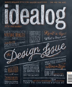 | 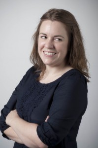 | ||
| Idealog Issue 41 | Aimee Carruthers | ||
What is a major difference between magazine design and book design?
It’s easier to talk about the similarities. Both must inform, entertain, delight and surprise the reader. The typography and layout needs to draw the reader in and stimulate their interest in the article.
What is your favourite Idealog cover? Did you notice increased sales for that edition?
Probably our chalkboard cover for the Design Issue (41) [pictured above]. It’s great to make something offscreen and the extra effort paid off with a lot of press in various design blogs, including coverjunkie.com.
Thinking of a publication (book or magazine) as a product, what percentage of the appeal to the customer comes from design?
There is definitely a small percentage of people who buy books just because they look good! (guilty as charged). But aside from those few, I think the design has a massive effect on how valuable they think the product is. Dynamic layouts, strong hierarchies and attention to detail elevate the content within.
Which category in the PANZ Book Design Awards appeals to you personally and why?
It’s a toss-up between my two loves, typography and illustration. I think great typography and a great cover go hand in hand in creating product appeal.
How is design relevant to electronic publications? How do the design considerations differ from a physical publication?
Electronic publications have the same aims – inform, entertain, delight and surprise the reader, but with different restrictions (size, formats) and the added element of interactivity. Story telling isn’t necessarily linear anymore.
What is your favourite book? How did the design influence your decision to read the book in the first place?
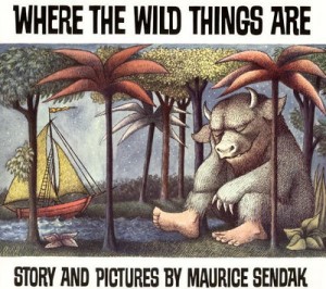
Where the Wild Things Are. There’s more illustration than words, but the book made me pause and think a lot. Why is Max so angry? Why do the monsters think he’s their king? It’s a book I’ve looked over again and again, taking away something different each time.
Only 1 day to wait!
13 June 2013
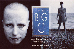
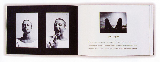
This week we are taking a look at some of our previous winners in anticipation of the Shortlist announcement tomorrow. On the final day of the countdown we are taking you all the way back to 1997. Sixteen years ago, The Big C: My Experience with Cancer won best book. The judges said that this book exemplified collaboration between author/photographer and designer.
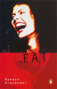
Best cover in 1997 was won by Fat for its “exceptional energy and style.”
Only 2 days to wait!
12 June 2013
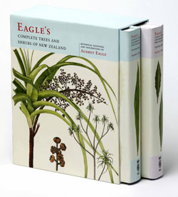
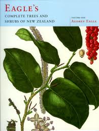
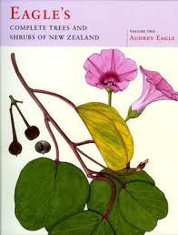
This week we are counting down to the Shortlist announcement on Friday, by taking a look back at some of the previous winners. Six years ago, this book Eagle’s Complete Trees and Shrubs of New Zealand won best book, best cover and best illustrated. Judge Denis Welch said that this book “will outlast all of its makers as the definitive reference work of its kind … a monumental achievement of scholarship, art and design.”
Only 3 days to wait!
11 June 2013
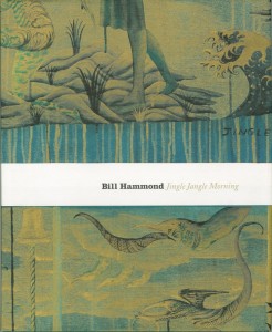
This week we are counting down to the Shortlist announcement on Friday, by taking a look back at some of the previous winners. Five years ago, this book Bill Hammond: Jingle Jangle Morning, swept three awards, winning best book, best cover and best illustrated. Judge Guy Somerset said that this book “hovered above the other books like one of Hammond’s birds.”
Only 4 days to wait!
10 June 2013
This week we are counting down to the Shortlist announcement on Friday, by taking a look back at some of the previous winners. To start off the countdown take a look at the 2003 winners of the best book and best cover categories.
Ten years ago Kay Buisman said that what makes a best cover winner is: “excitement, ‘buy me’ factor, colour, humour, originality.”

