Lift Education Award for Best Educational Book or Series – Secondary/Tertiary 2024
Finalist
Designer: Camilla Lau
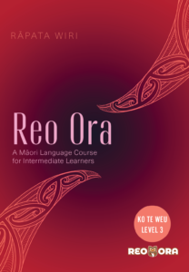
Title: Reo Ora – Ko Te Weu Level Three: A Māori Language Course for Intermediate Learners
Publisher: Huia Publishers
Format: 228 x 150 mm, 164pp. Section sewn, drawn on cover. Soft Cover Stock: 300gsm artboard coated one side, anti-scuff laminate 1 side only wit hspot UV finish on front and spine. Text printed on 120gsm Rice White Woodfree.
Cover:
- Cover Masthead: TT Knickerbockers Grotesque, 122pt size with 20pt tracking in pastel pink
- Author: Neue Haas Unica W1 Thin, 24pt size with 190pt tracking in peach orange
- Subheading: Neue Haas Unica W1 Light, 24 pt size with 22.8pt leading and 25pt tracking in pastel pink
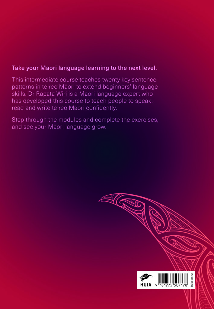
- Back cover: Neue Haas Unica W1 light, 14pt size set at 16.8 leading and 25pt tracking in pastel pink
Interior:
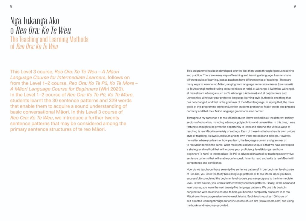
- Headings: TT Knickerbockers Grotesk Regular, 24pt size
- Body: Neue Haas Unica W1G Regular and bold
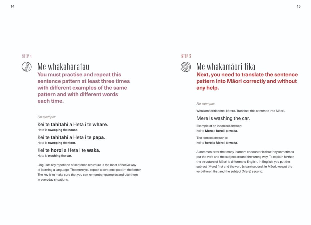
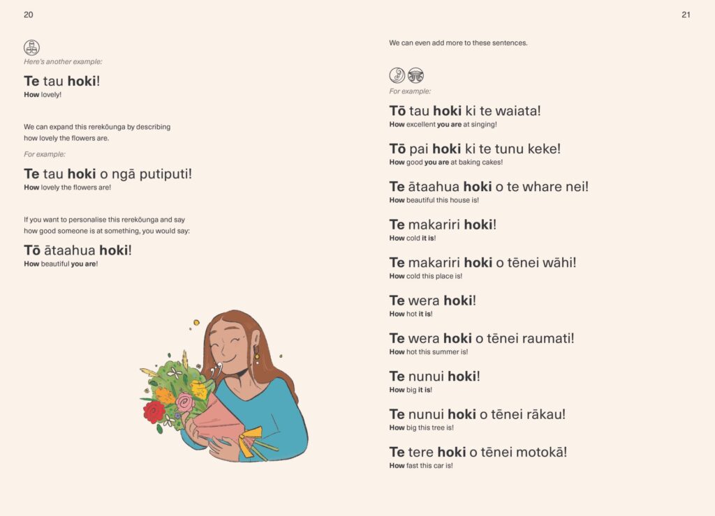
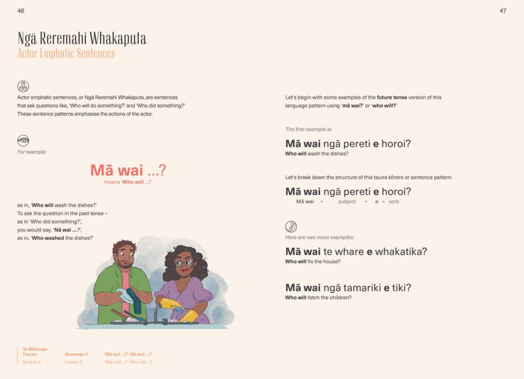
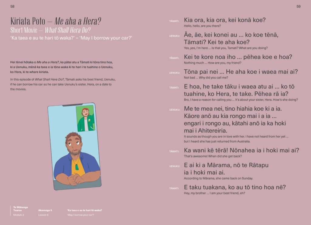
“The design challenge was to create a language-learning book that was unobstructed, well-lit, and visually stimulated. The design needed to encourage continuous and repetitive use through a clear hierarchy of information, heading styles, comprehensive colour pallet with intuitive wayfinding, and the use of iconography and illustrations to provide a memorable and well-supported learning journey. Lessons are short, so there needed to be a savvy incorporation of simple infographics and pullouts to explain new concepts, and visual aids acting as mnemonics to help remember sentence patterns. Interesting and playful fonts that may take more ‘effort’ also aided”
Judges’ comments What a delight and pleasure it will be for intermediate Māori language learners opening this book! Featuring an elegant cover, the interiors are where the design truly sings. Open the creamy matte pages and enter a world of subtle colour and typographic panache. Utilising white space, indentation, size, type, and colour contrast with great skill, the systematic design of information is extremely well executed. The illustrations contribute but don’t overwhelm, enhancing the overall reading experience.

