Lift Education Award for Best Educational Book or Series – Primary 2023
Finalist
Designers: Cover: Barnaby McBryde, LearnWell (handwriting font) and Jane Meder, Jane Meder Illustration and Design. Interior: Robyn Hopcroft, Hop2it Art and Design (compositor), Pietro Lubich, LearnWell (template), Jane Meder, Jane Meder Illustration and Design
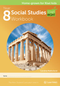
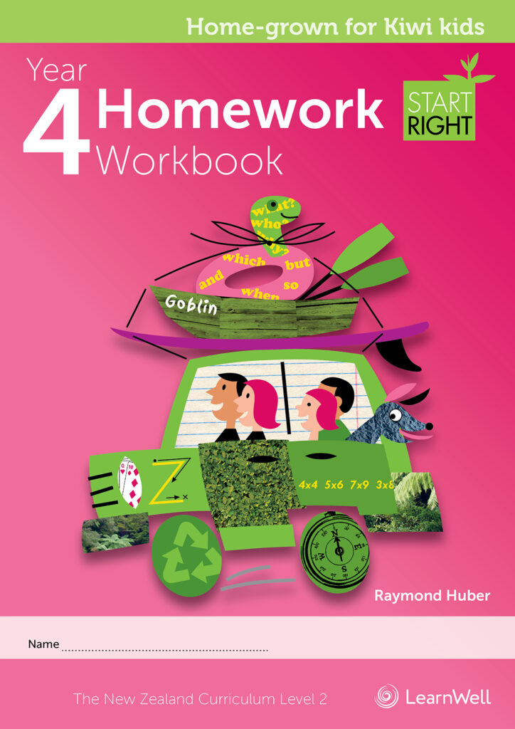
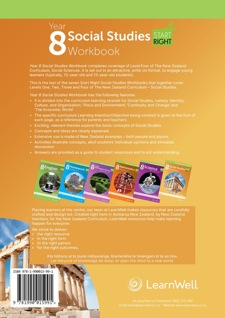
Title: Start Right Workbook series: Year 4 Homework & Year 8 Social Studies
Publisher: ESA Publications trading as LearnWell
Format: 295 x 210mm, 94 – 144pp, PUR Perfect Binding
Typography: Body text: Inter
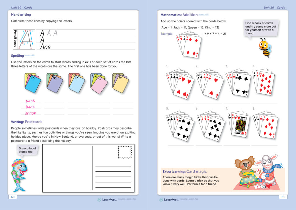
Headings: Museo Sans. The book’s handwriting exercises use a font created by LearnWell. This font consists of letter forms in line with the New Zealand Ministry of Education Teaching Handwriting document.
“The Start Right workbook series is based on the NZ Curriculum and covers an
age group from 5 to 13 years, it was important to have the typography and
illustrations progress appropriately for each year level. We’ve made use of Te
Reo supported fonts in the making of the Start Right workbook series. The main
body font called [Inter] and the heading fonts are [Museo] & [Museo Sans]. Both
fonts and their variants come with the “Macron’ed” letters built-in inside their
Glyphs map.”
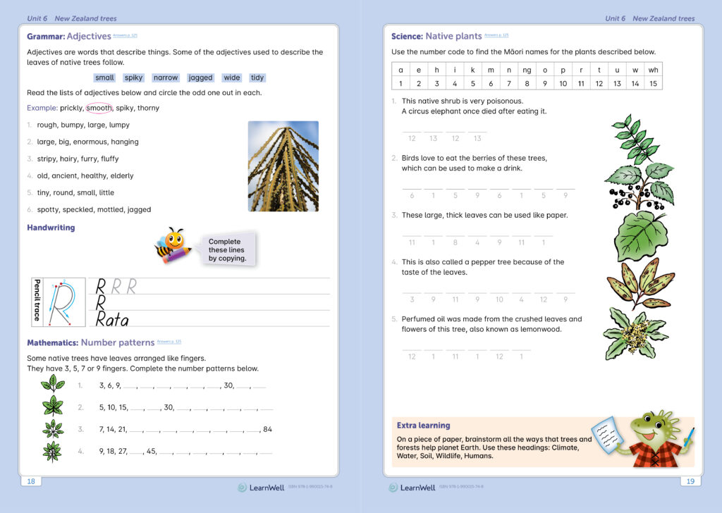
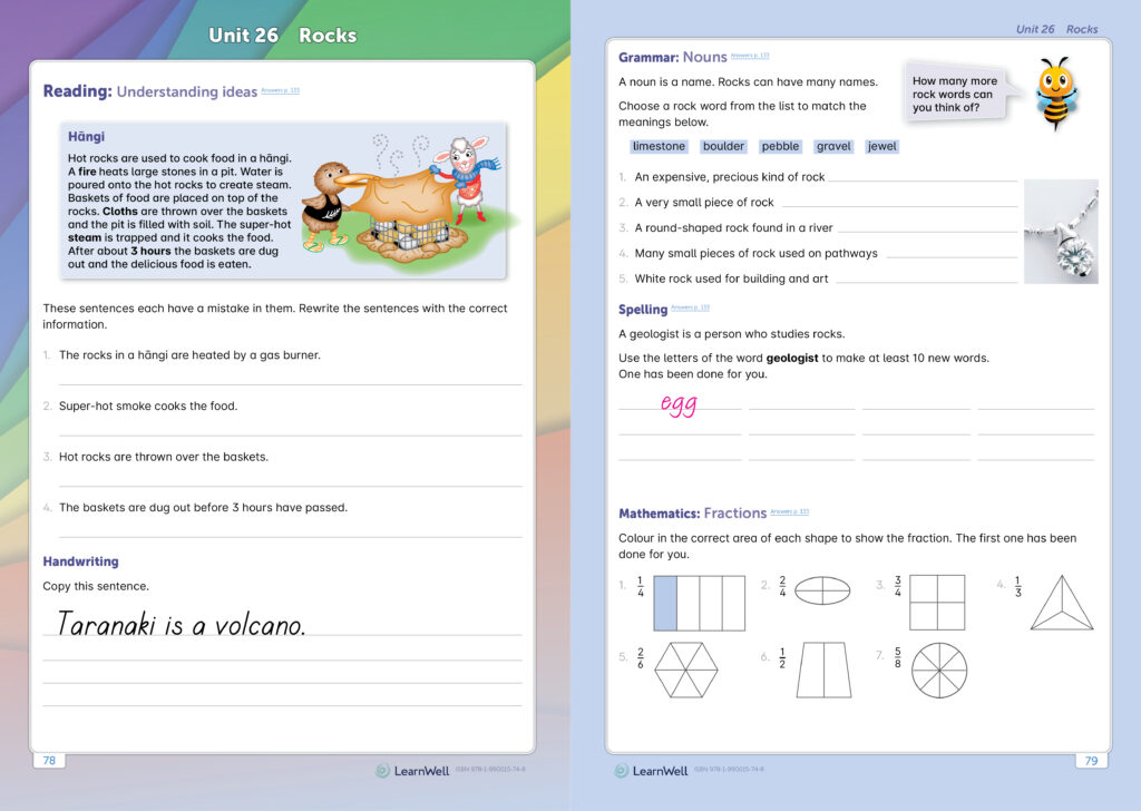
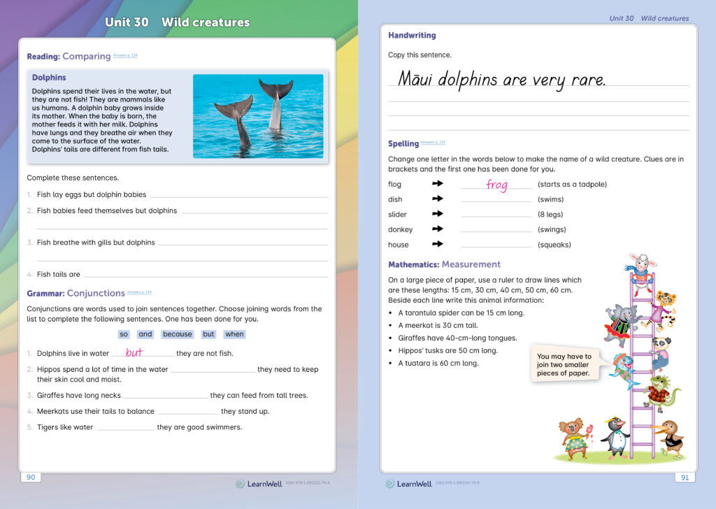
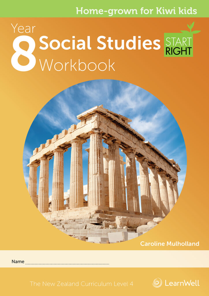
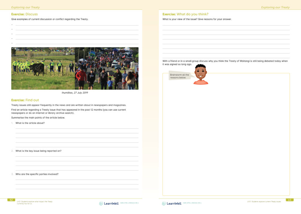
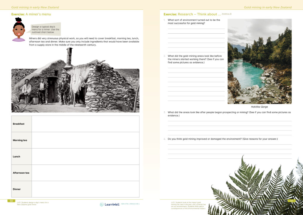
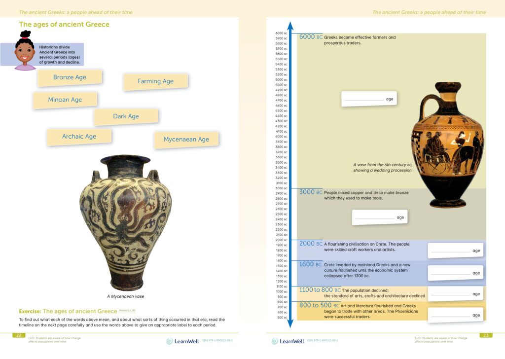
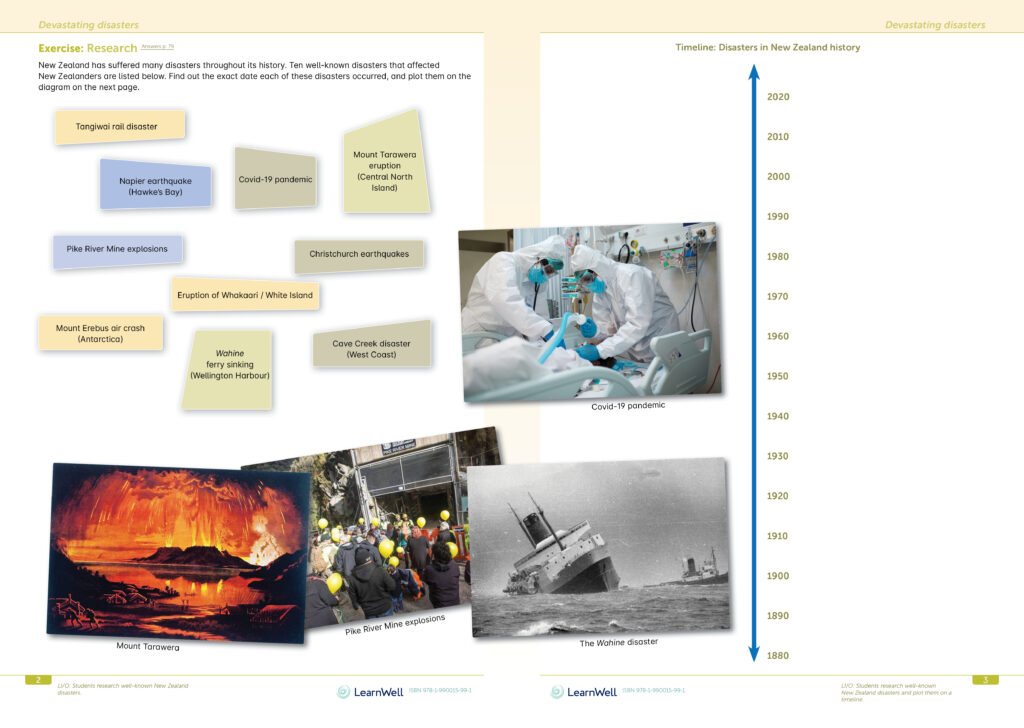
Judges’ comments In an era when so much noise is made about how to teach tamariki from outside the profession, to have design certainty and continuity around presenting the curriculum content is a tough gig. These Start Right titles credit not only teachers but the pupils with intelligence. The design system reassures the learner that they are on a learning journey with typographic point sizes used for Year 4 subtly reduced for Year 8. This allows the space for longer form answers at Intermediate. The design system has enough flexibility to move from Year 4 cartoon style illustrations to Year 8 clear cut photography. The design successfully acknowledges the fun of engaging early learners to the later encouragement of sophistication of interpretation as the learner progresses.
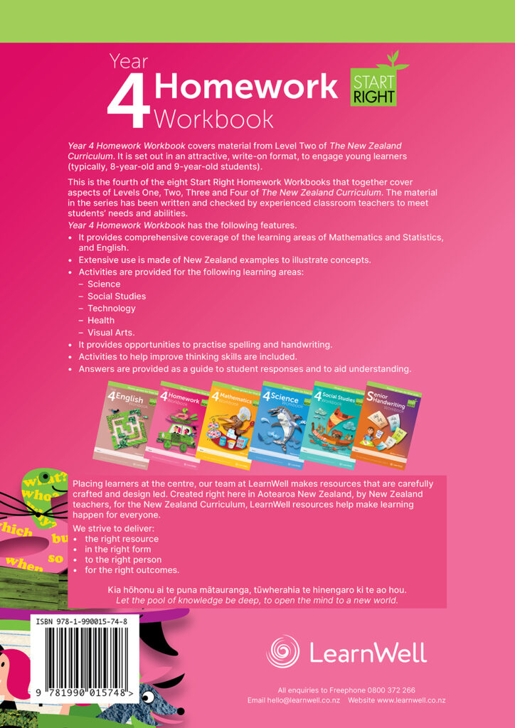
This series brings together a myriad of visual elements and texts to provide clearly set out, highly structured pages that are also engaging and look like they would be fun to complete. The designs are well targeted to their respective age groups with distinct differences in the layout, colours and size of typography between the two books. They look to be highly effective tools for teachers and students.


