Mary Egan Publishing Award for Best Typography 2019
Winner
Designer: Arch MacDonnell and the team at Inhouse Design
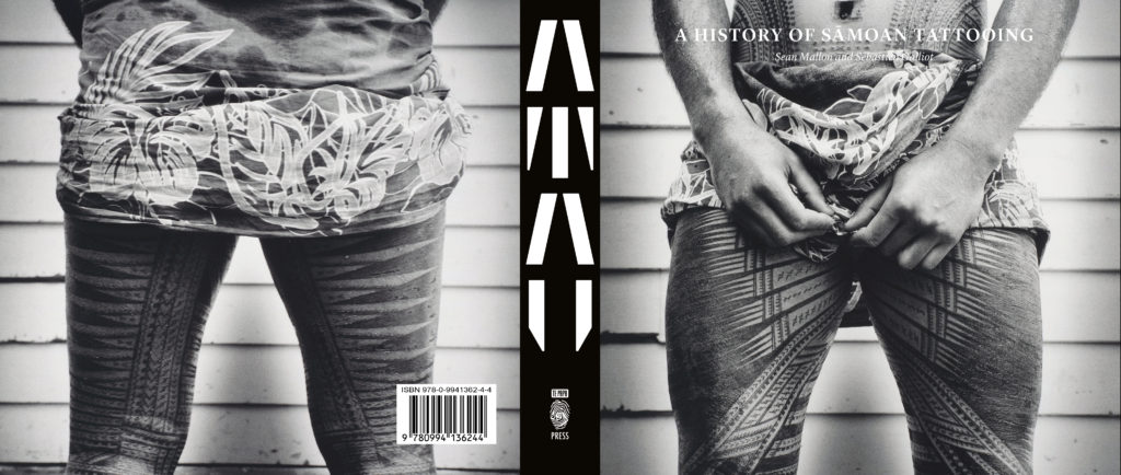
Title: Tatau: A History of Sāmoan Tattooing
Publisher: Te Papa Press
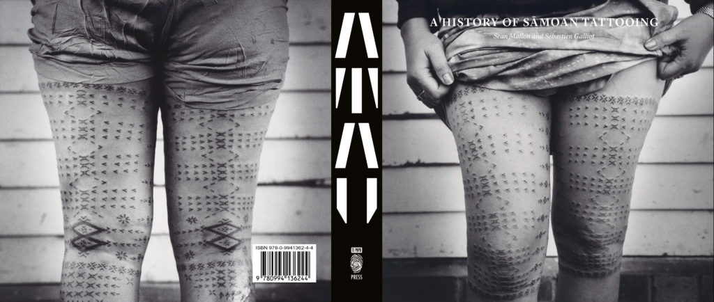
Format: 255 x 200mm, 300pp, hardback. The half-jacket is reversible, with the peʻa tatau on one side, and the malu tatau on the other. Debossed title motif on the case.
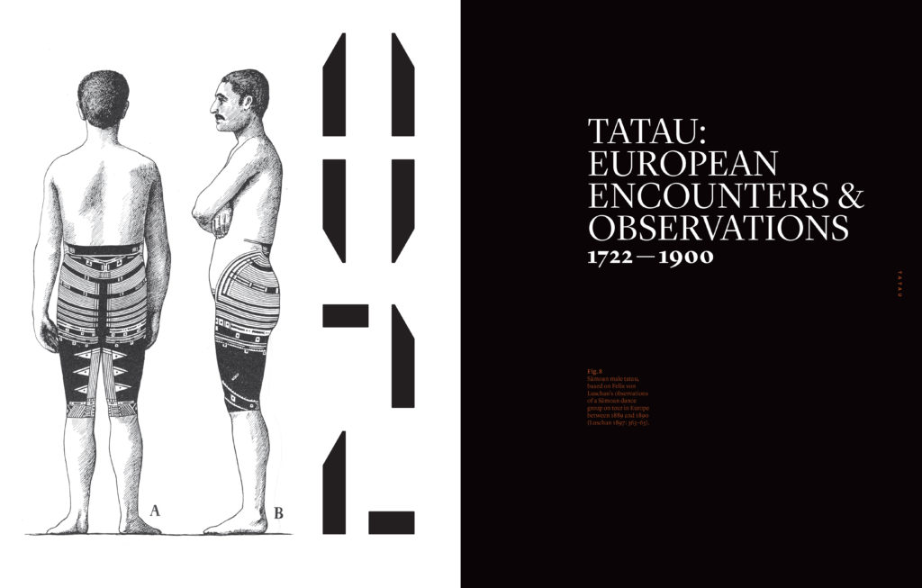
Typography: A unique stencil typeface was created that draws on the shark tooth motif prevalent in Sāmoan tatau. This was used for the titles and chapter numbers. Support fonts are Lyon and Callibre. Leading and font sizes vary. The typeface is debossed onto the case of the book, and can be seen above the half jacket.
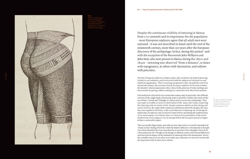
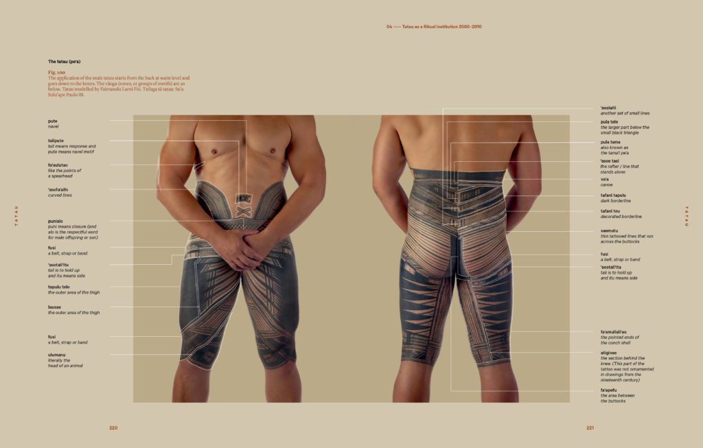
Judges’ Comments “This is a book that has had much attention paid to every detail. The three types of content inside are carefully thought out through the typography and design choices that differentiate them, with page detailing and placement visually echoing the fine intricacies of tatau. The earthy colour palette used is well considered and supports the type hierarchy nicely.”
“This book is a complete knockout! An absolute treasure. Beautiful treatment of a worthy subject. Beautiful colour tones, paper stock, presentation of information. My only reservation is the choice of murky brownish text but overall a publishing triumph.”
“Outstanding! The paragraph widths seem slightly too wide but otherwise excellent consideration of every detail, presenting intricate information in a considered, easy to access/scaffolded manner. Can’t fault the stock choices, colour palette, font selection, weight and scale.”
“Such tremendous fine detail is achieved across a very demanding range of typographic hierarchy from outer cover to end matter. Although one or two instances could be considered as being set in a slightly smaller point size or too light a weight one can forgive this as the sheer weight of words and the nature of the many sections in the book is such a huge task. Excellent typographic craft.”

