1010 Printing Award for Best Cookbook 2023
Finalist
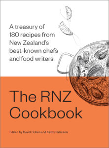 Designer: Kate Barraclough, illustrations by Pippa Keel
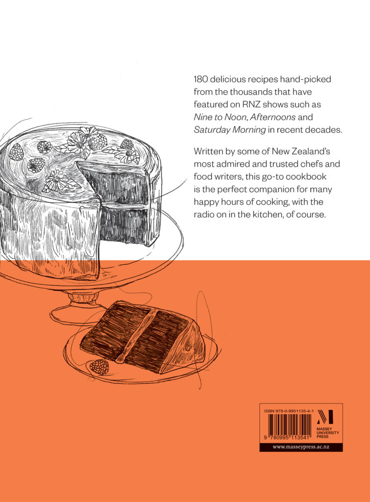
Title: The RNZ Cookbook: A treasury of 180 recipes from New Zealand’s best-known chefs and food writers
Publisher: Massey University Press
Format: 250 x 190mm, 272pp. Hardback, two piece case, Yulong Pure text throughout
Typography: Set in Founders Grotesk, Light and regular in various sizes.
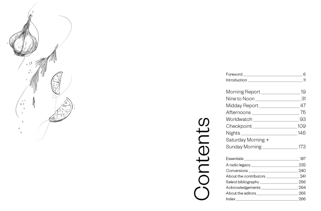
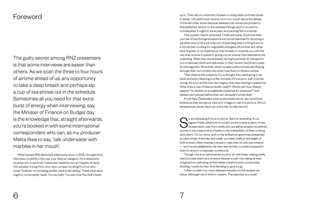
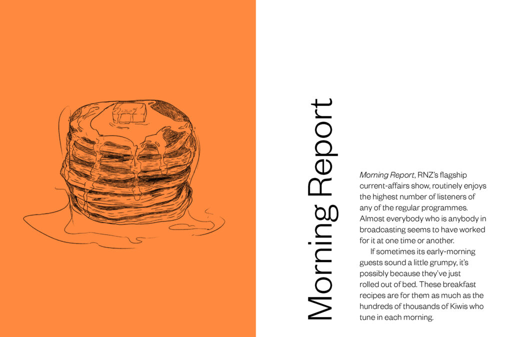
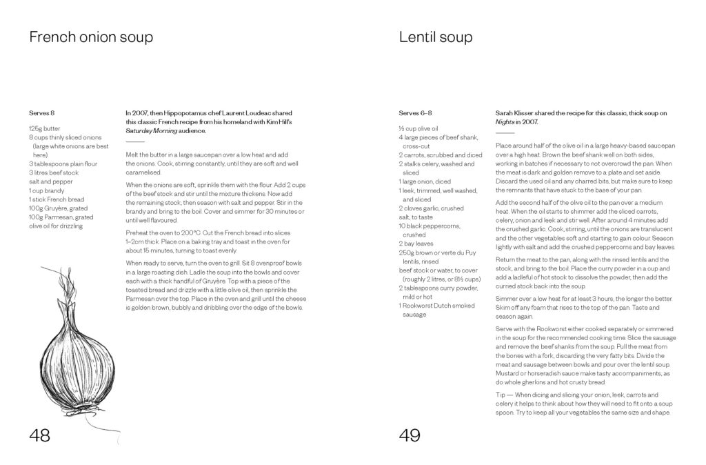
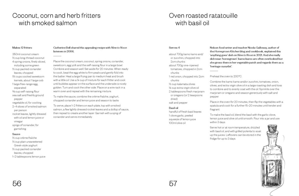
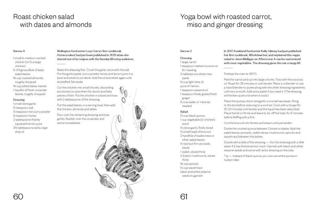
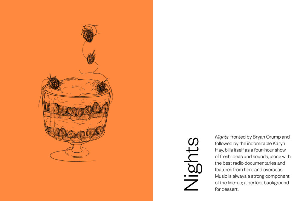
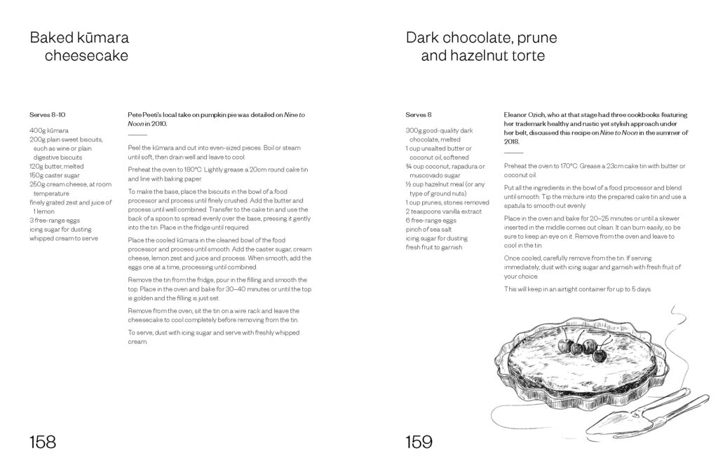
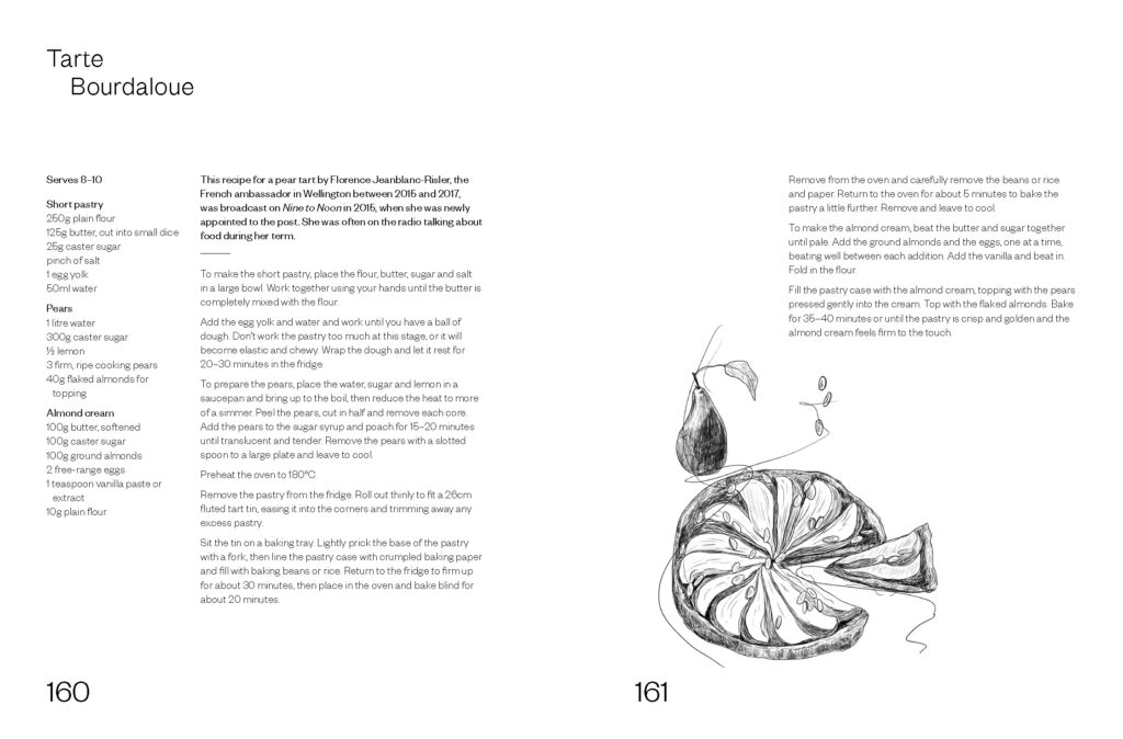
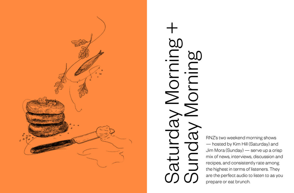
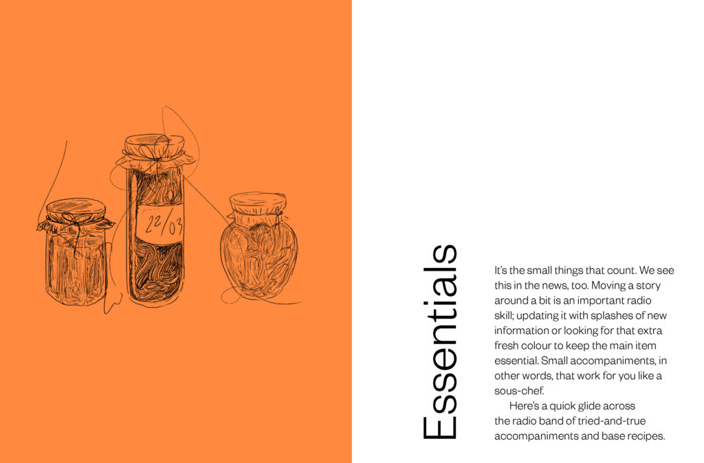
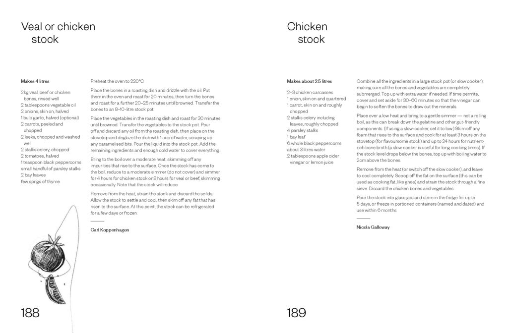
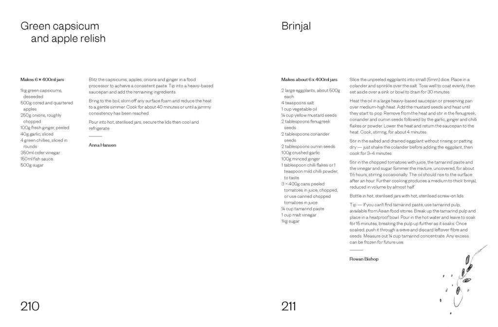
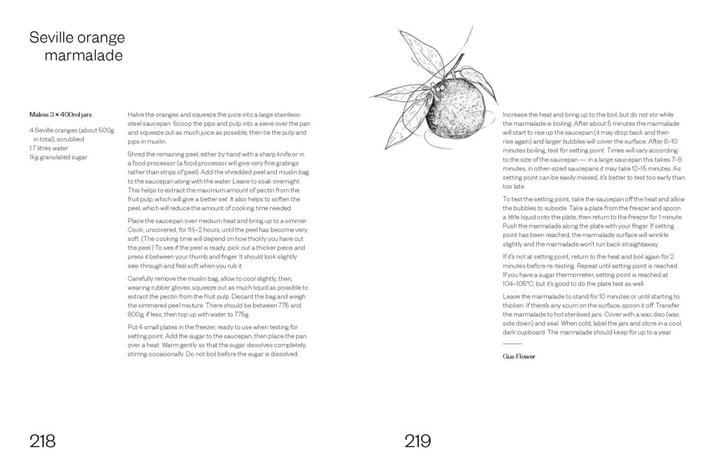
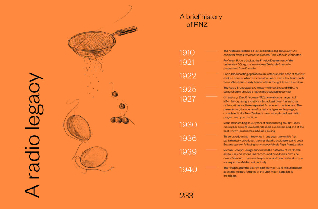
"The brief to the designer was to create a timeless yet contemporary book using uncoated stock (Yulong Pure) printing throughout in black plus 1PMS (orange). Because it is a collection of heritage and archival recipes there could not be any food photography and so the design of the book had to work hard to compensate for this given that the cookbook market is awash with beautifully styled food images. We wanted to make a virtue of this difference by using the occasional line drawings only, harking back to an earlier era when cookbooks did not have images."
Judges’ comments With 180 recipes loaded with flavour and culinary inspiration from a vast array of chefs and food writers from Aotearoa, the design task of somehow representing the diversity, but with a sense of neutrality amidst all the personalities and voices is no mean task. The design acknowledges that radio listeners have the smarts to complete the pictures themselves. Pippa Keel's line work illustrations add visual seasoning, sparingly used, just enough to punctuate the clean, pared back, white space, strong grid and Kate Barraclough's elegant typographic treatment. The line breaks, spaces between the words and lines of methods and process are so important. Subtle type weight changes also just do enough to direct the reader through the recipes. The design is reminiscent of cool timeless recipe books of the 1970s and 80s, yet the crisp black text against white with orange section breaks and reverse out type give the heat of a contemporary classic.
The forthright visual simplicity of this book won me over from the outset. The orange and cream colourway is beautifully offset by the teal endpapers, resulting in a contemporary-but-retro feel. The typography is confident and at scale. The selection of the sans serif typeface is key to the design success. It has some lovely visual quirks – such as the nearly closed C – and the variation in line weight brings a visual warmth that sits perfectly on the cream uncoated paper. The recipes are well set out and easily read. The delicate illustrations add variance to pages where needed.

