Allen & Unwin Award
for Best Commercial Book for Adults 2022 Finalist
Designer: Megan van Staden
Title: Times Like These
Publisher: Allen & Unwin
Format: 234 x 153mm, 264pp, paperback.
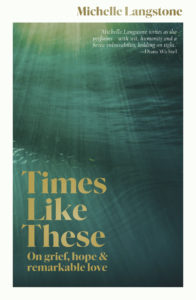
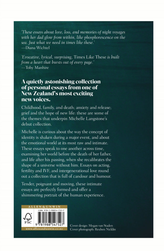
The cover is tactile, with an uncoated stock, that allows the reader to hold onto it easily. The gold foil was chosen to lift out off the cover and glimmer and wink, like a little light, like the prospect of sunlight and better days within the essays.
Typography: Body serif: Fairfield LH 45 Light, 12/18. Headings: Parnaso Bold, 36/36.
The cover imagery is representative of grief, and feeling so deeply, akin to the depths of the ocean, with the rays of light symbolic of hope and light at the end of the tunnel. The designer diagonally balanced the typography, which stands out in a golden foil, shimmering like sun rays. It is also representative of the theme of water that runs throughout the book, of the author’s family boat, of the title essay, which is about the boat and of the ocean as well.
Michelle Langstone adds: ‘What it looks like to me is what I used to see when I was submerged and almost drowning – the light filtering through from above and being in that kind of half-state of alive and not quite dead. I don’t mean that to sound morbid in any way. Grief is a bit like that too – you’re alive but partly dead.’
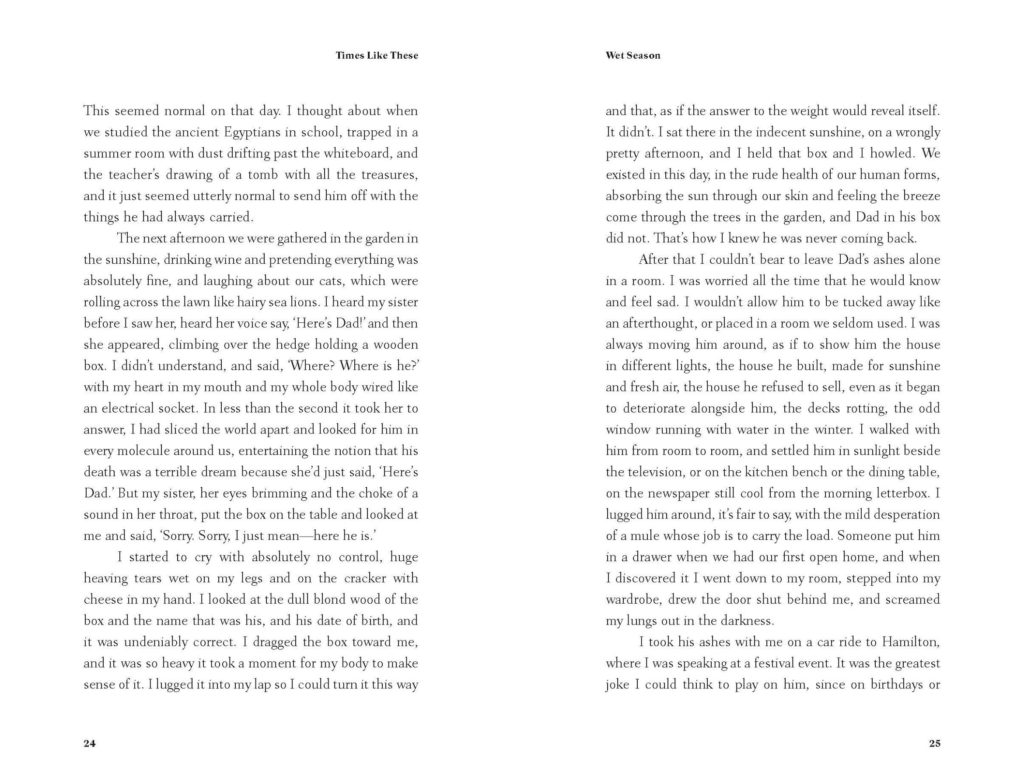
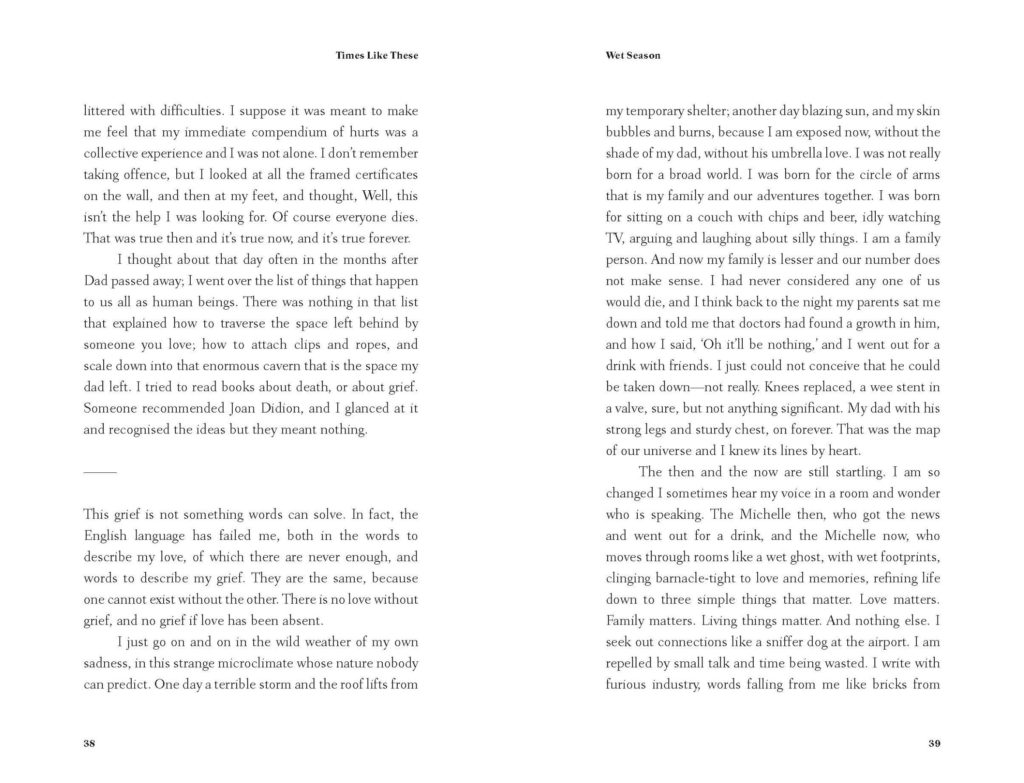
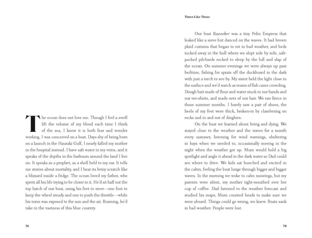
Layout: As the book is about grief and loss, the brief was to keep the design restrained and quiet. Megan kept the typographic treatment quite classic, and there is a nice contrast between the fine body serif and emphatic yet elegant titling font. Generous margins and leading allow a spacious layout. There is also a theme of hope and growth, which inspired the diagonal footers and headers leading the eye across the page and anchor the text block.
Each chapter heading gets its own opener, in a sense a private space and grace, designed to give the reader a sense of being held as you turn into a new essay and gently dropped into it.

