Mary Egan Publishing Award for Best Typography 2019
Finalist
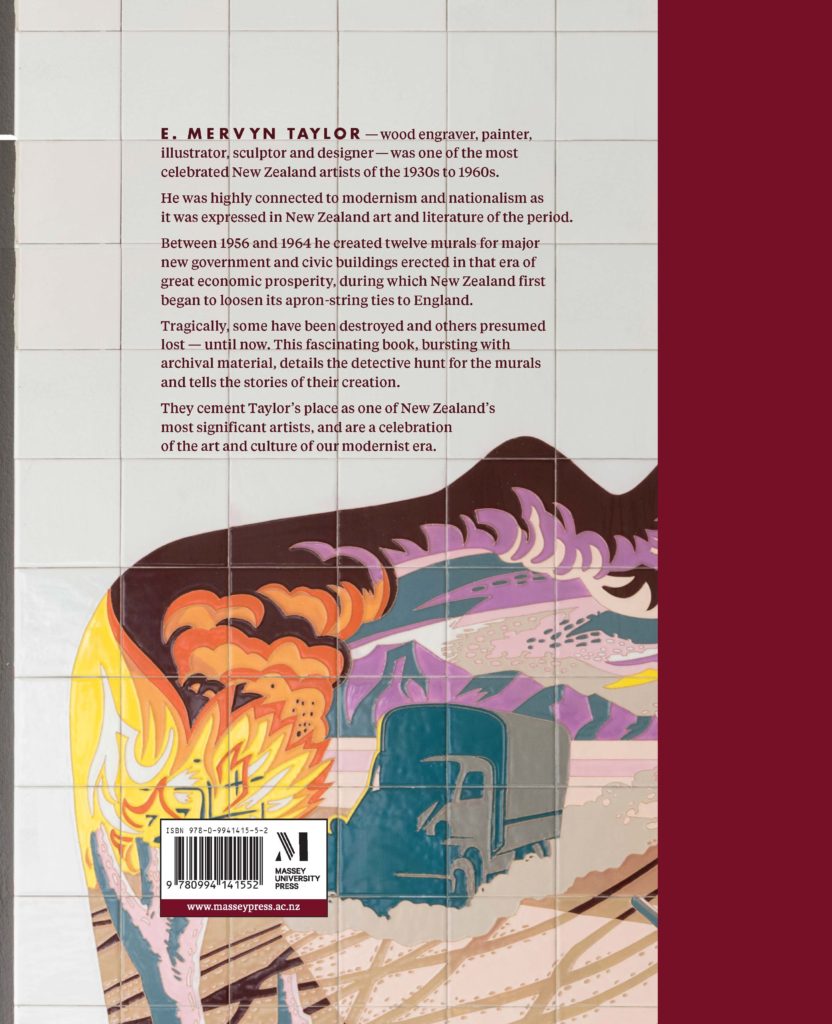
Designer: Anna Brown with endpapers designed by Bronwyn Holloway-Smith
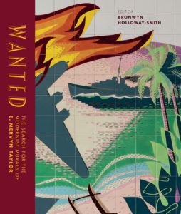
Title: Wanted: The search for the modernist murals of E. Mervyn Taylor
Publisher: Massey University Press
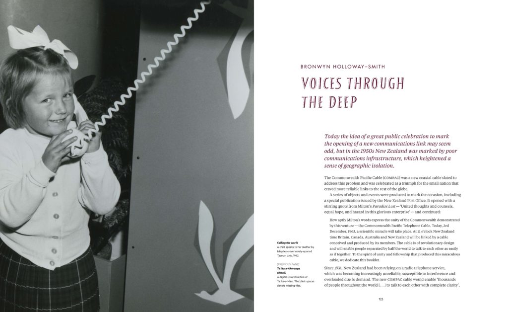
Format: 250 x 210mm, 256mm, hardback. Cloth spine with gold blocking plus gloss artpaper panels on the case boards. Two paper stocks used for the internal pages; 160gsm Sun Woodfree and 128 Goldeast Matt Art.
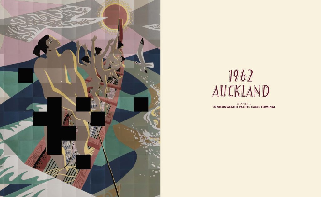
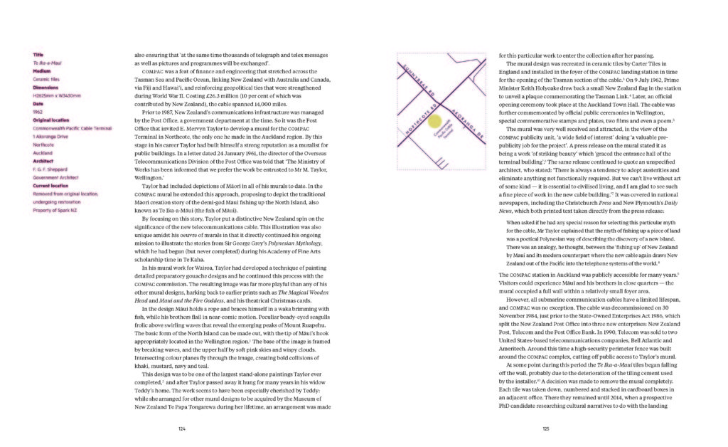
Typography: Body font: Futura CE Book 9pt; titles/ display for chapters: Festival TitlingW00 39.5pt.
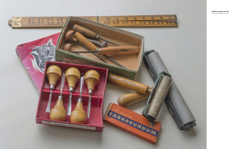
Judges’ comments: “A wide variety of fascinating visual content is presented within the book, and is handled with careful placement, to not overload the page. The generous margins used for the text act as a balance and contrast to this, which helps to anchor the book visually. The typographic choices – particularly the use of Festival Titling & Futura echo the era of E. Mervyn Taylors work.”
“This book is exquisite. The two different modernist types show a clever nod to and sensitivity to the content; a lovely detail. Love the mid-century look which echoes the artist’s work. Beautiful presentation and as a whole package the images and text work beautifully together.”
“Well presented images and image crops. This is a good record and investigation into this artist’s work. The title and text fonts don’t quite hang together, and the design could have assisted the content more.”
“Across all the typographic requirements from cover to end matter there is skilful craft apparent. Crisp and certain kerning and tracking make for an easy read traversing from line to line, detail to detail. And type weights for specific details are all very well controlled and considered. Good choices of stand-out chapter heading typeface with body copy and maps all era appropriate.”

